Search Results
Photographs of Monterey Motel sign, Las Vegas (Nev.), February 12, 2017
Date
Archival Collection
Description
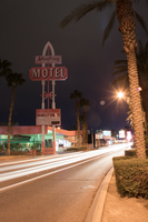
Site address: 1133 S Las Vegas Blvd
Sign owner: Monterey Motel Corp.
Sign details: The building was constructed in 1944 (Assessor). The business opened as the Monterey Lodge Motel (RoadsideArchitecture). A vintage postcard from 1954 shows The Monterrey Lodge Motel with much of the current architecture, although a different sign is present (Las Vegas motels then and now). The motel advertises itself as endorsed by several automobile clubs, including the Automobile Association of America (AAA).
Sign condition: Condition is 4, good. The cabinets, light boxes and neon are intact and in good condition. The paint shows slight fading and no flaking or peeling, except for light to moderate deterioration and rust on the bottom of the lower cabinet.
Sign form: Double pole sign
Sign-specific description: Double poles painted in bands of pink topped by bands of white support a rectangular reader board with a pink metal cabinet. Plastic pink sans serif letters spell out "FAMILY UNITS" on the face of the readerboard. On the lower motel side of the readerboard is a rectangular black plastic sign which states, "COLOR TV by RCA" in multi-colored san serif letters. At the top of the cabinet on the motel side is an arrow pointing toward the business. At the top of the north face of the cabinet is white coated skeleton neon tubing which states, "ENTER NO VACANCY" in sans serif letters. On the south face of the cabinet the lettering is reversed to say, "NO VACANCY ENTER". Mounted above the readerboard are three poles. The two outside poles are painted white and consist of round pedestals, shafts and capitals. The capitals are outlined in white skeleton neon. The rectangular interior pole is painted pink. A pink, rectangular bar (from an asterisk now covered by plastic wrap advertising) intersects the middle of all three poles. A rectangular shield shaped metal cabinet painted pink sits on the poles above the readerboard. White sans serif letters outlined in black paint and clear skeleton neon spell out "MOTEL". The three poles continue out of the cabinet to support a second pink metal readerboard which features "Monterey" spelled in plastic cursive letters. The three poles extend above the second reader board where they join to make an arch. The two outside poles are outlined in white skeleton neon.
Sign - type of display: Neon and Reader boards
Sign - media: Steel and Plastic
Sign - non-neon treatments: Reader boards
Sign environment: This is located on Las Vegas Boulevard South just north of the strip.
Sign - date of installation: Circa 1950's-1960's (RoadsideArchitecture)
Sign - date of redesign/move: A 2009 photograph shows the sign painted blue (Virus, 2009). Flaking paint under the "COLOR TV by RCA" sign shows an older layer of blue paint. A sign of similar age in the parking lot of the motel is still painted the same light blue shown in the photograph.
Sign - thematic influences: There is a Googie star on the sign as well as an arch which was a popular 1950's/60's sign design. Also they advertise automobile clubs on their sign and have a western ranch style building which are also Mid-Century Modern trends as well.
Sign - artistic significance: The sign showcases Googie, Western and motor court artistic aspects.
Survey - research locations: Clark County Assessor, Parcel No. 162-03-112-034. Retrieved from http://www.clarkcountynv.gov/assessor/Pages/PropertyRecords.aspx?H=redrock&P=assrrealprop/pcl.aspx Las Vegas motels then and now. (n.d.) Monterey Lodge - 1133 South Las Vegas Blvd. Retrieved from http://stefanidrivesvegas.com/8.html RoadsideArchitecture. (n.d.). Monterey Motel. Retrieved from http://www.roadarch.com/signs/nvvegas3.html Virus, R. (2009 April 5). Monterey Motel, Las Vegas, NV. Retrieved from https://www.flickr.com/photos/25229906@N00/5769946413/in/photostream/
Surveyor: Mitchell Cohen
Survey - date completed: 2017-09-04
Sign keywords: Steel; Plastic; Reader board; Neon; Pole sign; Back to back; Backlit
Mixed Content

Photographs of Candlelight Wedding Chapel sign, Las Vegas (Nev.), 2002
Date
Archival Collection
Description
Site address: 800 S 4th Street
Sign details: The Candlelight Wedding chapel is located on the corner, just north from the Riviera and in the same parking lot as The Algiers. The small white, wooden roofed structure sits just to the east of the street and the northern side butts against Stardust Rd . Outside, the corner is treated with grass, and landscaping, creating a pleasant environment to go along with the charm of the building as well. The low level pole sign faces north/west. The building has a small wooden cross, surrounded on the edges with white neon, on the top of the building, in the same fashion as the Little Church of the West. The style of the building is classic New England architecture
Sign condition: Structure 4 Surface 3 Lighting 3
Sign form: Pylon
Sign-specific description: The main sign for the candlelight wedding chapel is essentially a small pole sign with three separate sections of cabinets along with lighting elements. The white steel pole rises out of the ground ,before transforming into a large two sided marquee cabinet. The cabinet is crafted with sculptural elements into its outer edge. The four corners swell up and bulge, before slightly swooping inward. The top and bottom edges are climaxed into a shallow point. The sides sweep into the notch of a negative circular shape. The sides are given a scroll type feel. In two lines across the red face of the sign, Wedding Chapel is spelled is white text, occupying most of the space of the cabinet. Across the very bottom of the cabinet Wedding Information is spelled in an all white single row of text. The larger text is lined with incandescent bulbs and outlined in neon. The bottom line of text is just lined in neon. The pole protrudes through the top of the sign where a small horizontal, internally lit cabinet, sports sculpted edges as well. The top and bottom edges sweep from either side, then descend meeting at a point in the center. The sides are simply concave, radiuses inward. The white cabinet is lit internally, illuminating the white plastic face. Black text stretches across the plastic face, reading candlelight. Below the main cabinet two internally lit cabinet sandwich the pole, creating two faces. The cabinets are all white, with white faces, utilizing red letters. At the very top of the pole is a tree tiered formation created with raceways and lined with incandescent bulbs. One raceway rises vertically into the air perpendicular to the ground, while the two flanking pieces arch out created a three-pieced fountain shape. It is also reminiscent of a Fleur de Lis.
Sign - type of display: Neon; Incandescent; Backlit
Sign - media: Steel; Plastic
Sign animation: none
Sign environment: The positioning of the Candlelight Wedding chapel gives it a unique role as an accent of softness, among a bombardment of neon and pulsating lights. Just to the North, is the Algiers parking lot, and to the south, the Riviera. Directly west across the strip there is the ever electric Circus Circus. Amid all this chaos of incandescence, screeching cabs, and buzzing current, the green shrubbery and plot of turf finely houses the pylon, and leads up to the structure itself. It is very charming and fresh compared to. It definitely is reminiscent of the era of establishment such as its neighbor the Algiers.
Sign manufacturer: YESCO
Sign - thematic influences: The theme of the sign has little to do with the theme of the wedding chapel, and more so to do with the architectural theme, than the function of the establishment. The pole sign contains standard elements of local signage. The logo cabinet, and internally lit message center. It even contains the most common element of a raceway lined with incandescent bulbs. The sculpted edges of the pylon's logo cabinet are reminiscent of other cabinets with sculpted edges. The most famous reference to this shape seen in classic Vegas history, is the original corner fascia seen on the Golden Nugget. As far as being compared to the only other existing independent wedding chapel, its structure is similar, that being a small structure boasting a highly visible steeple.
Surveyor: Joshua Cannaday
Survey - date completed: 2002
Sign keywords: Pylon; Neon; Incandescent; Backlit; Steel; Plastic
Mixed Content
Photographs of Algiers signs, Las Vegas (Nev.), 2002
Date
Archival Collection
Description
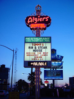
Site name: Algiers Hotel (Las Vegas, Nev.)
Site address: 2845 S Las Vegas Blvd
Sign owner: Larry Kiefer
Sign details: Located on the NE corner of Riviera Blvd and Las Vegas Blvd The facade of the Algiers building itself is comprised of storefronts, while the hotel portion lies through an archway, behind the facade. The entire stucco front is illuminated and treated with neon borders and font. Across the narrow parking lot stands the Algiers pylon sign, along Las Vegas Blvd
Sign condition: Structure 3 Surface 3 Lighting 4
Sign form: Pylon; Fascia
Sign-specific description: The façade and pylon/pole sign work together to create the attraction of the Algiers. The pole sign is double backed sign with neon marquee logo at the top and an internally lit, white, plastic front, message board with vinyl lettering. The top section of the message board is a rear lit, plastic, graphically treated sign, while the bottom of the board is an electronic message center. Crowning the very top of the structure is a sculpted crown-shape comprised of the polished brass raceways, which also adorn the top and lower portions of the pylon. These raceways contain 11 watt white incandescent bulbs which chase each other from top to bottom. The Algiers logo is channel lettering with double neon of the rose colored variety. The word "Hotel" is spelled in ruby neon. The façade of the building is comprised of five different sections. The first contains the Algiers logo in channel letters filled with blinking incandescent bulbs and outlined in ruby neon. Texts " Hotel, Restroom, Video poker, pool and entrance," are spelled in rose colored neon. The next four sections are storefronts with neon borders in their windows. Each section is separated by a section of vertical, polished, gold raceways with chasing animated bulbs. The backlit graphically treated storefront marquees adorned with an incandescent bulb border. The last section of the building supports a metal sign box with double neon letters spelling "Algiers". Above each section, the storefront crowns to a point, reminiscent of a classic Persian gateway or spire. Each swooping section is bordered with vibrant neon.
Sign - type of display: Neon; Incandescent; Backlit
Sign - media: Steel; Plastic
Sign - non-neon treatments: Graphics; Paint
Sign animation: Chasing, flashing, oscillating
Notes: The text, which resides on the southern wall and reads "Casino," is filled with incandescent bulbs that all illuminate at the same time, and oscillate. They then shut off at the same time, and then repeat. The raceways of incandescent bulbs chase each other while the neon, which surrounds the back lit, plastic, screens on this wall flash on then off. The bottom two raceways sandwiching the reflective panel chase from left to right, while the remainder of the raceways surrounding the signs, run right to left. The incandescent bulbs on the pylon chase each other gracefully up the length of the pylon. The animation is patterned so as to appear as if a section of several bulbs are pulsing its way up the towers, hugging the edge of the bulbous tops. The raceways continue around the east face of the building. The umbrellas in the plaza behind the pylon, also are animated with incandescent bulbs chasing each other downward along the raceways.
Sign environment: The Algiers is settled across the street from the Circus Circus and shares the lot with the Candlelight Wedding Chapel.
Sign manufacturer: YESCO
Sign - date of installation: 1953
Sign - date of redesign/move: Refinished in 1992 by Larsen Sign
Sign - thematic influences: The Algiers is an Arabian nights/Persian theme, mixed with the vestiges of classic Vegas aesthetics, such as the polished, gold, animated raceways, the roadside pole sign design, the text, and the similarity to the classic desert paradise theme of the 50's through today. Examples of this classic style are the Sands, the Dunes, the Aladdin, and the Sahara.
Sign - artistic significance: As mentioned above it is a representation of an era in Vegas and the thematic influence of the desert themed establishment.
Surveyor: Joshua Cannaday
Survey - date completed: 2002
Sign keywords: Flashing; Oscillating; Chasing; Pylon; Fascia; Incandescent; Neon; Backlit; Steel; Plastic; Graphics; Paint; Pole sign
Mixed Content
Genuine Auto Parts Neon Survey document, September 23, 2017
Date
Archival Collection
Description
Site address: 3738 Boulder Hwy
Sign owner: Carquest Auto parts/ Golden State Supply/ Cannon Property LLC
Sign details: This building was built in 2014 which replaced a different Auto Parts building which still carried Car Quest. This location sells self-installation car parts. The sign itself was for the Charleston Auto Parts, but was restored for the Genuine Auto Parts around 2012/13 for its 2014 installation.
Sign condition: 5- Still in pristine condition since recently restored
Sign form: Roadside pylon sign
Sign-specific description: This sign has a long black steel base. The main portion of the sign is a steel orange jelly bean shape that has a yellow arrow surrounding it and points towards the building. The yellow arrow has flashing incandescents. Below the arrow states "Genuine" painted on the board in white block letters with a thin black trim. Underneath the word Genuine is a painted black square that has white letters spelling out "AUTO" and "PARTS" underneath, both in white neon. In between these words is the start of the yellow arrow. Under the black box is painted "3738 Boulder HWY" in the painted white block font with a thin black trim. This sign stays true to its original design for the Charleston Auto Parts sign with the arrow and Auto Parts words, and the only thing changed was the word Charleston to Genuine and the address from Main Street to Boulder Hwy.
Sign - type of display: Neon and Incandescent
Sign - media: Steel
Sign - non-neon treatments: Incandescent light bulbs
Sign animation: Flashing incandescent light bulbs
Sign environment: This location is on Boulder HWY with an RV sales lot next door. The original sign was located between Main and Charleston.
Sign - date of installation: 2014 in this location - original sign was for Charleston Auto Parts, but was restored for the Genuine Auto Parts around 2012/13 for its 2014 installation. Original installation year would have been circa 1950's
Sign - date of redesign/move: 2014 restored and put in this location though if it is the Charleston Auto Parts sign restored then the sign itself would date back to the 50's
Sign - thematic influences: This sign is remnant of the old time auto shop sign particularly with the arrow to accommodate to the car consumer era of the 50's/60's.
Sign - artistic significance: Restoring the sign and putting it back up for a similar purpose stays true to Vegas history by having the Neon live on.
Survey - research locations: Asessor's Page, Recapturist Website http://www.recapturist.com/portfolio/charleston-auto-parts/, Roadside Architecture website http://www.roadarch.com/signs/nvvegas2.html , Car Quest Auto Website https://www.carquest.com/stores/nv/las-vegas/14980
Survey - research notes: http://www.recapturist.com/portfolio/charleston-auto-parts/ shows this sign in its original form for the Charleston Auto Parts, but was restored for the Genuine Auto Parts around 2012/13 for its 2014 installation.
Surveyor: Emily Fellmer
Survey - date completed: 2017-09-23
Sign keywords: Neon; Incandescent; Steel; Flashing; Roadside; Pole sign; Directional
Text

Inspire Theater Neon Survey document, August 18, 2017
Date
Archival Collection
Description
Site address: 107 S Las Vegas Blvd
Sign owner: Fremont LV Blvd LLC
Sign details: The original construction year of the building dates back to 1952. Though in 2013 the building was redesigned to open as the Inspire theater in 2014. The Inspire Theater offers a variety of venues including a 150 seated theater, a rooftop patio and multiple cocktail bars.
Sign condition: 5 - new sign with good quality day and night
Sign form: Blade and semi-decorated shed
Sign-specific description: The sign itself is all connected though it wraps around the whole building, it starts with a long rectangular blade with their logo then goes in a rectangle around the building and ends with their logo on a shorter blade with their logo. The longer white rectangular blade portion begins on the corner of the building above their rooftop lounge (which meets together back to back with a smaller rectangular blade). If you are going north on Las Vegas Blvd you will see the big blade which reads "INSPIRE" in channeled silver thin print font letters. The adjacent blade is a bit shorter, so you can see a portion of the big blade over the smaller one if you are looking at the building from the East Fremont District, with this overlay it looks like there is a letter "I" and a dash(-) underneath it. On the actual portion of the shorter blade there are the "INSPIRE" thin channeled font letters, which are identical in design to the other side of the sign but just a smaller font. The outside edges of these back-back signs are horizontally lined with neon tubing. These blades then continue around the building into two horizontally neon lined strips that make the building have a decorated shed feature to it. This then makes a rectangular feature around the whole building. In between the top of the rectangle and the bottom, there is a balcony where guests can hang out. Though on both the left and the right sides of the blade there are plasma screens that show advertisements for their property. Also on the west side of the building there are thin horizontal strips of LED/plasma lights that sparkle in an iridescent fashion.
Sign - type of display: Neon
Sign - media: Steel
Sign - non-neon treatments: T.V. screens, LED
Sign animation: Flasher and iridescent light flow
Sign environment: On the corner of South Las Vegas Blvd. and Fremont St. East, the first property on the south side of the Fremont St East District.
Sign - date of installation: 2014
Sign - thematic influences: The sign is incorporated into the architecture, as well as the sign wraps around the entire building which is remnant of the decorated shed look. The sign is related to the theater theme since the blade style sign was very prominent for the 1950's and 60's movie theater signs, such as the El Portal movie theater sign.
Sign - artistic significance: Their sign is very remnant of a 1950's Movie theater sign with the blade and wrap around of Neon, since they are a modern day theater it seems as if it's a retro throwback.
Survey - research locations: Inspire website, assessor's website
Surveyor: Emily Fellmer
Survey - date completed: 2017-08-18
Sign keywords: Blade; Neon; Steel; LED; Flashing; Video screen
Text

Kings Row Trailer Park Neon Survey document, September 14, 2017
Date
Archival Collection
Description
Site address: 3660 Boulder Hwy
Sign owner: Kings Row Trlr Pk Inc
Sign details: This property is still functioning as a mobile home park along Boulder Highway. They are one of the largest RV parks in Southern Nevada and within a close distance to downtown and Boulder Station Casino. They advertise that they have some of the best deals in town as well as about 200 spaces available. They have been operating in Las Vegas for more than 60 years.
Sign condition: 5 - in great condition, well maintained
Sign form: Roadside pole with a message center and directional elements
Sign-specific description: This sign is made up of many different small cabinets. The top is a painted crown that is plastic and backlit. This sits on top of a red minimal arrow sign that points to the direction of the trailer park. This sign has yellow incandescent light bulbs lining the edge with "Kings Row" painted in white paint on the top of the sign, "Trailer Park" painted in bold yellow text in the center, and the text is outlined with neon tubes. The cabinet under this is a long, red trapezoid with "OVERNITES" painted on it in bold white text that is also outlined with neon tubes. Under this is what appears to be an iron flourish on top of another plastic backlit sign. This sign as "RV SPACES" painted on it in bold red text over yellow paint, "INDOOR HOMES TRAILERS CAMPING" in bold red text against a white background, and "MOBILE HOME SPACES POOL REC HALL" in bold red text against a yellow background. Under this is another iron flourish. Following that sign is a plastic backlit reader board. Under that is a plastic backlit sign with "CAMPERS" in white text and underlined against a red background. Finally, there is another plastic sign in the shape of an arrow with "Kings Row" in a light blue script, "ENTRANCE " in red, and "TRAILER PARK" in black inscribed on it.
Sign - type of display: Neon, incandescent, backlit
Sign - media: Steel and Plastic
Sign - non-neon treatments: Paint
Sign environment: This property sits along Boulder High way and near many other RV rental businesses. It is also down the street from Boulder Station Hotel & Casino.
Sign - date of installation: Possibly c. 1962
Sign - date of redesign/move: Current sign not the original, which was a long rectangular shape cabinet
Sign - thematic influences: This sign is very unique to the RV park. To emphasize the "Kings Row" theme, the crown perched on the top of the sign is designed to help with this. Much of this sign is used to tell motorists and pedestrians what the property has.
Sign - artistic significance: This sign is elaborate. There are many different elements to this sign overall. This sign is that there is a crown to signify the royal theme of this property, possibly as a way to differentiate from other RV park signs around town.
Survey - research locations: Kings Row website, assessor's website
Surveyor: Lauren Vaccaro
Survey - date completed: 2017-09-14
Sign keywords: Neon; Incandescent; Backlit; Steel; Plastic; Paint; Pole sign; Roadside; Directional; Reader board
Text

Vegas Trailer Supply Neon Survey document, September 10, 2017
Date
Archival Collection
Description
Site address: 3076 Fremont St
Sign details: There is no information regarding the history of this property. According to their business page on Yelp, the business has closed.
Sign condition: 4, the sign is in good condition though it is not confirmed it the sign is still in working condition.
Sign form: Roadside pole sign
Sign-specific description: This sign is unique because there are two different signs featured for this property. One of the signs is supported by a large white pole. The top portion of this sign is a faded blue oval with "Vegas" painted on it in white script. Under this is a plastic, back lit sign with the word "TRAILER" in a white, western-style text against a red background. Under this is another sign that reads "SUPPLY" in the same style as the "TRAILER" sign. Beneath this is another back lit plastic sign that has an interesting graphic with the words "custom truck" filling it in red text and the "T" in "custom" is also the "T" in "truck." Under "custom truck" are the words "truck accessories" written in an artful cursive text and the words "and More!" printed in a plain sans serif text. The other sign for this property stands under this one and has five different poles supporting it. It also is placed between a blue pole and the white pole that holds up the other sign. This sign is very stylistic. This includes large red arrow that is outlined with red neon tubes and is sandwiched between a blue, rectangular sign that reads "VEGAS" along the side of it in bold white letters and "TRAILER SUPPLY "in open cabinet yellow letters in the center. The "Vegas" letters are outlined with neon tubes that glow light blue when lit up. Under this is a plastic, back lit rectangular sign that reads "PROPANE" in bold blue text against a blue background.
Sign - type of display: Neon and Plastic back lit sign
Sign - media: Steel and Plastic
Sign - non-neon treatments: Plastic back lit portion
Sign environment: This property was on East Fremont Street in an area that was filled with other business that would service or sell cars.
Sign - thematic influences: These signs combined have many different styles going on in them. The first sign has a western style of font possibly evoking a western theme that has been popular throughout many properties in Las Vegas as a throwback to our past as a small western town. The other sign, that is smaller in comparison to the other, is reminiscent of the Googie style signs that were prevalent in the 1950's because of the stylistic red arrow that is featured on it.
Sign - artistic significance: There are so many styles featured in these signs combined. This sign is an excellent study in how signs for the same property can include a mixed variety of design styles.
Survey - research locations: Yelp website https://www.yelp.com/biz/vegas-trailer-supply-las-vegas , Classic Las Vegas website http://classiclasvegas.squarespace.com/classic-las-vegas-blog/2015/5/25/neon.html , Las Vegas 360 website http://www.lasvegas360.com/1787/daily-neon-vegas-trailer-supply-neon-sign/
Survey - research notes: It was very difficult to find information regarding the history of this property.
Surveyor: Lauren Vaccaro
Survey - date completed: 2017-09-10
Sign keywords: Neon; Plastic; Steel; Backlit; Roadside; Pole sign
Text

Wee Kirk o' the Heather Neon Survey document, August 13, 2017
Date
Archival Collection
Description
Information about the Wee Kirk o' the Heather sign that sits at 231 S Las Vegas Blvd.
Site address: 231 S Las Vegas Blvd
Sign owner: Wee Kirk Property Group LLC
Sign details: Wee Kirk O' the Heather is one of the oldest standing Wedding Chapels to still remain in operation to this day. The building was originally constructed in 1925. Two wedding chapels Wee Kirk O' the Heather and the Hitching Post both opened in 1940 across the street from each other though the Hitching Post has been torn down. Wee Kirk O' the Heather is Scottish themed where the name translates to "Little Chapel of the Lucky Flowers." Since the chapel is considered as one of the oldest wedding chapels here in Vegas, there are quite a few wedding renewals or generational marriages. The site has been featured in multiple Las Vegas films; such as "Fools Rush In, "Intolerable Cruelty," and many more.
Sign condition: 4.5 - The sign is well maintained, no damage is seen.
Sign form: Pylon
Sign-specific description: The current sign is circa mid-2000s. It is mainly a white plastic backlit sign that states "Wee Kirk o the Heather" in a violet swirled font. There is a yellow reader board underneath this. Below the reader board is a small 'Open" sign that contain incandescent light bulbs. Above the logo is a neon rendering of a flower in skeletal neon. The original sign and establishments color scheme was dark blue, mustard yellow and pure white. The protruding cantilever construction is a beautiful decorative white leaf and floral bouquet with a mustard yellow vase. On the bottom is a dark blue faux wood, zig zagged at both ends of the structure and features traditional Gothic font in white. Connected to the faux wood structure is the hanging sign held by two poles with a sign that says "Wedding Chapel; Everything Arranged."
Sign - type of display: Neon, incandescent light bulbs and plastic back lit portion.
Sign - media: Steel and Plastic
Sign - non-neon treatments: Reader board and plastic back lit portion
Sign environment: This location is on Las Vegas Blvd. South and Bridger Ave. This is just a few blocks south of Fremont Street. The property is surrounded by the Villa Inn Hotel-Motel and Lloyd D George Courthouse.
Sign - date of installation: Circa Early-2000's
Sign - date of redesign/move: Transition form older sign to current sign in Early-2000's
Sign - thematic influences: The sign beckons to the current trend of minimal square clean designs that is simple, white, purple and yellow with a trim of leaf and floral design at the top rendered in Neon. The flower design is symbolic to the meaning of "Wee Kirk o the Heather" translation into Wedding chapel of Lucky Flowers.
Sign - artistic significance: The theme of both the sign and architectural building is of a small cottage themed chapel with a minimalist sign. The usage of yellow and purple added to the kitsch theme with the added purple wood trimming to the building. The coloring of the building is similar to the colors in their sign.
Survey - research locations: Wee Kirk O the Heather website https://www.weekirk.com/ , UNLV archives, and Vintage Vegas http://vintagelasvegas.com/search/wee+kirk+of+the+heather , viewing the sign in person, and speaking to a representative on their website.
Surveyor: Gisselle Tipp
Survey - date completed: 2017-08-13
Sign keywords: Pylon; Neon; Incandescent; Plastic; Backlit; Steel; Reader board
Text
Photographs of Trader Bills sign, Las Vegas (Nev.), April 18, 2017
Date
Archival Collection
Description
The Trader Bills gift shop-turned-motorcycle shop sits at 328 Fremont Street inside the Fremont Street Experience. Information about the sign is available in the Southern Nevada Neon Survey Sheet.
Site address: 328 Fremont St
Sign owner: Marshall Family, LP
Sign details: The current building was constructed in 1943 (Assessor). Trader Bill's was a Western style leather and gift shop (RoadsideArch.com). The business has been located downtown at least since the 1930's or 1940's (UNLV digital photo collection) but possibly longer (Shemeligian, 1997). The store moved to its present location by the 1950's (RoadsideArch.com). It later became the Jewelry Outpost and Las Vegas Harley-Davidson (Shemeligian).
Sign condition: Condition 3-4. Cabinet and lights are in good condition. The paint on the street side of the sign is extremely faded.
Sign form: Blade
Sign-specific description: The metal cabinet is shaped like an upside down "L" which points toward the building. The cabinet is painted red. On the side of the sign facing Las Vegas Boulevard the paint has faded almost completely to reveal the earlier blue paint. An arrow-shaped metal cabinet runs along the Fremont Street side of the sign. The sides of the arrow are painted yellow. Three rows of yellow incandescent light bulbs cover the shaft of the arrow and nine rows cover the feathers and head. "Trader" is spelled out in yellow san serif channel letters which run horizontally across the top of the sign. The interiors of the letters are outlined in white neon tubing. "BILLS" (no apostrophe) runs vertically down the sign in the same channel lettering. Rungs run along the spine of the sign and what appears to be a ladder is located under "Trader" at the top of the sign. A plaque on the back of the arrowhead near the last "S" in "BILLS" has a YESCO logo and states "THIS SIGN IS THE PROPERTY OF THE YOUNG ELECTRIC SIGN COMPANY-{illegible] 876-8080
Sign - type of display: Neon and incandescent
Sign - media: Steel
Sign - non-neon treatments: Incandescent
Sign environment: This location is in the Fremont Street Experience on the corner of Fremont street and Fourth Street. It is across the street from Neonopolis and surrounded by other gift shops.
Sign manufacturer: It has the YESCO logo and states that it is the property of YESCO though it is not confirmed if they manufactured it.
Sign - date of installation: Circa 1960's
Sign - date of redesign/move: The sign is probably from the 1960's (Roadside Architecture). A photograph circa 1960 shows the sign painted dark blue with yellow letters (Classic Las Vegas, n.d.). A photograph from 1991 shows the color scheme unchanged (Classic Las Vegas). The sign was painted its current red color by 2006 (RoadsideArch.com).
Sign - thematic influences: The building is Western style brick and weeping mortar.
Survey - research locations: Clark County Assessor Classic Las Vegas. (n.d.). A brief history of Fremont Street, North side of the street, Third to Fourth. Retrieved from http://classiclasvegas.squarespace.com/downtown-history/2007/5/3/a-brief-history-of-fremont-street-cont.html RoadsideArcitecture. Las vegas Signs, Trader Bill's. Retrieved from http://www.roadarch.com/signs/nvvegas3.html Shemeligian, B. (1997 June 19). Landmark downtown shop changes focus. Las Vegas Sun. Retrieved from https://lasvegassun.com/news/1997/jun/09/landmark-downtown-shop-changes-focus/ UNLV Digital Collections. (n.d.). Film transparency showing Trader Bill's souvenir shop in Las Vegas, circa 1930s-1940s. Retrieved from http://n2t.net/ark:/62930/d1nk2c
Surveyor: Mitchell Cohen
Survey - date completed: 2017-08-14
Sign keywords: Blade; Neon; Incandescent; Steel
Mixed Content
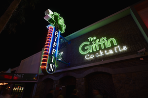
Photograph of The Griffin sign, Las Vegas (Nev.), June 28, 2017
Date
Archival Collection
Description
Site address: 511 Fremont St
Sign owner: Aaron Chepenik and Jonathan Hensleigh
Sign details: Opened in February of 2007 as a medieval British pub/ tavern style bar. This location brought on a wave of revitalization of the East Fremont District especially since many new bars/restaurants started to open in this area after this bar did.
Sign condition: 5- still looks relatively new
Sign form: Blade and overlay neon on building
Sign-specific description: Placed above the entrance their brick building the letters The Griffin Cocktails is painted with white block letters outlined with black paint is painted on the building itself. These letters have skeletal neon surrounding the letters. The Griffin letters are yellow tubes and do illuminate green at night, the word cocktails lights up white. To the left of the entrance but still on the building is a green painted griffin drinking a painted white martini ( also all outlined with black paint) The neon tubing outlining the griffin is a yellow tubing but glows green at night ( possibly argon inserted to make it glow green). The Blade is placed a little left of the entrance and hangs off of the building by two blue steel beams, but in between the beams is a beautiful swirl design. At the top of the Blade there is a green griffin sipping a martini (same design as the one painted on the building). At the base of the griffin is white THE letters painted with skeletal neon. Then below is the blue portion of the blade spelling out GRIFFIN in a Britannic looking font in white channeled letters which do illuminate white at night. This part of the blade is outlined in neon ,possibly argon, since it does illuminate blue at night. On the side of the blade ( if you're looking from the road) there are about 14 red curved neon tubes lining the sign.
Sign - type of display: Neon
Sign - media: Steel and Brick Wall
Sign - non-neon treatments: Using the brick wall as a portion of the sign is a design not seen often in Vegas.
Sign animation: Oscillation of red neon tubes on the side of the sign.
Sign environment: Located in the Fremont East District in between Las Vegas Blvd. and 6th St. This location has The Vault to the East of it and The Smashed Pig Gastropub to the west. It is across the street from the Park and Evil Pie. In the middle of the street right in front of the Griffin Bar is the Martini Glass sign.
Sign manufacturer: YESCO
Sign designer: Owners Aaron Chepenik and Jonathan Hensleigh-Aaron stated that the blade portion of the sign was inspired by the old Boulder Club Blade sign
Sign - date of installation: Slightly before they opened so late 2006/early 2007
Sign - thematic influences: Griffin shows that it has a medieval and kind of fantasy kind of feel since its interior does have that cool medieval tavern vibe to it, especially with their fireplaces. Using their brick wall as a part of the sign is a cool innovative way to use their space and stay true to their theme.
Sign - artistic significance: Medieval theme. The blade is a prominent theme in the 50s/60s, though their blade sign was inspired by the Boulder Club (opened 1931-1960) blade.
Survey - research locations: Acessors page, outreach to owner Aaron Chepenik
Survey - research notes: Possible use of argon within their yellow painted tubes, similar to the Yucca Motel signs leaves.
Survey - other remarks: The Blade does look very similar to the Boulder Club blade, so its awesome to see modern properties paying homage to the ones that are no longer around.
Surveyor: Emily Fellmer
Survey - date completed: 2017-09-15
Sign keywords: Oscillating; Steel; Neon; Blade; Fascia; Building-front design
Mixed Content