Search Results
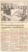
Newspaper clipping, NLV honoring Goynes for community contributions, Las Vegas Sun, June 19-21, 1998
Date
1998-06-19
Archival Collection
Description
Article by Adrienne Packer for Las Vegas Sun lauding the community contributions of Theron Goynes, dated June 19-21, 1998.
Text
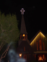
Photographs of Little Church of the West signs, Las Vegas (Nev.), 2002
Date
2002
2017-08-02
Archival Collection
Description
Photos show Little Church of the West signs during the day and at night. Two surveys were conducted to gather information about this sign. One was conducted in 2002 and one was conducted in 2017. PDFs are available for both surveys. See the 2017 survey PDF for additional information that is not included in the object description.
Site name: Little Church of the West
Site address: 4617 S Las Vegas Blvd
Sign owner: Greg Smith
Sign details: The Little Church of the West now resides on the south end of the Strip, along the east side among the smaller roadside hotels. Surrounded with pleasant landscaping the property is a charming and welcome sight among the more barren area of the strip.
Sign condition: Structure 4 Surface 4 Lighting 5
Sign form: Pylon; Fascia
Sign-specific description: There are two specific signs which are significant to the property. The first being the double backed internally lit pylon roadside sign which sits on the east side of Las Vegas Blvd and faces east/west. The 10 feet at its widest, and thirty seven feet tall. The structure consists of a center pole upon which an internally lit plastic sculpted message board sits. Painted in an old west script upon the plastic are the words "Little Church Of The West Wedding Chapel," with painted scrollwork on the top and the bottom of the plane. The entire message board is bordered in neon. Sitting on top of the message cabinet is a small, sculpted apse and bell. The original sign from its original construction still exists atop the actual structure of the Little Church of the West. It is an image of a cross outlined in white neon.
Sign - type of display: Neon; Backlit
Sign - media: Steel; Plastic
Sign - non-neon treatments: Graphics; Paint
Sign animation: none
Sign environment: The property sits among the dying roadside motel environment of the South end of Las Vegas Blvd It stands as on of the properties that is still in good repair. The pleasant landscaping and grass provide a pleasant establishment among the southern strip. It seems to capture the environment it has always tried to attain, of the picturesque country church.
Sign manufacturer: Larsen Sign
Sign - date of installation: It was originally part of William J. Moore's Last Frontier Village, which was assembled in the late 1950's. The current pylon sign was manufactured in 1996.
Sign - date of redesign/move: Originally, it resided in the Las Frontier until it was demolished in 1954. The Little Church of the West stood approximately in the spot where Sax Fifth Avenue is located. When the New Frontier was constructed, it was moved to the east side of the Strip approximately where the Silver Slipper was located. It stood in this location until 1978 when it was moved to the south edge of the Hacienda's property. The property was moved to its current location in 1996.
Sign - thematic influences: The thematic influence of the Little Church of the West draws from its original property which was the Old Western theme of the Frontier Hotel Casino. The Last Frontier Village was assembled from actual Western towns and reassembled on the Last Frontier's Property. With its wooden facade, brown color tones, script and pylon structure, the Little Church of the West rings true with its origins, while still incorporating the subtle elements of Las Vegas such as neon.
Sign - artistic significance: The Little Church of the West is reminiscent of old west theme which extends back to the very beginnings of Las Vegas and which dominated the themes for a period of time. " Before it became filled with themed western architecture, Las Vegas was an actual western town with a Spanish Style train station and false front facades fronting plank sidewalks"-Alan Hess, After Hours Architecture. Such properties, which dominated the early years of Las Vegas, were the Pioneer Club, the El Rancho Vegas, the El Cortez, the Last Frontier, Binion's Horseshoe, and the Silver Slipper.
Surveyor: Joshua Cannaday
Survey - date completed: 2002
Sign keywords: Pylon; Fascia; Neon; Backlit; Steel; Plastic; Graphics; Paint
Mixed Content
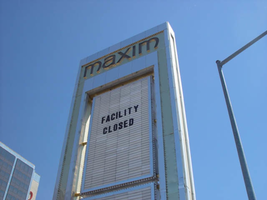
Photographs of Maxim signs, Las Vegas (Nev.), 2002
Date
2002
Archival Collection
Description
Daytime views of the Maxim Hotel and Casino signs. Information about the sign is available in the Southern Nevada Neon Survey Data Sheet.
Site address: 160 E Flamingo Rd
Sign owner: Premier Interval Resorts
Sign details: The Maxim is located just east of the Bourbon Street, in close proximity to Bally's Hotel Casino. The Maxim is no longer operating, and is fenced off from further inspection. The signage that is seen entails building signs, the original pylon, and the porte cochere
Sign condition: Structure 2 Surface 2
Sign form: Pylon; Fascia; Porte-cochère
Sign-specific description: Building: The tower itself contains the logo and giant text spelling the name of the establishment, on one side of the building. The tower is mirrored and reflective, thus matching the porte cochere and pylon, and reserves to collect its building signage to one end of the tower. The tower, which runs east/west, and faces north/south contains the signs on the east end structure. On the north and south faces of the building, giant red channel letters run vertically along the block surface. The letters look to be lined on the interior of the letters with neon. The logo can be seen on the east face. Pylon: The pylon sign is essentially a giant vertical monolith of a rectangle, divided into several different sub-shapes. The center of the monolith is occupied by cabinets which fill in most of the shape, with a small gap bordering the cabinet. The cabinets are treated the same as the square arch, and flush with the surface. The cabinets are very subtle and create an illusion of one solid object. The entire outer arch shape and interior cabinets are bordered with polished aluminum. The interiors surface of the arch are covered in polished gold aluminum panels. The lining of the incandescent bulbs on the sign is interesting. On the arch the incandescent bulbs are on the interior return width of the aluminum borders. With this configuration, the bulbs sit parallel to the surface instead of perpendicular. The main marquee text is aligned horizontally across the top in gold channel letters with red plastic faces. The letters blend with the gold surface nicely. The interior cabinets are internally lit with plastic faces. There are two cabinets, the larger of the two, occupying the upper part the interior space of the monolith. Incandescent bulbs line the exteriors of the cabinets, sitting back on a recessed edge. Porte Cochere: The porte cochere is unique, opting to rise high above the surface of the pavement. The prismatic design crafted in polished aluminum, interlocks into a pattern suitable to the space which it resides. The recesses in which the decoration resides are separated by a small width of structure. This pattern of giant recesses, matched with the prismatic design in each negative space create a hulking environment high above the head in proud stature. Along the peak edge of the pieces of the prism, rods protrude every foot or so, creating a row of arms holding incandescent spheres.
Sign - type of display: Neon; Incandescent
Sign - media: Steel; Plastic
Sign - non-neon treatments: Graphics; Paint
Sign animation: chasing, flashing
Sign environment: The Maxim is now closed, and stands in marked contrast to its neighbors a bit to the east--the famous "Four Corners" of Flamingo and the Strip, and next to the trendy Meridian at Hughes Center apartment complex.
Sign designer: Maxim letter design: Kenneth Young, Porte Cochere; Lighting: Jack Dubois Pylon sign: Marnell Corrao
Sign - date of installation: 1977
Sign - thematic influences: The influence of the Maxim hotel was 70's Vegas design refined to simple geometric forms and curved linear logo's. The pylon was completely sheathed in polished aluminum, as well as the underside of the porte cochere being polished gold aluminum. The use of the popular 70's material is used extensively throughout the design. Letters hung over the main entrance, as well as signage on three sides of the building. Other examples of the material can be seen elsewhere but not as extensively. The only property that comes close is the pylon for usage of the material is the Westward Ho.
Surveyor: Joshua Cannaday
Survey - date completed: 2002
Sign keywords: Chasing; Flashing; Pylon; Fascia; Porte-cochère; Neon; Incandescent; Steel; Plastic; Graphics; Paint
Mixed Content
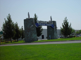
Photographs of McCarran Field signs, Las Vegas (Nev.), 2002
Date
2002
2017-09-08
Archival Collection
Description
Photos show McCarran Field signs during the day. Two surveys were conducted to gather information about this sign. One was conducted in 2002 and one was conducted in 2017. PDFs are available for both surveys. See the 2017 survey PDF for additional information that is not included in the object description.
Site address: 6005 S Las Vegas Blvd
Sign owner: McCarran International Airport
Sign details: On the south end of the Strip, the very last sign on the east side before you arrive at Sunset Blvd Facing West the two stone pylons are set approximately fifty feet off of the street at the end of a dual-lane stretch of pavement separated by an island of grass. The banner marquis between the two pylons stretches over this area of grass.
Sign condition: Structure 3 Surface 3 Lighting 4 Notes: The surface of the pylon is in good shape considering its age and its environmental condition. It is essentially left to fend for itself against the elements, being in the flat expanse of an airfield. The stone, plaques, and paint treatment are all badly worn, with the stone pylons, appearing the least worn.
Sign form: Pylon
Sign-specific description: The original McCarran Air Field entrance is constructed of two masonry pylons sit on an island of grass, and serve as an entrance to the private Hughes executive airport terminal. Each individual tower is adorned with a propeller attached to the front and the representation of a bird's wing crowning the tops Both facets are constructed of steel. When facing the structures the left has a plaque on the bottom section with the inscription "1948" while the one on the right reads "Las Vegas". Between the two pylons a stretch of text in white channel letters and white neon, large text in the old "Frontier style text reads McCarran Airport. The signage sits independently on top of a sturdy connecting steel cabinet, which supports the words "executive terminal" in smaller channel letters, with white neon. The cabinet is a painted blue horizontal plane tapering wider on either end in rounded profile patterns. The wings are outlined in pink neon, while the propellers are outlined in rose neon with a circle of white in the middle.
Sign - type of display: Neon
Sign - media: Masonry
Sign - non-neon treatments: Paint
Sign animation: none
Sign environment: The surrounding area is rather dark due to the wide expanse of the airfield which stretches out behind the sign. It truly is a last marker for the end of the Strip, and stands alone. Even though it is in close proximity to the major strip resorts of the Four Seasons as well as the Mandalay Bay and various small roadside hotels, it seems to stand in solitude.
Sign - date of installation: 1948
Sign - date of redesign/move: The blue banner of steel and white letters was added after its initial construction.
Sign - thematic influences: The masonry pylons are constructed in an adobe style masonry reminiscent of the desert landscape surroundings. Designed for the airport, the appendages stem obviously around the theme of flight. This may be denoted from the propeller and the wing. The juxtaposition of the two elements, one being the method of flight in nature and the other man made, serves as a reminder of mans fascination with flight. The added banner's text is in the pioneer fashion of the original Last Frontier.
Sign - artistic significance: Opened in 1948, the sign was intended for use as a marker for the endpoint of the Strip. " It was part of the city's expanding policy creating a jet-scale entrance for the city," Jorg Rudemer from Lost Las Vegas. Artistic significance also lies in the combination of materials using masonry, steel and, neon. The piece successfully combined these elements to provide an architecturally solid design by day, which was cohesive with its surrounding landscape. A metamorphosis takes place at night as the sign is transformed into a glowing specter of its daytime counterpart. The surrounding area is rather dark as the pylon rises up out of the darkness as a neon marker for the property. The illuminated wing and propeller stand out as the significant and successful partners in the world of flight.
Surveyor: Joshua Cannaday
Survey - date completed: 2002
Sign keywords: Pylon; Neon; Masonry; Paint
Mixed Content

neo000058-004
Date
2017-09-21
Description
Sign animation: Chasing, flashing, oscillating
Notes: The text fascia sign just to the north of the giant glass display illuminates with a background of neon tubing which chases from right to left. The pattern of colors running across are a sequence banks of red, pink purple and blue vertical neon tubing, chase each other creating a pulsating movement of the individual banks of these colors. While they are animating, the channel letters, which spell "Riviera," are dark and proceed to light up one letter at a time. Once all lit they remain lit, until the background stops with all the bars illuminated. Once all the bars are lit, the interiors of the letters turn off one at a time starting on the far right. The giant mirrored section of the building, advertising for the Splash stage show. The sequence can be best described from its dramatic powering up. The entire sign comes alive with a rapid upward chasing pattern covering the surface of the tower. Once alive, small white bulbs grow out of the end of the space on the top and bottom of the end of the "Splash" text. Once all the previous elements are illuminated, the letters in the Splash logo shut off, illuminate one letter at a time in red neon, then the white neon figure of the seal balancing a ball on the end of it's nose, lights up. The neon bordered circular raceway, then animates with the bulbs in the center chasing each other in a clock-wise sequence. Once lit the vast array of white bulbs grown out of the end of the text begin to gently oscillate, as well as the sparse assortment of floating and attached incandescent bulbs on the wall of the tower. Once the bulbs animate for a few seconds, the entire wall chases downward, becoming black as night, except for the Slash logo text. Underneath the entire front side of the western face of the Riviera, the incandescent bulbs which cover the entire surface oscillate in a wildly, while the ringed entablature on the wall animates quietly in comparison. The multi-colored rings of neon tubing chase each other from left to right, chasing the distance then repeating. The sequence then changes direction and chase from left to right. Creating the tops and bottoms of the entablature are raceways lined with incandescent bulbs that chase each other from left to right. On the surface of the west wall incandescent bulbs chase each other along the raceways which run horizontally around the internally lit cabinets. The small vertical raceways which run inside the clear plastic boxes chase each other from top to bottom, but all the raceways are offset to each other by a few seconds. At the North end of the property the signage for the Riviera's, "Nickeltown" gambling attraction, dominates the corner. He animation on the large exploding sculptural fountain lights up the entire corner. The three rocketing pieces of steel are wrapped in repeating bands of their corresponding colors of blue, purple and yellow. All three simultaneously chase from bottom to top, until completely lit. Then they begin to animate in a chasing pattern from bottom to top. After a few moments of chasing, they chase from beginnig to top once more, leaving al the tubes dark in its path. Along the circular entablature, which runs the circumference of the top mass of the fountain, incandescent bulbs chase each other from right to left, but only on the side which faces the casino. The wall, which faces north, contains the multicolored banks of vertical neon bars that animate in a specific pattern. They chase each other from right to left, then only the purple neon tubing illuminates, they chase again, then only the blue neon tubing illuminates. They chase once again, and then only the gold bars illuminate. The bars chase yet one more time, then all of the tubing illuminates, thus ending the sequence. The main entrance to nickel town is adorned with neon text and images, but only the stars higher up on the wall itself animate. The incandescent bulbs elevated above the surface of the mirrored wall, animate in a soft oscillating pattern, adding the twinkling effect. The larger five pointed stars are animated on the interior by a center of oscillating incandescent bulbs, while concentric neon shapes echo outward in the yellow, purple and blue colors seen on the adjacent wall facing north. The smaller snow-flake esque star shapes are alive with oscillating incandescent bulbs. Looking upward along the north face of the closest tower, the giant vertical, Riviera channel letters animate one character at a time, oscillate then shuts off.
Notes: The text fascia sign just to the north of the giant glass display illuminates with a background of neon tubing which chases from right to left. The pattern of colors running across are a sequence banks of red, pink purple and blue vertical neon tubing, chase each other creating a pulsating movement of the individual banks of these colors. While they are animating, the channel letters, which spell "Riviera," are dark and proceed to light up one letter at a time. Once all lit they remain lit, until the background stops with all the bars illuminated. Once all the bars are lit, the interiors of the letters turn off one at a time starting on the far right. The giant mirrored section of the building, advertising for the Splash stage show. The sequence can be best described from its dramatic powering up. The entire sign comes alive with a rapid upward chasing pattern covering the surface of the tower. Once alive, small white bulbs grow out of the end of the space on the top and bottom of the end of the "Splash" text. Once all the previous elements are illuminated, the letters in the Splash logo shut off, illuminate one letter at a time in red neon, then the white neon figure of the seal balancing a ball on the end of it's nose, lights up. The neon bordered circular raceway, then animates with the bulbs in the center chasing each other in a clock-wise sequence. Once lit the vast array of white bulbs grown out of the end of the text begin to gently oscillate, as well as the sparse assortment of floating and attached incandescent bulbs on the wall of the tower. Once the bulbs animate for a few seconds, the entire wall chases downward, becoming black as night, except for the Slash logo text. Underneath the entire front side of the western face of the Riviera, the incandescent bulbs which cover the entire surface oscillate in a wildly, while the ringed entablature on the wall animates quietly in comparison. The multi-colored rings of neon tubing chase each other from left to right, chasing the distance then repeating. The sequence then changes direction and chase from left to right. Creating the tops and bottoms of the entablature are raceways lined with incandescent bulbs that chase each other from left to right. On the surface of the west wall incandescent bulbs chase each other along the raceways which run horizontally around the internally lit cabinets. The small vertical raceways which run inside the clear plastic boxes chase each other from top to bottom, but all the raceways are offset to each other by a few seconds. At the North end of the property the signage for the Riviera's, "Nickeltown" gambling attraction, dominates the corner. He animation on the large exploding sculptural fountain lights up the entire corner. The three rocketing pieces of steel are wrapped in repeating bands of their corresponding colors of blue, purple and yellow. All three simultaneously chase from bottom to top, until completely lit. Then they begin to animate in a chasing pattern from bottom to top. After a few moments of chasing, they chase from beginnig to top once more, leaving al the tubes dark in its path. Along the circular entablature, which runs the circumference of the top mass of the fountain, incandescent bulbs chase each other from right to left, but only on the side which faces the casino. The wall, which faces north, contains the multicolored banks of vertical neon bars that animate in a specific pattern. They chase each other from right to left, then only the purple neon tubing illuminates, they chase again, then only the blue neon tubing illuminates. They chase once again, and then only the gold bars illuminate. The bars chase yet one more time, then all of the tubing illuminates, thus ending the sequence. The main entrance to nickel town is adorned with neon text and images, but only the stars higher up on the wall itself animate. The incandescent bulbs elevated above the surface of the mirrored wall, animate in a soft oscillating pattern, adding the twinkling effect. The larger five pointed stars are animated on the interior by a center of oscillating incandescent bulbs, while concentric neon shapes echo outward in the yellow, purple and blue colors seen on the adjacent wall facing north. The smaller snow-flake esque star shapes are alive with oscillating incandescent bulbs. Looking upward along the north face of the closest tower, the giant vertical, Riviera channel letters animate one character at a time, oscillate then shuts off.
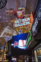
Photographs of Girls of Glitter Gulch signs, Las Vegas (Nev.), June 24, 2016
Date
2016-06-24 to 2017-09-17
Archival Collection
Description
The famed Vegas Vickie sign advertising the now permanently closed Girls of Glitter Gulch adult entertainment club sits at 20 Fremont Street at the Fremont Street Experience. Information about the sign is available in the Southern Nevada Neon Survery Data Sheet.
Site address: 20 Fremont St
Sign owner: Derek and Greg Stevens
Sign details: Glitter Gulch is next to the Golden Goose. This now closed property has a long history in Las Vegas. In 1959, the Fortune Club was where the Glitter Gulch would soon replace it. For the history of the Golden Goose: Herb Pastor bought the Mecca Club from Sylvia Sioratta in 1974 then opened up the Golden Goose soon after. Mr. Reed's was the property that sat next to the Golden Goose at this time; however, that then became Bob Stupak's Glitter in 1980. In 1981, Pastor ended up buying the Glitter Gulch. In 1991, Pastor merged both of these properties into a strip club. Both of these properties ultimate closed in the summer of 2016. The signage was taken down in 2017.
Sign condition: Vegas Vickie has been taken down and half the Glitter Gulch sign was also taken down.
Sign form: Blade and sculptural sign
Sign-specific description: Perched atop the signage for the Glitter Gulch is Las Vegas favorite girl, Vegas Vickie. She is dressed up in cowgirl attire and kicking her leg out onto Fremont Street. She is painted so you can see all her details in the day and she is a channeled sign lined with neon tubes that matches her paint so you can see her at night as well. She sits on top of a very geometric piece of gold (like a golden nugget) that shines brightly and dotted with incandescent light bulbs. The "Glitter Gulch" letters are open channeled, lined with neon tubes that glow red at night, and filled with neon tubes that glow blue at night and oscillate as well. During the day these letters are a bold white font and instead of a dot for the "I" it is a four point star. Underneath the golden nugget like structure of the sign is a bunch of silver coins lined with neon tubes.
Sign - type of display: Neon, incandescent, back lit
Sign - media: Steel, plastic, fiberglass
Sign - non-neon treatments: Fiberglass and back lit plastic
Sign animation: Neon in Glitter Gulch text oscillates
Sign environment: These signs sit in the midst of the excitement on Fremont Street Experience. Some of the other properties that sit near them are Binion's, Golden Gate Hotel & Casino, and the Plaza Hotel & Casino.
Sign manufacturer: Ad Art
Sign designer: Jack Dubois and Charles Barnard of Ad Art
Sign - date of installation: 1980
Sign - date of redesign/move: Vegas Vickie was taken down in 2017 for restoration and may return back to Fremont after.
Sign - thematic influences: Both of the Glitter Gulch and Golden Goose signs are extremely iconic signs in Las Vegas history and combine elements that are typically used in signage throughout the city, such as: sculptural signage and signs that have a dominant theme for the property. Vegas Vickie being a part of the signage for the Glitter Gulch also gives some indication that this property is a gentleman's club. They are elaborately designed to draw people's attention to these businesses, which many other signs throughout the city aim to do as well.
Sign - artistic significance: These signs are significant because the design of them is elaborate and they are excellent examples of signs that use sculpture/image to help convey the theme of the property. They are also crafted in such an excellent manner and filled with numerous details.
Survey - research locations: Fox news website http://www.fox5vegas.com/story/31783315/d-las-vegas-owner-buys-3-more-fremont-properties , Vintage Las Vegas website http://vintagelasvegas.com/search/glitter+gulch, Review Journal Article https://www.reviewjournal.com/business/casinos-gaming/mermaids-la-bayou-and-glitter-gulch-come-to-a-close-on-fremont-photos/
Surveyor: Lauren Vaccaro
Survey - date completed: 2017-09-17
Sign keywords: Blade; Sculptural; Neon; Incandescent; Backlit; Plastic; Oscillating; Steel
Mixed Content
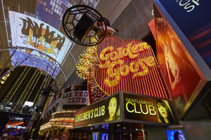
Photographs of Golden Goose sign, Las Vegas (Nev.), June 24, 2016
Date
2016-06-24 to 2017-09-17
Archival Collection
Description
A sign for the permanently closed Golden Goose Gentlemen's Club sits at the Fremont Street Experience. Information about the sign is available in the Southern Nevada Neon Survery Data Sheet.
Sign owner: Derek and Greg Stevens
Sign details: The Golden Goose is next to Glitter Gulch. This now closed property has a long history in Las Vegas. In 1959, the Fortune Club was where the Glitter Gulch would soon replace it. For the history of the Golden Goose: Herb Pastor bought the Mecca Club from Sylvia Sioratta in 1974 then opened up the Golden Goose soon after. Mr. Reed's was the property that sat next to the Golden Goose at this time; however, that then became Bob Stupak's Glitter in 1980. In 1981, Pastor ended up buying the Glitter Gulch. In 1991, Pastor merged both of these properties into a strip club. Both of these properties ultimate closed in the summer of 2016. The signage was taken down in 2017.
Sign condition: 3, the Golden Goose signage is still on Fremont Street and in good condition.
Sign form: Blade and sculptural sign
Sign-specific description: Perched atop the signage for the Golden Goose is a sculptural goose made out of fiberglass wearing a brown cowboy hat and red scarf around its neck with white polka dots all over it. In its right hand it hold a golden egg covered in incandescent light bulbs, which looks just like the eggs surrounding the bottom of the goose. Under the goose and the eggs surrounding it is a base that has a yellow border on the top and bottom of it and yellow incandescent light bulbs lining these lines. In the center is an orange band. The main portion of the signage for the Golden Goose is an interesting organic shape in a red/brown color that curves inward at in the middle top of the sign and in the middle side of the sign that faces Fremont. The edge of the sign that faces Fremont Street is lined with ten golden eggs that look just like the ones surrounding the goose; however, these vary in size and do not line all the way down the entire sign. This edge of the sign also has red incandescent light bulbs covering it. Each side of the sign is lined with a yellow line that outlines the sign and incandescent light bulbs are part of that line as well. "Golden Goose" is in a stylish mustard yellow font with made up of open channel letters filled with incandescent light bulbs. This sign is also lined with neon tubes that run up and down the sign and oscillate at night.
Sign - type of display: Neon, incandescent, back lit
Sign - media: Steel, plastic, fiberglass
Sign - non-neon treatments: Fiberglass and back lit plastic
Sign animation: Neon tubes lining the Golden Goose sign oscillate.
Sign environment: These signs sit in the midst of the excitement on Fremont Street Experience. Some of the other properties that sit near them are Binion's, Golden Gate Hotel & Casino, and the Plaza Hotel & Casino.
Sign - date of installation: About 1974
Sign - date of redesign/move: The Golden Goose sign was removed from Fremont in 2017.
Sign - thematic influences: Both of the Golden Goose and Glitter Gulch signs are extremely iconic signs in Las Vegas history and combine elements that are typically used in signage throughout the city, such as: sculptural signage and signs that have a dominant theme for the property. The signage for the Golden Goose features a sculpture of a goose to drive the theme of the property to motorists and pedestrians. They are elaborately designed to draw people's attention to these businesses, which many other signs throughout the city aim to do as well.
Sign - artistic significance: These sign are significant because the design of them is elaborate and they are excellent examples of signs that use sculpture/image to help convey the theme of the property. They are also crafted in such an excellent manner and filled with numerous details.
Survey - research locations: Fox news website http://www.fox5vegas.com/story/31783315/d-las-vegas-owner-buys-3-more-fremont-properties , Vintage Las Vegas website http://vintagelasvegas.com/search/glitter+gulch, Review Journal Article https://www.reviewjournal.com/business/casinos-gaming/mermaids-la-bayou-and-glitter-gulch-come-to-a-close-on-fremont-photos/
Surveyor: Lauren Vaccaro
Survey - date completed: 2017-09-17
Sign keywords: Blade; Sculptural; Neon; Incandescent; Backlit; Plastic; Oscillating; Steel; Fiberglass
Mixed Content
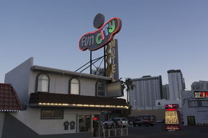
Photographs of Fun City Motel, Las Vegas (Nev.), March 1, 2017
Date
2017-03-01
2017-08-30
Archival Collection
Description
The Fun City Motel sits at 2233 South Las Vegas Boulevard. Information about the sign is available in the Southern Nevada Neon Survey Data Sheet.
Site address: 2233 S Las Vegas Blvd
Sign owner: Rick Trusdell and Chetak Development Corporation
Sign details: Originally the Glenn Vegas Motel in early 50's then the sign was reused for Holiday Motel in 1960's and later to the Fun City Motel circa 1970's to current.
Sign condition: This is rated a 2 since the structure is in semi-salvage condition. No treatment seems to have been done. The damage from the sun has left the bright red hue into a grayish purple color. Part of the neon lettering from Fun City is not in working condition.
Sign form: Pole
Sign-specific description: The Fun City Motel sign was installed in 1952. However, the sign has been used in other properties before it became the Fun City Motel. The Sign was first used for the Glenn Motel circa 1950's with a western theme. The reason why the Fun City Motel doesn't resemble Googie influence is because the original funky curvilinear shape was designed to be a peanut. The Glenn Vegas Motel sign included an illustrated rodeo cowgirl holding a looped rope towards the left end of the sign. In the middle top of the sign is a woman diver; towards the bottom of the sign is an outline of a pool with the word swimming pool in the middle. The peanut shape is painted black. In-between all the designs; in large letters Glenn Vegas Motel is written in white with the female diver drawing separating the two words. Underneath the peanut shaped structure is a rectangular sign held by two hooks on each sign with the word motel. The entire structure itself is held by two steel poles with a blue incandescent directional squiggly arrow facing downwards. The Holiday Motel version changed from the black background to a brilliant red with white large neon letters reading Holiday. The sign removed all implication of the western theme and changed the squiggly directional arrow from light blue to a silver hue. There were two additions to the sign; the first is the word motel vertically connected to the side of the directional arrow and second is a circular structure in white and yellow. Later with the Fun City Motel sign there wasn't much change from Holiday Motel. The only significant change was the name of the establishment. The fun city lettering lights up in multiple colors like the rainbow at night. And the two poles that hold up the structure were painted to black. Today the sign itself has lost all its brilliant red hue and is now a gray color from over sun exposure and no maintenance done to the sign. The directional incandescent arrow is still bright yellow.
Sign - type of display: Neon and incandescent
Sign - media: Steel and fiber glass
Sign animation: Chasers for the incandescent directional arrow. The circular structure on the tops of the curvilinear shape have incandescent lights following a circular motion.
Sign environment: This location is on the North end of the strip near the Holiday House, Holiday Motel, and Kaei Thai restaurant.
Sign manufacturer: YESCO
Sign - date of installation: Circa 1970's
Sign - date of redesign/move: 1950's the sign was used for Glenn Vegas Motel, and in 1960's into the Holiday Motel.
Sign - thematic influences: The fun city sign is funky with an odd curvilinear shape that was originally used for a western theme motel as a peanut. Today the theme seems to be clownish with its colorful palette and rainbow neon.
Sign - artistic significance: The fun city sign is funky with an odd curvilinear shape that was originally used for a western theme motel as a peanut. Today the theme seems to be clownish with its colorful palette and rainbow neon.
Survey - research locations: Assessor's page, Photographs on the internet from Vintage Vegas website http://vintagelasvegas.com/search/Fun+City+Motel
Surveyor: Gisselle Tipp
Survey - date completed: 2017-08-30
Sign keywords: Neon; Incandescent; Steel; Chasing; Pole sign; Roof Sign; Back to back; Backlit
Mixed Content
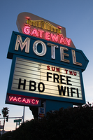
Photographs of Gateway Motel sign, Las Vegas (Nev.), March 12, 2017
Date
2017-03-12
2017-08-30
Archival Collection
Description
The Gateway Motel sign sits in early evening light at the northeast corner at 928 South Las Vegas Boulevard. Information about the sign is available in the Southern Nevada Neon Survey Data Sheet
Site address: 928 S Las Vegas Blvd
Sign owner: Vinod Soni and Gateway Motel Inc
Sign details: The Gateway Motel dates back to early 1930's and could be considered one of the earliest motels to pop up in Las Vegas. Before the name changed to Gateway Motel it was named as the Gateway Auto Court circa 1930-1946 it was known as the Gateway Auto Court. The first sign was built circa 1930's and their new remodeled sign which is still in use today was built circa 1950's. The 1950's sign was originally painted darker colors and had a larger graphic of a gate. The original 1930's sign has the streamline modern influence that was prominent in 1930's and 40's. The sign itself is a pole sign with a square structure at the top. The font Auto-Court is in pure neon with that fire-red hue; the font is placed in the middle to stand out the most. The word Gateway is on top of Auto-Court in black with black streamline lines surrounding the word. Underneath is a small wooden board hanging probably stating no vacancy. The background color of the square structure is in pure white and the pole is chrome.
Sign condition: The condition of the sign is a 3.5. Some of the neon is not working when it's turned on at night. The paint has some sun/UV damage since it looks faded. The reader board has a stained effect from sun damage.
Sign form: Pylon with three separate signs converged into one.
Sign-specific description: The sign is made out of glass, steel, plastic, and concrete. The color palette is light blue, white and a cream white. The sign is designed in separate sections. The white cream based portion is situated at the top with a gate and bridge illustrative design in glass tubes and neon. The gate itself lights up yellow with red on the side. The font Gateway is larger than the gate and is in the color white when lit up. Underneath the Gateway word is a subliminal directional arrow pointing towards the motel buildings This section is in the color sky blue with the word motel in massive white letters. Underneath the directional arrow is the reader board surrounded by the steel light blue border. The reader board states Free Wi-Fi and HBO. Underneath in the left corner is a small light blue board that states "no vacancy" in neon. These three separate signs are all connected like blocks with a concrete pillar structure holding up the sign. During the evening, the light blue paint is not shown and is just pure black with the neon illuminating the sign.
Sign - type of display: Neon and plastic back lit sign
Sign - media: Steel, plastic and concrete
Sign - non-neon treatments: Plastic back lit portion
Sign environment: This location is on the corner of Las Vegas Blvd and Charleston. This is right next to the original Dona Maria Tamales restaurant.
Sign - date of installation: Circa 1950's
Sign - date of redesign/move: From a 1930's streamline modern sign to a 1950's Mid-Century modern architectural roadside motel sign.
Sign - thematic influences: The sign is influenced by Mid-Century Modern roadside architecture, with the directional arrow as a staple in many motel roadside designs of the 1950's and 60's to accommodate the car consumer era.
Sign - artistic significance: One main trends of the 1950's designs with neon signs is using illustrative motifs with the inclusion of directional arrows to lend to the highway travelers an idea of where the property is located. To make sure these travelers don't miss the establishment in an empty road.
Survey - research locations: Assessor's Page, Roadside Architecture Website http://www.roadarch.com/signs/nvvegas.html , Neon Museum book Spectacular, Vintage Las Vegas http://vintagelasvegas.com/search/Gateway+Motel
Surveyor: Gisselle Tipp
Survey - date completed: 2017-08-30
Sign keywords: Neon; Plastic; Backlit; Steel; Concrete; Roadside; Reader board; Back to back
Mixed Content
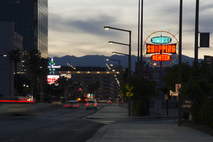
Photographs of Somerset Shopping Center sign, Las Vegas (Nev.), April 4, 2017
Date
2017-04-04
2017-09-01
Archival Collection
Description
The Somerset Shopping Center sign sits at 252 Convention Center Drive. Information about the sign is available in the Southern Nevada Neon Survey Data Sheet.
Site address: 252 Convention Center Dr
Sign owner: Somerset Shopping Center CO LP
Sign details: This shopping center was built in 1966 next to the Somerset House Motel. The motel was demolished in 2011; however, the shopping center is still around. Some businesses that reside in the shopping center include: a hair and nail salon, a dry cleaners, an Ethiopian restaurant, and a place for banquets to name a few.
Sign condition: 5, the sign is in beautiful condition.
Sign form: Pole
Sign-specific description: This pole sign sits close to the street so motorists and pedestrians can view it easily. A light blue pole holds up the main portion of this sign, as well as back lit plastic signs on each side of the pole that display what businesses are in the shopping center. The sign itself consists of a yellow ring that encircles three other signs. This yellow circle is covered in incandescent light bulbs that chase when the sign is lit up at night. Also, extending from this yellow circle are light blue poles in various lengths that are surrounded in neon tubes and oscillate around the yellow circle when the sign is lit up at night. In the center of the circle are three signs. The first sign is an elongated oval that has the word "SOMERSET" painted on it in bold white letters with a black outline on a light blue background. Neon tubes outline these letters. The sign under that is a large rectangle shape with each of the sides curving inward. There are also incandescent light bulbs lining the outer edge of this sign that chase when the sign is lit up. This sign has the word "SHOPPING" painted on it in bold white text against a red background. Neon tubes outline each letter of this word. The sign under this is another elongated oval that is a similar size to the "SOMERSET" sign. This sign reads "CENTER" in bold white text against a red background and neon tubes outline this word as well.
Sign - type of display: Neon, Incandescent light bulbs and back lit
Sign - media: Steel and plastic
Sign - non-neon treatments: Plastic portion of sign
Sign animation: Oscillating, chasing
Sign environment: The shopping center that this sign is located in is about a block away from the Strip and is near a few monumental properties. It resides close to the Las Vegas Country Club, the Las Vegas Convention Center, and the Guardian Angel Cathedral that Paul Revere Williams designed. It is down the road from casinos like the Wynn, Encore, Circus Circus, and the Westgate. The Peppermill, an iconic Las Vegas restaurant, is down the street as well. It was down the street from the Stardust when that property was up and running.
Sign manufacturer: YESCO
Sign - date of installation: Most likely 1966, 1960's era
Sign - thematic influences: The design of this sign is very eye-catching from the road, as are many roadside signs throughout this era of the city. Bold text and light animation make this a standout sign to attract motorists and pedestrians to the shopping center.
Sign - artistic significance: This sign appears to have some Googie design influence throughout it. It has a space age feel to it because of the yellow circle that surrounds the "SOMERSET SHOPPING CENTER" signs and the blue poles that extend from it also add to this style.
Survey - research locations: Assessor's Page http://www.clarkcountynv.gov/assessor/Pages/searchbybusinessname.aspx , Vintage Las Vegas website http://vintagelasvegas.com/search/somerset , Roadside architecture website http://www.roadarch.com/signs/nvvegas.html
Surveyor: Lauren Vaccaro
Survey - date completed: 2017-09-01
Sign keywords: Neon; Incandescent; Backlit; Steel; Plastic; Oscillating; Chasing; Pole sign
Mixed Content