Search Results
Photographs of ABC Stores sign, Las Vegas (Nev.), March 3, 2017
Date
2017-03-03
2017-09-01
Archival Collection
Description
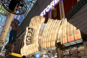
The ABC Stores sign sits at 23 East Fremont Street inside the Fremont Street Experience. Information about the sign is available in the Southern Nevada Neon Survey Sheet.
Site address: 23 Fremont St
Sign owner: Sidney and Minnie Kosasa
Sign details: The idea of the ABC stores originated in Hawaii with their first store opening in Waikiki in 1964 as a traveler convenience store selling groceries, cosmetics and souvenirs. The company now has location here in Las Vegas as well as Guam and Saipan. The owners wanted a name that everyone could remember so they named it ABC. The building that houses this ABC Store on Fremont was originally constructed in 1940. The property opened as the ABC Stores in November of 2001.
Sign condition: 5- relatively new and in good condition.
Sign form: Flat bullnose sign, though nearly a canopy sign
Sign-specific description: Above their entrance are big silver plumes that are all lined with chasing incandescent. At night these plumes look like a iridescent pearl color. There is one big plume in the middle and two on either side of the big one. On the middle plume there is a blade sign stating "ABC (vertically) Stores (horizontally)" which is also lined in incandescent on the roadside portion of the sign. The blade portion is a backlit plastic sign. Above the silver plumes is "ABC STORES" in channeled block font letters. These letters are outlined in blue neon (argon) and have gold colored incandescent that are flashing.
Sign - type of display: Neon, incandescents and backlit plastic signs
Sign - media: Plastic and steel
Sign - non-neon treatments: Neon, incandescents and backlit plastic signs
Sign animation: Chaser for the incandescents on the plumes and flasher on the incandescents in the ABC letters above the plumes.
Sign environment: This property is on Fremont in between Main and First Street. To the east would be the site of the old Famous Pioneer Club and La Bayou was to the west, but has been torn down in the past year. Across the street was the Glitter Gulch.
Sign manufacturer: YESCO
Sign - date of installation: 2001
Sign - thematic influences: The plumes that this location has look very similar to the 1970's Raul Rodriguez Flamingo feathers.
Sign - artistic significance: Could be reminiscent of the 1970's Flamingo Feathers designed by Raul Rodriguez. Though it is also remnant of the old showgirl outfits with their plumes and big feathery outfits.
Survey - research locations: ABC website http://www.abcstores.com/about/ , Acessor's Page, contact with Lovella Joy C. Romulando the Assistant Property manager.
Surveyor: Emily Fellmer
Survey - date completed: 2017-09-01
Sign keywords: Neon; Incandescent; Backlit; Plastic; Steel; Chasing; Flashing; Bullnose
Mixed Content
Photographs of Tourist Center signs, Las Vegas (Nev.), 2002
Date
2002
Archival Collection
Description
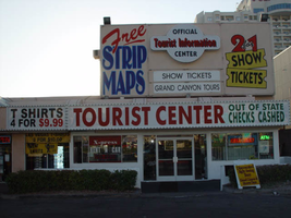
Daytime views of signs for a Tourist Center, Mini-Mart, and Travelodge on the Strip. Information about the sign is available in the Southern Nevada Neon Survey Data Sheet.
Sign details: Continuing north, a tourist and information center as well as a mini mart are incorporated into the front of a low rise Travelodge. A small parking lot creates the space between the structure and the street. The light earth tone stucco facade has a small high rise wall behind it, which is treated with signage and graphically treated with paint.
Sign form: Fascia
Sign-specific description: To the north of the Polo Towers plaza, a small lot located next to the Travelodge houses the Tourist Information Center and Gift Shop. A long, back-lit message center runs the length of the west face of the building along the front edge of the low-rise building. It is divided into three sections: The first belonging to the T-shirt mini mart on the north end of the lot, another small section advertising for the same business, then the rest of the sign stretching north belongs to the Tourist Center. The first section is not back-lit yet retains the steel raceway which encloses the entire sign. This section has a stucco background with green channel letters reading "Souvenirs Mini-Mart," with green neon on the interior. The second section is separated by a vertical raceway lined with bulbs. This section advertises for prices of shirts in the shop. The third section, which belongs to the Tourist Center, is dominated by red text which reads "Tourist Center." A higher elevation building sits right behind the front building. Assorted graphics adorn the surface of the building advertising for free maps and discounts. A rounded back-lit cabinet with two sections sticking out from either side hangs on the west face of this higher elevation structure. "Tourist Information" is spelled in red text, and the word "center" below that in black text. Green neon runs along the width edge of the cabinet, as well as the edges of the actual elevation of the building which it is hung, and the painted text below.
Sign - type of display: Neon; Incandescent; Backlit
Sign - media: Steel; Plastic
Sign - non-neon treatments: Paint
Sign animation: Chasing
Sign manufacturer: YESCO
Sign - date of installation: 35274
Surveyor: Joshua Cannaday
Survey - date completed: 2002
Sign keywords: Chasing; Fascia; Neon; Incandescent; Backlit; Steel; Plastic; Paint
Mixed Content
Photographs of Official Tourist Bureau and Viva Vegas Gifts signs, Las Vegas (Nev.), 2002
Date
2002
Archival Collection
Description
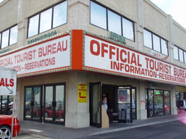
Daytime views of the Official Tourist Bureau and Viva Vegas Gifts signs on the Strip. Information about the sign is available in the Southern Nevada Neon Survey Data Sheet.
Site address: 3734 S Las Vegas Blvd
Sign details: The signage of the property is a wrapping fascia of horizontal message boards, which advertise for the businesses present. The building is a two story complex on the west-side of Las Vegas Blvd, facing east with a small parking lot along the front and on the south sides. The signage is present on the south and east walls. The signage acts as an artificial marker denoting the difference between the row of doors and wall size windows below, and the large panes of glass and tan stucco finish of the upper level.
Sign condition: Structure 4 Surface 3 Lighting 3
Sign form: Fascia
Sign-specific description: The advertisements are broken up into two distinct sections, but are treated aesthetically the same to retain the continuity of the property. The first is a red steel cabinet, which wraps the southeast corner. The faces of the east and south sides are bordered with aluminum, gold polished raceways, lined with incandescent bulbs. The backlit panels possess text which occupies the majority of the white surface. In red text, both of the sides read, "Official tourist bureau," above "Information-reservations." On the east side of the building above the cabinet, two tan horizontal steel boxes, support green channel letters that read in two lines, "Official," then "Tourist Bureau." Above the south face of the signage two separate sections of the green text read "Information" on the left side of the sign, and "Reservations" on the right hand side. They are treated the same as the previous text on the east face, with letters that possess green neon on the interior, and are in all caps. Further north, on the east face of the building, is another cabinet. This sign is only one side, occupying the flat plane of the remainder of the east face of the building. It too is a red steel cabinet with a back-lit face. On the left hand side of the face the two lined text reads "Viva Vegas," a top the word "Gifts." The second line of the text is flanked on either side by red graphic images of diamonds. The right hand portion of the sign reads prices for T-shirts and souvenirs, in black, blue and red text.
Sign - type of display: Neon; Incandescent
Sign - media: Steel; Plastic
Sign animation: Chasing
Notes: The incandescent bulbs which surround the cabinets chase each other.
Sign manufacturer: YESCO
Surveyor: Joshua Cannaday
Survey - date completed: 2002
Sign keywords: Chasing; Fascia; Neon; Incandescent; Steel; Plastic
Mixed Content
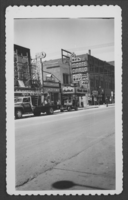
Photograph of businesses and casinos on Fremont Street, Las Vegas, Nevada, circa 1931-1943
Date
1931 to 1943
Archival Collection
Description
Left to right: Young Electric Sign Co. workers on scaffolding in front of the Westerner Gambling Hall and Saloon (owned by the Stockers), Kolstad's Toggery men's store, the Monte Carlo Club, the Keyhole Bar, Steel's Jewelry. Site Name: Monte Carlo Club (Las Vegas, Nev.); Westerner Gambling Hall and Saloon (Las Vegas, Nev.)
Image

Photograph of Le Thai sign, Las Vegas (Nev.), April 10, 2016
Date
2016-04-10 to 2017-08-15
Archival Collection
Description
The sign for Le Thai restaurant sits at 523 Fremont Street in Downtown Las Vegas. Information about the sign is available in the Southern Nevada Neon Survey Data Sheet.
Site address: 523 Fremont St
Sign owner: Dan and Shauna Coughlin, Dan doubles as the chef as well
Sign details: The buildings original construction year was 1934. The restaurant opened in November of 2011, Le Thai offers a famous Three curry made by Chef Dan Coughlin as well as other traditional Thai food inspired by Dans grandma and mom from Thailand. They also have a beer garden behind their main restaurant. Dan was the owner to Mix zone cafe and is the son of the owner of the King and I (Nikki Bujadham). This building has a tin facade with a pull out canopy for outdoor seating.
Sign condition: 5- looks very new and in amazing condition
Sign form: Blade
Sign-specific description: The blade is mainly made of plastic that is backlit at night time, but has a dark steel border. At the top of the sign is a circle that has Le written in black cursive on the sign, and illuminates red neon at night. Also on this circle portion of the sign it states Downtown Las Vegas in a smaller print type font. This circle is outlined in incandescents, as well as the incandescents being surrounded by red neon. Below the circle there is a red curved arrow that states Thai in black letters that have a white trim, this font looks italicized and has little circles on a part of each of the letters, this makes it a very distinct font for them specifically. Underneath the Words Thai, the sign states Noodles & Bar in a regular white block type font.
Sign - type of display: Incandescent light bulbs and neon
Sign - media: Plastic and Steel
Sign - non-neon treatments: Graphics on plastic portion of the sign are backlit
Sign animation: Chasing:
Notes: incandescent light bulbs
Sign environment: In the East side of Fremont Street, located in between Las Vegas Blvd and 6th street. To the west of the property is the Dont Tell Mama Bar and to the east is Commonwealth. Currently across the street is the Therapy restaurant and the old Emergency Arts building.
Sign manufacturer: YESCO
Sign designer: Owners Shauna and Dan
Sign - date of installation: 2012
Sign - thematic influences: The font that they use for Le and Thai are quite different but it shows the blend of how their restaurant is and does make it more distinguishable since their font draws the attention of people walking by.
Sign - artistic significance: With the usage of both Neon and incandescent the sign really does pop out which is a similar trend to many signs over the age, particularly since there is a lot of pedestrian traffic in the region. The arrow is a great direction indicator, as well as it showcases the 1950s blade sign trend with the arrow at the bottom.
Survey - research locations: Le Thai restaurant website https://lethaivegas.com/, Assessor's page, and contact with Le Thai LLC
Survey - research notes: The assessor's page said the buildings original construction year was 1934 though there was no record of what it originally opened up as.
Surveyor: Emily Fellmer
Survey - date completed: 2017-08-15
Sign keywords: Graphics; Plastic; Backlit; Steel; Blade; Chasing; Incandescent; Neon; Back to back
Mixed Content
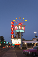
Photographs of Holiday Motel, Las Vegas (Nev.), March 1, 2017
Date
2017-03-01
2017-08-25
Archival Collection
Description
The multi-colored Holiday Motel sign sits at 2205 South Las Vegas Boulevard. Originally Holiday Inn, the motel has operated for over 50 years. Information about the sign is available in the Southern Nevada Neon Survey Data Sheet.
Site address: 2205 S Las Vegas Blvd
Sign owner: Calcaterra Family and Trust
Sign details: Holiday Motel was built-in 1952 - a one acre lot with 14,238 sq. ft. of living space.
Sign condition: 2 - The neon is not working completely, majority of the lights have not been repaired or maintained. The actual paint has shifted from a brilliant red into a subdued salmon rustic color from exposure of Sun/UV and wind.
Sign form: Pole mounted sign with reader board
Sign-specific description: The Holiday Motel is an animated sign that is part of the mid-century and Googie design. The color scheme is mostly a primary color palette of red, blue and yellow. The neon holiday typography is the only element of the sign that differs from the palette, but only when it is lit up. Instead the holiday font illuminates multiple colors to continue the clown theme effect. The sign is in true Googie fashion that popularized roadside signage from 1950s-late1960s. It is in the style of a pylon sign with a directional arrow that points towards the motel entryway. When the sign lights up the directional arrow uses a chaser to animate the arrow and its design with incandescent bulbs. The directional arrow surrounds the holiday motel square shaped portion of the sign. On the top portion of the sign is a rainbow design with five metal rods with circles at the end shooting out of the rainbow. These five rods when lit up in the evening are animated as well and produce a wave motion. On the side of the sign are separate white letters encased in red circles and are designed vertically reading the word motel.
Sign - type of display: Neon, incadescent
Sign - media: Steel and plastic
Sign animation: Animation with upper circles/rods chasing from one to the next.
Sign environment: Property is near other motels and the Stratosphere.
Sign manufacturer: YESCO
Sign - date of installation: c. 1952
Sign - thematic influences: This sign is completely influenced by the 1952 Holiday Inn sign. Both are include an animated chaser direction arrow. The initial design is completely replicated from the Holiday Inn sign. The only difference is the five animated rods in Holiday Motel and where Holiday inn sign has a star instead of a rainbow at the top of the sign. The main difference is that the Holiday Motel sign includes a side panel with the word motel spelled vertically.
Sign - artistic significance: Artistic theme includes a circus theme, but also involves the Googie roadside sign that channels the space age landing beacon. As for majority of signs in 1950s-1960s the sign itself was quite colorful and in the shape of a pylon sign to grab the travelers attention.
Survey - research locations: roadarch.com, assessor's website
Survey - research notes: There was hardly any information pertaining to the history of the Holiday Motel sign. The property was originally called the Holiday Inn Motel but had to change its name in the 1960s due to the large Holiday Inn chain.
Surveyor: Gisselle Tipp
Survey - date completed: 2017-08-25
Sign keywords: Neon; Incandescent; Steel; Plastic; Chasing; Reader board; Pole sign
Mixed Content
Arizona Charlie's Hotel and Casino Neon Survey document, August 18, 2017
Date
2017-08-18
Archival Collection
Description
Information about the Arizona Charlie's Hotel and Casino sign that sits at 4575 Boulder Hwy.
Site address: 4575 Boulder Hwy
Sign owner: American Casino and Entertainment Properties LLC
Sign details: Currently Arizona Charlie's Boulder is owned by the Parent company American Casino and Entertainment Properties LLC. The original Arizona Charlie's on Decatur was first opened around the 1980's owned by Ernest Becker III and his three sons. These locations were named for Becker's uncle Charlie Meadows. The Becker family has had a long history of development and real estate. Arizona Charlie's Boulder opened in 2001.
Sign condition: 5 - looks new
Sign form: Super Pylon
Sign-specific description: Octagonal design. Effigy of a cowboy at its center in an oval plastic backlit sign. There is the words "Arizona Charlie's Boulder" in channeled neon letters. Underneath is a Reader Board with a LED video screen.
Sign - type of display: Neon, Incandescent, Plasma T.V. screen and reader board
Sign - media: Steel and plastic
Sign - non-neon treatments: LED plasma screen and Incandescents
Sign animation: Flasher for incandescent bulbs
Sign environment: A residential area surrounds the property, and adjacent to the main property is their own RV park.
Sign manufacturer: Possibly YESCO
Sign - date of installation: c. 2007
Sign - thematic influences: The Red and yellow/gold color scheme adds an old west and cowboy theme to the sign. The old West theme was very prominent in Las Vegas in the 1940's.
Survey - research locations: Assessor's Page, Arizona Charlie's Website
Survey - research notes: http://www.arizonacharliesboulder.com/?gclid=Cj0KEQjw9uHOBRDtz6CKke3z6ecBEiQAu0Jr3mlOR65dHh6OypoEF3LcYOCTWpwRltGP9Kh6YWjwBKgaApoi8P8HAQ
Surveyor: Wyatt Currie-Diamond
Survey - date completed: 2017-08-18
Sign keywords: Pylon; Neon; Incandescent; Steel; Plastic; Flashing; Reader board; Video screen
Text

Lawless Center Neon Survey document, August 25, 2017
Date
2017-08-25
Archival Collection
Description
Information about the Lawless Center sign that sits at 4100 E Lake Mead Blvd.
Site address: 4100 E Lake Mead Blvd
Sign owner: Patricia Van Buskirk
Sign details: This location opened 1962, and has been family owned since then. This is a shopping center where businesses within it have changed over the years.
Sign condition: Needs some retouching but in good shape, 4
Sign form: Pylon
Sign-specific description: This pylon contains a mid-century modern star at the top of it that is painted white with skeletal neon that also illuminates white. Though each corner of the star has an incandescent light bulb. Under this are two googie style shapes one rusty-red and the other is a teal blue. These shapes have white letters stating "Lawless Center" in a mid-century modern font. The first word illuminates blue and the second is red. Underneath is a plastic reader board but does not illuminate at night time.
Sign - type of display: Neon and incandescent
Sign - media: Steel
Sign - non-neon treatments: Plastic for reader board but does not illuminate at night
Sign environment: This location is on East Lake Mead in a residential area, but also has an auto body and paint store near it.
Sign manufacturer: YESCO
Sign designer: Brian "Buzz" Lemming
Sign - date of installation: 1963
Sign - thematic influences: In the Mid-century modern design, Atomic and space theming popular during the era.
Sign - artistic significance: According to Buzz Lemming it is designed after Sputnik, the star looking part on top.
Survey - research locations: Review Journal artricle https://www.reviewjournal.com/uncategorized/naming-las-vegas-lawless-center-history-a-mystery-worth-solving/ (all information from this article).
Surveyor: Wyatt Currie-Diamond
Survey - date completed: 2017-08-25
Sign keywords: Neon; Incandescent; Steel; Plastic; Reader board; Pole sign; Back to back
Text
Digital files
Level of Description
File
Archival Collection
Young Electric Sign Company (YESCO) Corporate Records
To request this item in person:
Collection Number: MS-00403
Collection Name: Young Electric Sign Company (YESCO) Corporate Records
Box/Folder: Digital File 00
Collection Name: Young Electric Sign Company (YESCO) Corporate Records
Box/Folder: Digital File 00
Archival Component
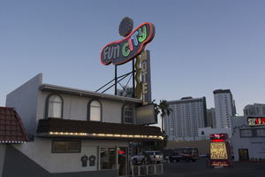
Photographs of Fun City Motel, Las Vegas (Nev.), March 1, 2017
Date
2017-03-01
2017-08-30
Archival Collection
Description
The Fun City Motel sits at 2233 South Las Vegas Boulevard. Information about the sign is available in the Southern Nevada Neon Survey Data Sheet.
Site address: 2233 S Las Vegas Blvd
Sign owner: Rick Trusdell and Chetak Development Corporation
Sign details: Originally the Glenn Vegas Motel in early 50's then the sign was reused for Holiday Motel in 1960's and later to the Fun City Motel circa 1970's to current.
Sign condition: This is rated a 2 since the structure is in semi-salvage condition. No treatment seems to have been done. The damage from the sun has left the bright red hue into a grayish purple color. Part of the neon lettering from Fun City is not in working condition.
Sign form: Pole
Sign-specific description: The Fun City Motel sign was installed in 1952. However, the sign has been used in other properties before it became the Fun City Motel. The Sign was first used for the Glenn Motel circa 1950's with a western theme. The reason why the Fun City Motel doesn't resemble Googie influence is because the original funky curvilinear shape was designed to be a peanut. The Glenn Vegas Motel sign included an illustrated rodeo cowgirl holding a looped rope towards the left end of the sign. In the middle top of the sign is a woman diver; towards the bottom of the sign is an outline of a pool with the word swimming pool in the middle. The peanut shape is painted black. In-between all the designs; in large letters Glenn Vegas Motel is written in white with the female diver drawing separating the two words. Underneath the peanut shaped structure is a rectangular sign held by two hooks on each sign with the word motel. The entire structure itself is held by two steel poles with a blue incandescent directional squiggly arrow facing downwards. The Holiday Motel version changed from the black background to a brilliant red with white large neon letters reading Holiday. The sign removed all implication of the western theme and changed the squiggly directional arrow from light blue to a silver hue. There were two additions to the sign; the first is the word motel vertically connected to the side of the directional arrow and second is a circular structure in white and yellow. Later with the Fun City Motel sign there wasn't much change from Holiday Motel. The only significant change was the name of the establishment. The fun city lettering lights up in multiple colors like the rainbow at night. And the two poles that hold up the structure were painted to black. Today the sign itself has lost all its brilliant red hue and is now a gray color from over sun exposure and no maintenance done to the sign. The directional incandescent arrow is still bright yellow.
Sign - type of display: Neon and incandescent
Sign - media: Steel and fiber glass
Sign animation: Chasers for the incandescent directional arrow. The circular structure on the tops of the curvilinear shape have incandescent lights following a circular motion.
Sign environment: This location is on the North end of the strip near the Holiday House, Holiday Motel, and Kaei Thai restaurant.
Sign manufacturer: YESCO
Sign - date of installation: Circa 1970's
Sign - date of redesign/move: 1950's the sign was used for Glenn Vegas Motel, and in 1960's into the Holiday Motel.
Sign - thematic influences: The fun city sign is funky with an odd curvilinear shape that was originally used for a western theme motel as a peanut. Today the theme seems to be clownish with its colorful palette and rainbow neon.
Sign - artistic significance: The fun city sign is funky with an odd curvilinear shape that was originally used for a western theme motel as a peanut. Today the theme seems to be clownish with its colorful palette and rainbow neon.
Survey - research locations: Assessor's page, Photographs on the internet from Vintage Vegas website http://vintagelasvegas.com/search/Fun+City+Motel
Surveyor: Gisselle Tipp
Survey - date completed: 2017-08-30
Sign keywords: Neon; Incandescent; Steel; Chasing; Pole sign; Roof Sign; Back to back; Backlit
Mixed Content