Search Results
Photograph of Le Thai sign, Las Vegas (Nev.), April 10, 2016
Date
2016-04-10 to 2017-08-15
Archival Collection
Description
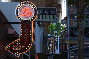
The sign for Le Thai restaurant sits at 523 Fremont Street in Downtown Las Vegas. Information about the sign is available in the Southern Nevada Neon Survey Data Sheet.
Site address: 523 Fremont St
Sign owner: Dan and Shauna Coughlin, Dan doubles as the chef as well
Sign details: The buildings original construction year was 1934. The restaurant opened in November of 2011, Le Thai offers a famous Three curry made by Chef Dan Coughlin as well as other traditional Thai food inspired by Dans grandma and mom from Thailand. They also have a beer garden behind their main restaurant. Dan was the owner to Mix zone cafe and is the son of the owner of the King and I (Nikki Bujadham). This building has a tin facade with a pull out canopy for outdoor seating.
Sign condition: 5- looks very new and in amazing condition
Sign form: Blade
Sign-specific description: The blade is mainly made of plastic that is backlit at night time, but has a dark steel border. At the top of the sign is a circle that has Le written in black cursive on the sign, and illuminates red neon at night. Also on this circle portion of the sign it states Downtown Las Vegas in a smaller print type font. This circle is outlined in incandescents, as well as the incandescents being surrounded by red neon. Below the circle there is a red curved arrow that states Thai in black letters that have a white trim, this font looks italicized and has little circles on a part of each of the letters, this makes it a very distinct font for them specifically. Underneath the Words Thai, the sign states Noodles & Bar in a regular white block type font.
Sign - type of display: Incandescent light bulbs and neon
Sign - media: Plastic and Steel
Sign - non-neon treatments: Graphics on plastic portion of the sign are backlit
Sign animation: Chasing:
Notes: incandescent light bulbs
Sign environment: In the East side of Fremont Street, located in between Las Vegas Blvd and 6th street. To the west of the property is the Dont Tell Mama Bar and to the east is Commonwealth. Currently across the street is the Therapy restaurant and the old Emergency Arts building.
Sign manufacturer: YESCO
Sign designer: Owners Shauna and Dan
Sign - date of installation: 2012
Sign - thematic influences: The font that they use for Le and Thai are quite different but it shows the blend of how their restaurant is and does make it more distinguishable since their font draws the attention of people walking by.
Sign - artistic significance: With the usage of both Neon and incandescent the sign really does pop out which is a similar trend to many signs over the age, particularly since there is a lot of pedestrian traffic in the region. The arrow is a great direction indicator, as well as it showcases the 1950s blade sign trend with the arrow at the bottom.
Survey - research locations: Le Thai restaurant website https://lethaivegas.com/, Assessor's page, and contact with Le Thai LLC
Survey - research notes: The assessor's page said the buildings original construction year was 1934 though there was no record of what it originally opened up as.
Surveyor: Emily Fellmer
Survey - date completed: 2017-08-15
Sign keywords: Graphics; Plastic; Backlit; Steel; Blade; Chasing; Incandescent; Neon; Back to back
Mixed Content
Photographs of Holiday Motel, Las Vegas (Nev.), March 1, 2017
Date
2017-03-01
2017-08-25
Archival Collection
Description
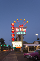
The multi-colored Holiday Motel sign sits at 2205 South Las Vegas Boulevard. Originally Holiday Inn, the motel has operated for over 50 years. Information about the sign is available in the Southern Nevada Neon Survey Data Sheet.
Site address: 2205 S Las Vegas Blvd
Sign owner: Calcaterra Family and Trust
Sign details: Holiday Motel was built-in 1952 - a one acre lot with 14,238 sq. ft. of living space.
Sign condition: 2 - The neon is not working completely, majority of the lights have not been repaired or maintained. The actual paint has shifted from a brilliant red into a subdued salmon rustic color from exposure of Sun/UV and wind.
Sign form: Pole mounted sign with reader board
Sign-specific description: The Holiday Motel is an animated sign that is part of the mid-century and Googie design. The color scheme is mostly a primary color palette of red, blue and yellow. The neon holiday typography is the only element of the sign that differs from the palette, but only when it is lit up. Instead the holiday font illuminates multiple colors to continue the clown theme effect. The sign is in true Googie fashion that popularized roadside signage from 1950s-late1960s. It is in the style of a pylon sign with a directional arrow that points towards the motel entryway. When the sign lights up the directional arrow uses a chaser to animate the arrow and its design with incandescent bulbs. The directional arrow surrounds the holiday motel square shaped portion of the sign. On the top portion of the sign is a rainbow design with five metal rods with circles at the end shooting out of the rainbow. These five rods when lit up in the evening are animated as well and produce a wave motion. On the side of the sign are separate white letters encased in red circles and are designed vertically reading the word motel.
Sign - type of display: Neon, incadescent
Sign - media: Steel and plastic
Sign animation: Animation with upper circles/rods chasing from one to the next.
Sign environment: Property is near other motels and the Stratosphere.
Sign manufacturer: YESCO
Sign - date of installation: c. 1952
Sign - thematic influences: This sign is completely influenced by the 1952 Holiday Inn sign. Both are include an animated chaser direction arrow. The initial design is completely replicated from the Holiday Inn sign. The only difference is the five animated rods in Holiday Motel and where Holiday inn sign has a star instead of a rainbow at the top of the sign. The main difference is that the Holiday Motel sign includes a side panel with the word motel spelled vertically.
Sign - artistic significance: Artistic theme includes a circus theme, but also involves the Googie roadside sign that channels the space age landing beacon. As for majority of signs in 1950s-1960s the sign itself was quite colorful and in the shape of a pylon sign to grab the travelers attention.
Survey - research locations: roadarch.com, assessor's website
Survey - research notes: There was hardly any information pertaining to the history of the Holiday Motel sign. The property was originally called the Holiday Inn Motel but had to change its name in the 1960s due to the large Holiday Inn chain.
Surveyor: Gisselle Tipp
Survey - date completed: 2017-08-25
Sign keywords: Neon; Incandescent; Steel; Plastic; Chasing; Reader board; Pole sign
Mixed Content
Photograph of dinner at El Shrimp Basket, undated
Level of Description
Item
Archival Collection
Young Electric Sign Company (YESCO) Corporate Records
To request this item in person:
Collection Number: MS-00403
Collection Name: Young Electric Sign Company (YESCO) Corporate Records
Box/Folder: Box 14
Collection Name: Young Electric Sign Company (YESCO) Corporate Records
Box/Folder: Box 14
Archival Component
Negative of Banquet Butter & Cheese sign, undated
Level of Description
File
Archival Collection
Young Electric Sign Company (YESCO) Corporate Records
To request this item in person:
Collection Number: MS-00403
Collection Name: Young Electric Sign Company (YESCO) Corporate Records
Box/Folder: Box 16
Collection Name: Young Electric Sign Company (YESCO) Corporate Records
Box/Folder: Box 16
Archival Component
Negative of Best Cleaners sign, undated
Level of Description
File
Archival Collection
Young Electric Sign Company (YESCO) Corporate Records
To request this item in person:
Collection Number: MS-00403
Collection Name: Young Electric Sign Company (YESCO) Corporate Records
Box/Folder: Box 16
Collection Name: Young Electric Sign Company (YESCO) Corporate Records
Box/Folder: Box 16
Archival Component
Negative of Blue Bird Cafe new sign, Logan, Nevada, undated
Level of Description
File
Archival Collection
Young Electric Sign Company (YESCO) Corporate Records
To request this item in person:
Collection Number: MS-00403
Collection Name: Young Electric Sign Company (YESCO) Corporate Records
Box/Folder: Box 16
Collection Name: Young Electric Sign Company (YESCO) Corporate Records
Box/Folder: Box 16
Archival Component
Negative of Boisean Motel sign, undated
Level of Description
File
Archival Collection
Young Electric Sign Company (YESCO) Corporate Records
To request this item in person:
Collection Number: MS-00403
Collection Name: Young Electric Sign Company (YESCO) Corporate Records
Box/Folder: Box 16
Collection Name: Young Electric Sign Company (YESCO) Corporate Records
Box/Folder: Box 16
Archival Component
Negative of Bonneville Motel sign, undated
Level of Description
File
Archival Collection
Young Electric Sign Company (YESCO) Corporate Records
To request this item in person:
Collection Number: MS-00403
Collection Name: Young Electric Sign Company (YESCO) Corporate Records
Box/Folder: Box 16
Collection Name: Young Electric Sign Company (YESCO) Corporate Records
Box/Folder: Box 16
Archival Component
Negative of Bow & Arrow Motel sign, Las Vegas, Nevada, undated
Level of Description
File
Archival Collection
Young Electric Sign Company (YESCO) Corporate Records
To request this item in person:
Collection Number: MS-00403
Collection Name: Young Electric Sign Company (YESCO) Corporate Records
Box/Folder: Box 16
Collection Name: Young Electric Sign Company (YESCO) Corporate Records
Box/Folder: Box 16
Archival Component
Negative of Chat & Chew sign, Las Vegas, Nevada, undated
Level of Description
File
Archival Collection
Young Electric Sign Company (YESCO) Corporate Records
To request this item in person:
Collection Number: MS-00403
Collection Name: Young Electric Sign Company (YESCO) Corporate Records
Box/Folder: Box 16
Collection Name: Young Electric Sign Company (YESCO) Corporate Records
Box/Folder: Box 16
Archival Component