Search Results
Photographs of Fatburger signs, Las Vegas (Nev.), 2002
Date
2002
Archival Collection
Description
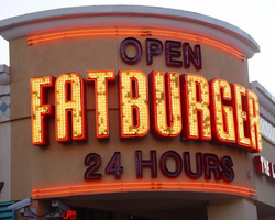
Daytime views of the Fatburger signs on the Strip. Information about the sign is available in the Southern Nevada Neon Survey Data Sheet.
Site address: 3763 S Las Vegas Blvd
Sign details: The Fatburger establishment is directly north across a small drive from Walgreen's. The pylon contains a logo sign, but the most dominant is the text logo above the main entrance. The small parking in front of the building is illuminated with its incandescence. Smaller signs spread out evenly on both the west and south walls.
Sign condition: Structure 5 Surface 5 Lighting 5
Sign form: Pylon; Fascia
Sign-specific description: The Fatburger eatery is directly north from Walgreen's in the same parking lot. It resides on the east side of the strip. The entrance faces SW, mirroring the Walgreen's entrance. It is a rounded storefront design with "Fatburger" spelled in all capital, large, red, channel letters bordered in red neon. The letters face outward and follow the same radius of the entrance, creating a fascia effect with the size of the text. They are filled with incandescent bulbs, which oscillate in a random pattern. Open, red, channel letters, filled with red neon sit above and below the large "Fatburger" text. Above the main sign the letters read "open" and below they read "24 Hours". At the north end of the west face of the building is a diamond shaped, red, steel box with the "Fatburger" in silver channel letters with yellow neon in the interior of the letters. The diamond shape has a border of red neon on its face. Flanking the main entrance, on the south and west face of the building in red steel channel letters, with red translucent plastic faces, the phrase "The last great hamburger stand" is spelled in all caps. They reside approximately the same height on the building as the "24 Hours" script on the main sign. Additional signage is located on the bottom portion of the pylon sign designated for the "The Plaza." Above the back-lit cabinet is an arrangement of text and logo for Fatburger. From left to right, "Fatburger" is spelled in channel letters, the diamond logo is in the center of the sign, then "Fatburger" is spelled again in yellow channel letters. The channel letters are closed front with red translucent plastic. The diamond is outlined in red neon.
Sign - type of display: Neon; Backlit
Sign - media: Steel; Plastic
Sign - non-neon treatments: Graphics; Paint
Sign animation: Flashing, oscillating
Notes: The incandescent bulbs which are present inside the main channel letters, over the main entrance all turn on and hold, oscillate rapidly, then shut off.
Sign environment: The Fatburger eatery is in a unique position, being a widely known property located in a conglomerate of shops including such other well traveled properties such as Walgreen's and McDonald's. In fact, the building is located exactly between these locations. Walgreen's lies directly to the south, with McDonald's to the north. The small stretch of properties is dwarfed by the megalithic MGM further to the north, while the elaborate detail of the New York New York resides west across Las Vegas Blvd Once a pedestrian passes the MGM, headed north, on the east-side of the strip, the Fatburger does makes an lasting impression upon the passerby, being the brightest of the three immediate company.
Sign - thematic influences: Fatburger is another example of a typical everyday establishment turned into an electrifying display to fit in with its environment. No particular theme can be seen specifically other than the logo and color scheme influenced by the establishment itself. The entrance to the establishment contains the text wrapping the radius of the corner, creating a beacon for pedestrians. Such influence can be seen in other larger properties with corner entrances such as the Flamingo, the Barbary Coast, Harrah's, and O'Shea's.
Surveyor: Joshua Cannaday
Survey - date completed: 2002
Sign keywords: Flashing; Oscillating; Pylon; Fascia; Neon; Backlit; Steel; Plastic; Graphics; Paint
Mixed Content
Photographs of Flamingo signs, Las Vegas (Nev.), 2002
Date
2002
2017-08-11
Archival Collection
Description
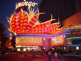
Photos show Flamingo signs at night. Two surveys were conducted to gather information about this sign. One was conducted in 2002 and one was conducted in 2017. PDFs are available for both surveys. See the 2017 survey PDF for additional information that is not included in the object description.
Site name: Flamingo Hotel and Casino (Las Vegas, Nev.)
Site address: 3555 S Las Vegas Blvd
Sign owner: Park Place Entertainment
Sign details: The majority of the Flamingo hotel and casino's neon signage encompasses the stretch of property that faces the strip. Even though the original porte-cochere and pylon sign are no longer in use, or in the original position, they are still evident and very much present. The original pylon has been moved around the corner onto Flamingo, actually closer to the Barbary coast than the Flamingo. The famous sculpted bull-nose design is repeated several times throughout the property and the design is repeated in visual reference on the towers of the hotel.. The Flamingo was one of the first hotels to push its entrance out to the street.
Sign condition: Structure 5 Surface 5 Lighting 5
Sign form: Pylon; Fascia; Porte-cochère
Sign-specific description: The Flamingo's vast array of signage of various types and styles make the hotel one of the more unique facades. Headed north just past the corner entrance to the Barbary Coast, only a two-lane drive separates the two properties. Across the drive, the original top of the old porte-cochere creates the first of the several three-dimensional, sculpted, corner sign you see. The well known swollen base and flexing body of this trademark crowning figure spread out in a bouquet of pink and orange steel feathers. Neon runs horizontally in a repeated pattern up the lengths of the feathers, with the outlying edge portions painted white and filled with incandescent bulbs, turning into single row raceways at the waving ends of the very tips. This corner serves as a pedestrian entrance now, and one of the main causeways between the Barbary Coast and Flamingo. The fattened plumage is set up high a top the corner of the building pointing to the southwest. The broad corner is dominated by the expansive sculpture. Standing atop of the plumage a channel letter logo sign faces outward spelling "Flamingo" in the Flamingo cursive text. The text is appropriated in a radius pattern, supported by a steel support structure making the logo seem as if it is floating above the sculpture. The sign is filled with incandescent bulbs. Two tubes of blue neon wrap the bull nose molding just below the three-dimensional structure, creating a space for the facade of the faceted pediment. Wrapping the face of the corner is a large entablature of patterned squares forming a grid like terrain with incandescent bulbs in the center of each square. Each square is faceted into pyramid shapes with bulbs at the center of each. Just above the pedestrian's head and below the faceted entablature, a raceway sandwiched by two tubes of pink neon creates a bottom line of the composition. The configuration continues to the right of the entrance into a smaller representation of the same effect. To the right of the old porte-cochere entrance, a small wall sign for "mega-jackpot world" is displayed with pink and Purple channel letters filled with neon on the section of wall which faces to the west. The sign is also incorporated into the famed pink and orange flame style, with the plumage emulated in channel pans on either side of the text. They are complete with horizontal neon bars and sections lined with incandescent bulbs as well. The section of wall that the sign sits upon is in the style of the faceted entablature spoken of previously. The two tubes of blue neon are above the pediment and sign and the bottom is also rounded out with the pink neon. Continuing east down the south face of the building, a continuous glass entablature is first seen, at the same height as the blue neon capped molding. The entablature is a glass wall lined with glass faced, two, dimensional figures of flamingos and shrubbery. Details such as wings, and other features are denoted by pink colored glass. Standing several inches off of the wall, the flamingos are lit from behind with red and pink neon creating halos, which reflect off of the glass behind them. The top edge of the pediment is lined with teal neon, while the bottom is blue. The top edge of the building, above the pediment and along other edges of the face, is a rolling design of hills lined pink neon. This element continues down the south wall of the building until it reaches the current porte- cochere. This structure is a circular drive covered with a circular roof. The east and west edges of the structure play host to large channel letter logo for the Flamingo. The pink steel structure spells "Flamingo" in their continuous cursive fashion, and filled with incandescent bulbs. The ceiling of the porte-cochere is an ornate pattern of raceways lined with incandescent bulbs. The pattern is reminiscent of a flower and it's radiating petals. The mirrored pediment continues past the porte-cochere on the wall of the building. Down the west face of the building, being the front of the facility along the strip, past the original porte-cochere, the glass pediment continues until it stops at a small wing of the building denoting another entrance. The entrance slightly radiuses out from the flat plane of the building, and is crowned by another three dimensional swollen bouquet of steel plumage spreading generously over the entrance, stretching it's waving fingers a good degree out on either side. It is constructed with the same color scheme and array of placement for incandescent lighting and neon. While not quite as bulbous as the southwest corner entrance, it breadth is the quality that beckons to the entrance. On the entablature below, the Flamingo logo is spelled in channel letters, and filled with pink neon. Teal neon lines the top of this pediment as well as blue along the bottom. The glass pediment continues on the wall north of the entrance until the face of the building goes from a stucco finish into a section of the elevation created by a wall of glass window panels. This section of the front is anchored in the center by as giant Doric column crowned by a third set of three dimensional sculpted array of pink and orange plumage. Like the two previously mentioned elements of this nature, the swollen base and stretching feathers take on a waving effect. This element is smaller in width than the previous two, but it's feathers or fingers curl forward in the center providing a support for a triangular cabinet section, with the two visible faces pointed northwest and southwest. The feathers continue in a smaller portion on top of the cabinet, appearing as if they rise thorough the cabinet.. The appearance of this set of plumage takes on different appearances for two reasons. The first being it's position upon the top of a column making appear as a torch. The plumage takes on the effect of being flames instead of feathers. The second being the severity of the curve of the center leaf or flame. From the side, coupled with the outer wings, it takes on the persona of a perched bird. The glass pediment continues past this section, stopping with another rooftop set of plumage on the entrance to the building, facing northwest. Above a backlit plastic advertisement cabinet, the fiery fingers of the sculpted, swollen signage, stand as a solid marker to the end of the property, or entrance to the pedestrian headed south. The glass pediment picks up again along the north face of the building headed east. On the East side of the Flamingo property, two fully three-dimensional sculpted steel structures serve as a gateway to the east side of the porte-cochere. Flanking either side of the drive, two identical bud-like structures stand with the same influence as the swollen elements of the front property. A short, faceted column, supports a three tiered, three layered rosebud shape crafted out of leaves more akin to palm fronds. Sagging leaves, pointed toward the ground, create the section between bud shape and the supporting column. They are folded down, representing the action of the leaves being opened. Neon runs in short horizontal bars along the outer surface leaves and all flat planes excluding the topsides of the relaxed leaves. These two markers also take on the persona an organic structure as a sapling palm tree, or rosebud, as well as the image of a burning torch. Building signage: Upon the western tower Flamingo is spelled in channel letters designed with the Flamingo text, and filled with pink neon. Upon the eastern face of the south tower, the half plumage of neon, flaming upward, reside underneath the Flamingo text logo. The same sign is repeated on the north edge of the west tower. Pylon: The original pylon sign now located on the north side of Las Vegas Blvd, in close proximity to the hotel, but actually between the Bourbon Street and the Barbary Coast. The vertical pylon is a double-sided pylon that faces east west. It has slightly modified over the years. The internally lit message center has been scaled down to fit its new environment. The pylon rises up in a square pole design, with neon running vertically up the center, approximately fifteen feet above the pedestrian's head, before being interrupted by the message cabinet. The cabinet has a white plastic face with removable letters. Gold polished raceways line the face of each of the sign, and incandescent bulbs line the raceways. The sides of the cabinet slope inward, round at the corners at the top, reaching toward the center that rises at a peak. The neon continues upward past the highest peak of the cabinet, and continues up to fan outward, created a giant frond of vermilion and red. The giant fan shape at the top supports channel letters, that spell "Flamingo' in white channel letters that are outlined in blue neon and filled with incandescent bulbs. The top fan shape is actually comprised of seven different levels, appearing to be stacked on top of one another. The center, oblong shaped panel, is the highest, with three sections on each side, fanned out, stepping back into space. The furthest wings on the edge are scrambled with bent and undulating tubes of pink neon. The center two are red, and the center holds the pink members. The waving tubes, which lose form and pattern as they spread toward the edges, resemble veins of a leaf, or the elements, which make up the feather. The sides of the pylon, including the internally lit cabinet, are treated with a pink paint.
Sign - type of display: Neon; Incandescent
Sign - media: Steel; Glass
Sign - non-neon treatments: Paint
Sign animation: Chasing, flashing, oscillating
Notes: The incandescent bulbs inside the text reading "Paris" on the balloon oscillate rapidly.
Sign environment: The Flamingo is in between the Barbary Coast and O'Shea's on the east side of the street. The establishment itself dominates the stretch of property, separating the pedestrian from the sidewalk with various shrubbery and palm, a phenomenon seen often on the strip. Exiting the Barbay Coast, headed north, the passerby is seamlessly brought into the Flamingo, bombarded by the vibrant pink and orange plumage, and continuous atmosphere. O'Shea's lies on the north end of the Flamingo, adding a bookend type effect along with the Barbary Coast. Even though the Barbary Coast is a vibrant and active property, most of it's action lies on the south side of the building, thus the Flamingo signage is the most dominating within its length along the Strip.
Sign manufacturer: Original Pylon: Ad-Art, Facade: Heath & Co
Sign designer: Original : Raul Rodriguez. Original Pylon: Bill Clarke
Sign - date of installation: Original Pylon: 1968 Original Porte Cochere 1976
Sign - date of redesign/move: When Park Place Entertainment separated the Flamingo name from Hilton, all of the text signs which read Hilton were removed. The original pylon sign was moved from the west side, or street side of the property, and moved East down Flamingo Rd., Between the Barbary Coast and the Bourbon Street during remodeling done in the Eighties. The pylon has been modified several times over the years, but has evolved into a slimmer, less flamboyant version, including a simplified internally lit message center.
Sign - thematic influences: The theme surrounding the resort is the theme of the pink flamingo bird, and its tropical environment. The blazing pink tone ( Vermillion ) of the neon is seen extensively throughout the property, as well as the repeated image of the pink bird. The white plaster facade and sculpted edges of the exterior's roof line are reminiscent of sun drenched villas, while staying well within the realm the surrounding environment. Elements such as the mirrored entablatures lined with illuminated pink Flamingos
Surveyor: Joshua Cannaday
Survey - date completed: 2002
Sign keywords: Chasing; Flashing; Oscillating; Pylon; Fascia; Porte-cochère; Neon; Incandescent; Steel; Glass; Paint
Mixed Content
Photographs of Frontier signs, Las Vegas (Nev.), 2002
Date
2002
Archival Collection
Description
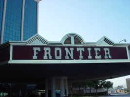
Daytime views of the Frontier Hotel and Casino signs on the Strip. Information about the sign is available in the Southern Nevada Neon Survey Data Sheet.
Site name: Frontier Hotel and Casino
Site address: 3120 S Las Vegas Blvd
Sign owner: Phil Ruffin
Sign details: The New Frontier Hotel and Casino sits south of the Stardust, on the east side of Las Vegas Blvd The Frontier main pylon still remains at the south end of the property, a short distance from the southeast, near the porte-cochere. A rear port e cochere also resides on the east side of the building . Like so many other properties the Frontier is composed of a low-rise building accompanied by, another higher rise structure, and a tower of rooms. A parking lot sits on the north end of the property, denoted by a small, double-sided pole sign. Two porte-cocheres adorn on the southeast and west sides of the property, as well as the famous pylon outside the eastern porte- cochere.
Sign condition: Structure 4 Surface 4 Lighting 4
Sign form: Pylon; Porte-cochère; Fascia
Sign-specific description: A parking lot sits on the north end of the property, denoted by a small, double-sided pole sign. It is a simple rectangular cabinet, with a small steel circular cabinet on the top east edge of the sign, and a triangle on the west edge of the height, pointing west. The two are connected by a long horizontal section, which runs along the top of the cabinet. The circle, arrow, and connecting pieces are lined with incandescent bulbs. The surface if the Frontier is reserved, not holding too many exterior references to a western theme, besides the actual script of the logo, and wood paneling of the overhangs, little else is there to support the theme. Just south of the parking lot and on the west side of the strip, the Frontier is separated from the sidewalk with a large section of green lawn, and a guard of tall palm trees against the east face of the building. Tall windows occupy most of the wall separated by columns of brick. The structure continues south and juts east to create an entrance, with a text logo above the door with brass edges and a wood panel facade. The three sided entrance is two tiered flat font design, with the lower half being taller, fit with a backlit message board. The top half is shorter in height, and plays home to the polished channel letters spelling "Frontier," and filled with incandescent bulbs. The surface of the top half of the facade is a rusted brown color, referencing panels of exposed wooden construction. The bottom edge of the entire face of the sign is a protruding brass geometric edge, as well as being the device that separates the two parts of the sign. The top edge of the top section is brass treatment also, but is crafted into different forms along its path. Directly in the center of the front face, there is an arch curving over a set of vents. The two sides are treated with an pointed triangular shape. The porte-cochere is located just south, if you follow the property, pointed toward the southeast extending off of the building. The northeast and southwest sides of the porte- cochere are lined on the top and the bottom with the same protruding, square molding, rising into a long, low rising arch, peaking in the center of the sign. The center portions of the sides are the same rusted brown tone seen on the entrance mentioned earlier. Suggestions of the paneling are evident at the edges. The "Old west" font, polished channel letters spell out "Frontier" on the rust facade. Each is filled with incandescent bulbs, and outlined in neon. Most impressive about the covered area is the space occupied by the ceiling. The underside of the port-cochere is separated by four large, deep, recessed rectangles with mirrored walls. The walls slope into another smaller recessed rectangle rising straight up only a sort distance before stopping. Standing directly underneath the section, it is seen as a smaller rectangle located within a larger one. Both rectangles are lined on all edges by polished gold raceways, and incandescent bulbs. The open space is occupied by multi armed, ornate brass chandelier. Each arm is adorned with faux gas lanterns. The arms are curved in a quite extreme fashion, making the piece appear more as an organic shape, or a creature such as an octopus. The centers are adorned with decorative silver spheres. Over the doors to the casino a large backlit message center panel, curves with the radius of the face of the building. The brown and polished metal edges of the sign combined with the incorporation of the architecture of the building, gives it a reserved, streamlined look. South of here the building grows in height and becomes a series of tall windows that create the wall. Following the property around to the building's west side, another porte-cochere can be seen. An eight-sided post serves as a valet station. The facade of the roof is treated as the entrance on the east side of the building. Protruding square brass edges form borders for polished channel letters filled with incandescent bulbs. Text is contained within the southwest, southeast, and western panels. Frontier is spelled in the properties font on both the southeast, and western sides. The southwest side reads "Parking" in the company's font, but is flanked by "self" and "valet," in smaller plain white channel letters filled with neon. The western and southeastern sides are crafted with the top edge of the pediments being an arch flanked by two triangle shaped rooflines. Elements also seen elsewhere over the other entrances. Looking up, facing this porte-cochere, the tower of rooms looms high overhead. Signage is located on all four sides of the tower. The northeast and southwest sides of the tower hold giant channel letters that spell "Frontier" with the interior being a reflective orange material. The facade is a giant replication of the two sides of the southeast and western sides of the multisided porte-cochere below. A giant polished metal framework, with a rounded arch flanked by two A frame roof lines, as well as the rust colored background hold the letters. The text is filled with incandescent bulbs. Along the northwest and southeast sides of the tower "Frontier" is spelled vertically down the face of the building in the distinctive channel letters. They too are filled with incandescent bulbs and finished orange on the inside. The famed main pylon sign for the frontier still stands in good repair, as reminder of Las Vegas past. It is located in the south side of the Frontier property facing north south. The two-sided sign is essentially pair of close set steel legs joined by an arch at the top to create one continuous shape. The steel is treated in a pastel pink coloring lined on both edges with a double row of incandescent bulbs. The inner portion of the arch contains three elements. The small cabinet at the top holds the image of the Frontier "F" logo. The edge of this cabinet is painted yellow, with a white internally lit face below that a long cabinet runs the length of the remaining space to the ground. The interior of the cabinet has been cut away to form a pattern of repeated circular holes down the length of the cabinet. This portion has been painted a teal color, with the edges lined with incandescent bulbs. In the space inside of the circles a continuous string of star shapes, reminiscent of the Stardust star emblems, are crafted in yellow painted steel and laden with small incandescent bulbs. The shape is interrupted twice with the main marquee logo for the establishment as well as well as a large internally lit message center. Both portions are not solid, double faced cabinets, but four single faced cabinets. The design is also seen in the Westward HO pylon. The bottom section message center can divided into essentially six parts: four individually denoted sections for vinyl lettering, and two steel panels with an animated neon silhouette of a cowboy riding a mechanical bull. The bottom half of the cabinet is one portion of the collection of section, with a thin, one letter width portion running the length of the cabinet, separating the sign into two halves. The top half is another section flanked by the two steel panels containing the bull rider. The middle portion contains crafted red vinyl logo the "Gilley's" establishment. A thin, one letter space cabinet, emerges out of the top of the sign, running a bit shorter than the length of the cabinet. The panel with the rider is actually three separate images, crafted with gold neon stacked on top of another in different positions to allow the three-stage animation process of the rider to be realized. Fashioned out of red neon text is written in the same text as the Frontier wall logo's above and below the rider. The word "Ride" sits above and the phrase "The Bull" is below the rider. He entire width edge of both the North and South sides are encrusted with yellow incandescent bulbs. While the bottom half of the pylon is dominated by the message center, a bit further up on the structure is the main marquee logo. The green steel cabinet is a rectangular with added elements of shape and design. The ends of the plane are slightly curved back into space, with the actual surface of the shape rising into a small pointed crest in the center. Across the surface of the cabinet the word "Frontier" is spelled in the "Western Font" in channel letters. The letters are outlined in neon and filled with incandescent bulbs. The surface of the cabinet is striped horizontally with tubes of red neon.
Sign - type of display: Neon; Incandescent; Backlit
Sign - media: Steel; Plastic
Sign - non-neon treatments: Graphics; Paint
Sign animation: Chasing, flashing, oscillating
Notes: The incandescent bulbs inside the text reading "Paris" on the balloon oscillate rapidly.
Sign environment: Sitting north of the Fashion Show Mall and, south of the Stardust, the Frontier seems to create its own environment upon an expansive property. The expansive sidewalks, healthy landscaping, and clean, reserved faced, make the Frontier more akin to the larger corporate establishments such as the Mirage, or Monte Carlo. It is quite the dominant presence on the west side of the street, for the east side is the vacant lot where the Desert Inn used to reside. The Frontier stands clean and strong amongst the chaos of the Fashion Show construction, and the empty lot across the street.
Sign manufacturer: Ad-art (Pylon), Sign Systems, Inc (facade and porte-cochere)
Sign designer: Bill Clarke (Pylon) Brian K. Leming (facade and porte-cochere)
Sign - date of installation: pylon: 1967 porte-cochere and facade 1981
Sign - date of redesign/move: The face of the Frontier was remodeled in an effort to keep up with the larger corporate casinos in 1998, but retained the main pylon, tower signage, porte-cochere signage and various entrance signs.
Sign - thematic influences: The obvious theme of the hotel is a Western, cowboy/pioneer themed establishment. The facade of the structure was at one time engulfed in the theme, but has slowly over time changed to compete and fit in with the ever-changing Las Vegas strip. Vestiges of the Western theme are present in the remaining elements of the porte-cochere, side entrances, the tower fascia and roofline, as well as all the text, including the main pylon. Other establishments that carry the much popular theme throughout Las Vegas history, include the Westward Ho, The Golden Nugget, The Bonanza, Hotel Apache, the Boulder Club, and the Pioneer Club.
Sign - artistic significance: In 1967, the Frontier sign was considered the tallest sign on the Strip. The 24 x 84 foot signature panel proved to be one of the largest at the time as well. Charles Barnard's scale model displayed at the Montreal Expo and his design of the seventeen-foot tall logo cabinet, were instrumental in Ad-Art landing the contract for the establishment. (Barnard) The cabinet and center scalloping used to incorporate animatronics, turning in concert.
Surveyor: Joshua Cannaday
Survey - date completed: 2002
Sign keywords: Chasing; Flashing; Oscillating; Pylon; Porte-cochère; Fascia; Neon; Incandescent; Backlit; Steel; Plastic; Graphics; Paint
Mixed Content
Photographs of Gameworks signs, Las Vegas (Nev.), 2002
Date
2002
Archival Collection
Description
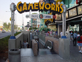
Daytime and nighttime views of the Gameworks' signs on the Strip. Information about the sign is available in the Southern Nevada Neon Survey Data Sheet.
Site address: 3785 S Las Vegas Blvd
Sign details: Game Works is located on the underground level of The Showcase Plaza, which is also home to such establishments as M&M World and the Show case theatres. Two small gateway pylons for the Game Works center, stand on other side of staircases that lead to the underground facility. Just east of there a large wall front design hands approximately nine feet above the ground on the structure of the mall.
Sign condition: Structure 5 Surface 4 Lighting 5
Sign form: Pylon; Fascia
Sign-specific description: The large wall marquee that reads GAMEWORKS in all capitals, utilizes deep, yellow, steel, channel letters painted black on the exteriors. The slightly arched sign is on the West wall of the building, facing West from the East side of the strip. The interior of the text contains double rows of yellow neon. The cabinet, which the words sit upon, is a black steel cabinet shadowing the individual letters in one cabinet. The backing cabinet itself is illuminated from its interior, with middle section of the width of the cabinet is made of a steel grating. This function allows the blue neon on the inside to cast a blue glowing halo seen from the exterior. Sitting on top of the right hand side of the marquee are two steel boxes manufactured into the shape of a male and female figure dashing to the end of the sign. These figures are made of black steel box like formations while retaining a cartoon-ish silhouette. Their posture suggests motion or running. These figures are constructed in the same fashion as the black cabinet, which the text is supported upon. They too are glowing with the blue interior neon halo. In front of the large wall sign are the two, single sided, gateway pylons. They serve as markers for the stairs that lead the underground facility. They sit on either end of the large channel cut into the sidewalk. One faces South on the South entrance, and one faces North at the North end. The signage is actually a smaller replica of the large building front logo. The same interior lit cabinet supports the same design of yellow channel letters, with the backing "shadow" cabinet. A difference between the larger and smaller cabinets is that the cabinets are surfaced with the grated material. The only difference in the channel letters besides their obvious discrepancy in size, is that single rows of neon comprise the interior of the channel letters. On either side of the sign, two, "space age" themed posts provide support. They are topped with a sculpted cylindrical fashion capital. The bases for which they are attached to the concrete with, are blue in color. The actual shaft of the pole is made of several smaller pipes, with a plastic cylindrical tube in the center. Inside this tube is a string of attached incandescent bulbs running vertically. Below the text, suspended with two rods, is an oval shaped, aluminum cabinet. In the face of the cabinet there are the words "cafe" and "lounge" painted in blue. Over the painted text is blue neon. From both sides of the sign, the blue neon scrawl is visible Separating the two words is a black circle with a red neon rectangular shape in the center. The ends of the cabinet are made small circular cabinets approximately seven inches in diameter.
Sign - type of display: Neon; Incandescent; Backlit
Sign - media: Steel; Plastic; Fiberglass
Sign - non-neon treatments: Paint
Sign animation: none
Sign environment: The Game Works facility is located directly across the street from the pedestrian "Brooklyn Bridge" element of the New York New York and sit is the shadow of the MGM super pylon. The vibrant yellow of the sign do stand out as distinct among the tremendous and attractive signage of the Showcase plaza. The large channel cut into the sidewalk, along with its large surrounding counterparts, makes the entrance reminiscent of that of a subway. The plaza itself is self-contained and while standing along the front a person is enveloped in the plaza without being distracted by the rest of the strip itself. The large signage looms over a pedestrian while walking by, or shouts at you while sitting along the shrub filled flowerbeds.
Sign - thematic influences: The actual theme of the sign is correspondent to that of the business, which the sign advertises. The property is an interactive gaming facility and lounge. The use of the glow of a monitor or computer screen. The polished aluminum poles supporting the gateways are reminiscent of the futuristic, or "space-age" theming associated with the classic representations of science fiction in movies and television throughout the twentieth century. Such examples of this classic representations may be seen in television programs from the past like "Lost in Space," or even literary descriptions in Orson Well's "War of The Worlds" of Ray Bradbury's "Martian Chronicles" The combination of materials along with the innovative use of lighting also suggests electricity and digital elements which associate with the function of the facility.
Sign - artistic significance: If not significant for simply combining different elements to create a completely self-contained sign, it fits into the movement in Las Vegas's history , which is geared more toward the family. Not only the space that it occupies, but also the function itself in intended to attract young people if not children into it domain. It is an obvious standout for the vote to make Las Vegas move toward a more family oriented town. Aesthetically the signage is modern innovation on a classic design.
Surveyor: Joshua Cannaday
Survey - date completed: 2002
Sign keywords: Pylon; Fascia; Neon; Incandescent; Backlit; Steel; Plastic; Fiberglass; Paint
Mixed Content
Photographs of Ginseng BBQ signs, Las Vegas (Nev.), 2002
Date
2002
Archival Collection
Description
Daytime views of the Ginseng BBQ signs on the Strip. Information about the sign is available in the Southern Nevada Neon Survey Data Sheet.
Site address: 3765 S Las Vegas Blvd
Sign details: Down the driveway created between the Fatburger and Walgreen's structure is a slightly larger lot, which is home to the Ginseng BBQ establishment. The signage is a gateway, banner structure which leads to this slightly larger lot. It is visible standing directly in front of the Fatburger sign, looking east down the alley.
Sign condition: Structure 3 Surface 3 Lighting 3
Sign form: Pylon
Sign-specific description: Attached to the section of the Fatburger building which houses the entrance to the Alan Albert's, and stretches across to the building which houses Walgreen's is a sign which is comprised of a horizontal overhead structure of steel beams, forming a lattice work or skeleton of an entrance. The top and bottom edges are white raceways with incandescent bulbs. Placed awkwardly along the bottom portion of the skeleton is a border of gold polished raceways with incandescent bulbs. There is no backing to the border, so it is simply an edge and nothing more inside this border consisting of the structure of the sign. The top and bottom edges of the structure are lined with incandescent bulbs. "Ginseng BBQ" is spelled in gold channel letters painted white on the inside, with red neon in the interior. The letters are all caps and centered inside the border. The sign faces west. The actual establishment is further east. through the gateway where a slightly larger lot is located, on the north face of the Walgreens side of the complex.
Sign - type of display: Neon; Incandescent
Sign - media: Steel
Sign animation: Chasing, flashing, oscillating
Notes: The text, which resides on the southern wall and reads "Casino," is filled with incandescent bulbs that all illuminate at the same time, and oscillate. They then shut off at the same time, and then repeat. The raceways of incandescent bulbs chase each other while the neon, which surrounds the back lit, plastic, screens on this wall flash on then off. The bottom two raceways sandwiching the reflective panel chase from left to right, while the remainder of the raceways surrounding the signs, run right to left. The incandescent bulbs on the pylon chase each other gracefully up the length of the pylon. The animation is patterned so as to appear as if a section of several bulbs are pulsing its way up the towers, hugging the edge of the bulbous tops. The raceways continue around the east face of the building. The umbrellas in the plaza behind the pylon, also are animated with incandescent bulbs chasing each other downward along the raceways.
Sign environment: The environment which the Ginseng BBQ's establishment shares is dictated by its neighbors of Walgreen's and Fatburger. The small enclosure of a lot, which is in front of the store, follows after passing underneath the main logo text banner for the restaurant. It is hidden among the various neighboring businesses, being protected by the larger structure in front of it.
Sign manufacturer: Vision Sign
Sign - thematic influences: No real theme surrounds the signage other than it appears that it was pieced together from various other pieces of signage. The white, steel skeleton appears as if it was there previously, and the Ginseng sign was attached later. The theme that it does fit into is the small eateries which pop up among the strip malls and small shopping centers along the strip. It is also one of two different Ginseng BBQ establishment.
Surveyor: Joshua Cannaday
Survey - date completed: 2002
Sign keywords: Chasing; Pylon; Neon; Incandescent; Steel
Mixed Content
Photographs of Glass Pool Inn signs, Las Vegas (Nev.), 2002
Date
2002
Archival Collection
Description
Daytime views of the Glass Pool Inn signs on the Strip. Information about the sign is available in the Southern Nevada Neon Survey Data Sheet.
Site address: 4613 S Las Vegas Blvd
Sign details: Located on the very south end of Las Vegas Blvd the Glass Pool Inn boasts a Pylon/Pole sign along the east side of the Strip. Both the sign and the adjacent lounge, which holds vestiges of wall signs, are directly Northwest of the famed glass Portaled pool, where the establishment takes its name.
Sign condition: Structure 3 Surface 2 Lighting 2
Sign form: Pylon
Sign-specific description: The Glass Pool's main sign is a double-backed, double poled, internally lit pylon design. The top portion, a sculpted internally lit marquee in the classic kidney pool shape, reads "Glass Pool Inn." A smaller sign of similar water referenced design, sits below the main marquee. They are both contained in sheet metal framed painted blue. The bottom portion is comprised of a incandescent bulb LED matrix center, a Sheet metal message center containing a small plastic readerboard with vinyl letters, and a red neon sign for vacancy. The boxes or the message centers are also blue sheet metal.
Sign - type of display: Neon; Incandescent; Backlit
Sign - media: Steel; Plastic
Sign - non-neon treatments: Paint
Sign animation: none
Sign environment: The Glass Pool Inn sits on south end of the strip among the small dying hotels of Las Vegas Blvd's earlier history, it is one of the first signs you see traveling North on the strip entering town. Just north lies the beginning of the main flood of architecture from the modern strip; while to its south are the beginnings of the strip and the spawning new growth of Las Vegas. The Glass Pool stands in the unique position of being in that gateway of entering the Las Vegas Strip
Sign manufacturer: YESCO
Sign - date of installation: 1953
Sign - date of redesign/move: In 1989 when Steve Wynn was establishing the Mirage, there was another property which also had the name: the small southern Strip, roadside motel. When Wynn acquired the name the original Mirage simply changed its name to the Glass Pool Inn. The original sign was left in place, and simply remodeled to fit the new name of the motel. Permitted by the county to refurbish in December of 1988.
Sign - thematic influences: Water and the pool itself, kidney-shaped design.
Sign - artistic significance: The Glass Pool is an artistic artifact of the older smaller strip hotels. Artistically it is reminiscent of the roadside pole sign used to attract traffic. It represents one of the last strip roadside motels in that portion of the Strip.
Surveyor: Joshua Cannaday
Survey - date completed: 2002
Sign keywords: Pylon; Neon; Incandescent; Backlit; Steel; Plastic; Paint
Mixed Content
Photographs of Grand Canyon Experience signs, Las Vegas (Nev.), 2002
Date
2002
Archival Collection
Description
Daytime and nighttime views of the Grand Canyon Experience signs on the Strip. Information about the sign is available in the Southern Nevada Neon Survey Data Sheet.
Site address: 3791 S Las Vegas Blvd
Sign owner: M H & K Enterprises
Sign details: The Grand Canyon Experience is directly North of the MGM next to the GameWorks complex. Above the clear glass entrances to the outdoor scenic tour's facility is a large building front designed marquee design, as well as a smaller version over the entrance facing northwest.
Sign condition: Structure 5 Surface 3 Lighting 5
Sign form: Fascia
Sign-specific description: The marquee reads Grand Canyon in yellow channel letters outlined in yellow neon, the insides are orange with orange neon in the middle. Experience is spelled in a cursive style orange channel letters with orange neon and incandescent bulbs on the interior. The two texts are supported on a steel framework of interconnecting steel pipes. The shape looks as if it is a bow pointed toward the ground. Two steel poles run vertically approximately 16 feet from the edge of the support system. They run toward the ground against the wall and stop to square i18" tall 10 inch deep, yellow, message box with a black surface. The neon whit von inside of the red channel letters reads "Shop Grand Avenue" in an all caps Arial style text. Two halogen lamps project off of the top of the sign and illuminate a three-dimensional sculpted caricature of a hiker. The entire structure is supported on the West wall of the building. The logo itself spans seventy-eight and a half feet at it's widest and is approximately twenty-three feet tall. Below the NW entrance to the establishment, a smaller version of the giant marquee sign sits above the door. Aluminum channel letters spell " Grand Canyon," with orange argon on the interiors. Below that sits a three-tiered back lit message panel. It forms a shape reminiscent of an upside down step pyramid. The top section actually contains yellow argon in nine-inch cursive text spelling experience. The three stepped cabinet is of a polished aluminum. The text sits on sheet metal raceways.
Sign - type of display: Neon; Incandescent; Backlit
Sign - media: Steel; Fiberglass; Plastic
Sign - non-neon treatments: Paint
Sign animation: Chasing, flashing, oscillating
Notes: The text, which resides on the southern wall and reads "Casino," is filled with incandescent bulbs that all illuminate at the same time, and oscillate. They then shut off at the same time, and then repeat. The raceways of incandescent bulbs chase each other while the neon, which surrounds the back lit, plastic, screens on this wall flash on then off. The bottom two raceways sandwiching the reflective panel chase from left to right, while the remainder of the raceways surrounding the signs, run right to left. The incandescent bulbs on the pylon chase each other gracefully up the length of the pylon. The animation is patterned so as to appear as if a section of several bulbs are pulsing its way up the towers, hugging the edge of the bulbous tops. The raceways continue around the east face of the building. The umbrellas in the plaza behind the pylon, also are animated with incandescent bulbs chasing each other downward along the raceways.
Sign environment: The Grand Canyon Experience is a rather large sign but is dwarfed by the immense MGM pylon just to the south of it. It is accented by faux rock serving as door jambs for the actual entrances.
Sign manufacturer: Mikohn Lighting and Sign
Sign - date of installation: 2000- 08
Sign - thematic influences: The actual theme of the sign is correspondent to that of the business, which the sign advertises. The text does not appear to be associated with any particular theme, but hold a style complimentary to each other. An element of theming is still evident with the faux rock facade, and the sculpted figure on top of the sign.
Sign - artistic significance: If not significant for simply combining different elements to create a completely self-contained sign, it fits into the movement in Las Vegas's history, which is geared more toward the family. The cartoon-like representation of a hiker, the fake rocks, the bright colors, and location in a strip mall, which centered on such establishments as Gameworks and M&M World, all point to the conclusion that families are welcome.
Surveyor: Joshua Cannaday
Survey - date completed: 2002
Sign keywords: Fascia; Neon; Incandescent; Backlit; Steel; Fiberglass; Plastic; Paint
Mixed Content
Photographs of Greek Isles signs, Las Vegas (Nev.), 2002
Date
2002
Archival Collection
Description
Daytime and nighttime views of the Greek Isles Hotel and Casino signs. Information about the sign is available in the Southern Nevada Neon Survey Data Sheet.
Site address: 305 Convention Center Dr
Sign owner: Mark IV Realty
Sign details: The property which is at the eastern end of Convention Center Dr., is one tower at the east end of the property, and is attached to a low-rise structure which reaches westward along the east side of Convention Center drive. Various signs adorn the facade of the Greek Isles including a small pylon sign, a porte- cochere and two wall/logo signs. The stucco surface of the front of the building is painted with images of rustic Mediterranean cottages, as well as the rising or setting sun image seen on the pylon as well.
Sign condition: Structure 5 Surface 5 Lighting 5 Notes: The signage for the Greek Isles is essentially brand new, with exception to the porte-cochere. The Porte cochere was left over from the previous establishment with a bit of standard upkeep.
Sign form: Pylon; Fascia; Porte-cochère
Sign-specific description: At the east end of Convention center Blvd The Greek Isles casino resides at the old site of establishments such as The Paddlewheel, and The Debbie Reynolds Hotel Casino. The signage consists a pylon sign, a porte- cochere and two wall signs. Located on the south side of the street, the signage is located in relatively small span of space along the north face of the establishment. At the western most end of the property, a section of the low rise structure radiuses outward creating a giant white, convex stucco canvass. A golden sunset has been painted on the entire surface of this rounded wall. A bright white round section represents it with the color blending from an intense yellow into a burnt orange on the top edge of the building. At the top of the wall along the surface, "Greek Isles is spelled in shallow blue channel letters, with each letter set upon a white cabinet which mimics the shape of the font. Incandescent bulbs fill each channel letter, surrounded by a border of blue neon. The text is very angular, also mimicking ancient Greek text and the text utilized in Caesar's Palace. Just below the text on the surface of the wall. A wall sign in the shape of a rectangle with scrolls on the either sides. The resultant effect is a two-dimension representation of an Ionic top of a column. The outer edge of the sign including the spiraling scrolls on either side is created with a narrow blue channel. Tubes of blue neon line the interior of this channel. The open rectangular space left in the banner of the sign reads "Hotel &Casino," in red channel letters, lined with red neon on the interiors. Further east on the surface of the building, the white stucco is treated with a mural of broken tile overhangs and open shutters. Column, and corbels are other elements represented in the mural of a Greek village. Another sign is located on the wall between the western most sign and the central Porte cochere. This sign is two parts. Pair of concrete columns support a cabinet, crafted in the same fashion as the secondary portion of the previously mentioned sign. The details of the scroll are created by gold raceways lined with incandescent bulbs. Painted in red , all capital, letters, the text "Restaurant &Lounge Show," lies horizontally across the white surface. Neon is crafted over the tops of the letters. Sitting on top of the cabinet is another set of channel letters. The shallow blue letters are filled with incandescent bulbs. The shadowing cabinet, behind the letters is painted gold. Blue neon borders each one of the letters. On either side of the text, three slightly arched rods angle out of the body of the faux scrolled cabinet. The rods are lined on the surface with one single tube of blue neon. A pair of gold, polished, doors lie underneath the sign between the columns. The main entrance of the building is underneath the porte-cochere, continuing east along the property. The surface of the awning is illuminated with lengthy backlit cabinets, lined on the top and the bottom with gold raceways lined with incandescent bulbs. Blue tubes of neon line the top and the bottom edges of the surface of the cabinet. The underside of the awning is divided in clear plastic covered recessed cubes, forming a grid over the surface. The interiors of the cubes are mirrored, and sloped to a point in the negative shape of a pyramid. The centers are adorned with incandescent bulbs. The borders that periodically broken up with polished, reflective panels of a bronze hue. The property continues east still, until a north/south drive separates the building from the pylon sign for the establishment. A pair of white painted steel poles are capped with a white cabinet, sculpted itself to add elements to the poles themselves. The left and right bottom edges of the cabinet are crafted to look lime the scrolled column capital, represented in the two logo wall signs on the east surface. The scrolls are created with blue paint, n the white surface, as well as the address painted in the center. The combination of the sculpted cabinet and supporting poles create a solid base for a giant black cabinet which housed a color LED message center. Atop the cabinet, another horizontal cabinet sits wider in length than the LED cabinet. The cabinet is crafted like the two wall signs as well, with bulbous radius ends, adorned on the surface and edges with the channel raceways creating the scroll shape. This channel is lined with blue neon. All capital, red channel letters, filled with red neon, reads "Hotel & Casino." A top this cabinet another sculpted cabinet hold the main logo text of the sign. The sign is crafted as a half circle, creating a cabinet with the entire outer edge being a single radius. The surface of the sign is painted in the same fashion the sunset mural on the east end of the building. The sign starts as a dark orange at the bottom and fades to a yellow at the top. The edge of the radius is interrupted by the main text. "Greek Isles" is spelled in the same fashion as all the other signs. The mimicking backing cabinets for the letters are painted white as well. The outer edge is also lined with gold polished raceways , and incandescent bulbs. The width of the sign from the LED cabinet on up is painted black
Sign - type of display: Neon; Incandescent
Sign - media: Steel
Sign - non-neon treatments: Graphics; Paint
Sign animation: none
Sign environment: The Greek Isles is on the unique street line of Convention Center drive. To the east there is a nightclub, a chain motel, The Las Vegas Hilton, and the transplanted Riviera pylon. To the west, on that side of the street, is a bank complex and the Casino Royal. Across the street the vast expanse of the Hilton Convention Centers parking lot, makes the Greek Isles seem much larger for it's relatively small set of signage.
Sign manufacturer: YESCO
Sign - date of installation: 2000
Sign - date of redesign/move: The Greek Isles signage is the same since its initial installation, but replaces other vestiges of the previous properties, most recently the Debbie Reynolds Hotel and Casino.
Sign - thematic influences: The theme of the property is quite evident in its name as well as in its facade. The exterior is made to appear with elements of a rustic Greek village utilizing a white stucco finish treated with mural designs of wooden shutters and other village amenities. On western end of the property, the large round, surface of the wall is treated with graphic paint representative to a rising or setting sun. This element also adds to the apparent ambiance of the serene village. The text for the property is crafted in the generalized angular style of the ancient Greek text, not that much dissimilar to the Caesar's Palace logo text. In fact they are almost identical in fashion.
Surveyor: Joshua Cannaday
Survey - date completed: 2002
Sign keywords: Pylon; Fascia; Porte-cochère; Neon; Incandescent; Steel; Graphics; Paint
Mixed Content
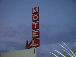
Photographs of Happi Inn signs, Las Vegas (Nev.), 2002
Date
2002
Archival Collection
Description
Evening and nighttime views of the Happi Inn signs on the Strip. Information about the sign is available in the Southern Nevada Neon Survey Data Sheet.
Site address: 3939 S Las Vegas Blvd
Sign details: The Happi Inn resides on the corner of Mandalay and Las Vegas Blvd, stretching east, ending at Gilles street. The property is the largest of the small roadside sites. The signage, however, is limited. Three pole signs and an internally lit cabinet comprise total signage. The two pole signs, being the tallest, reside on the north end of the property while a small vertical pole sign resides on the top of the building's roofline. The small internally lit cabinet sits over the drive, next to the main office.
Sign condition: Structure 3 Surface 4 Lighting 3 Notes: The structure of all the signs appear to be intact, with no visible, severe damage. Various lighting is out an all the signs, with the small roof line pole sign, no longer being lit. The internally lit cabinets on the sign within the pole sign furthest east, are no longer lit as well. The surfaces of the sign are intact, but are worn.
Sign form: Pylon; Fascia
Sign-specific description: Two pole style pylons, reside on the north end of the property. On the rear of the property on the corner of Mandalay Bay and Gilles Street, is a simple design. A single white, steel pole, supports three, two- sided cabinets stacked on top of each other to create the shape. A small white, horizontal, rectangular, cabinet, has a white face with "Office" painted in red text, and a red arrow pointing to the west. It sits slightly off center the center pole. A tall, thin, vertical, rectangular cabinet, is painted orange, and has the world "Motel," spelled in all capital, white neon letters. Centered on top of this cabinet, another internally lit cabinet, white cabinet, crowns the sign. The cabinet has a green face with white text spelling "Happi Inn" in all capital letters. The main pole sign for the property is similar to the previous piece, but a bit more elaborate. As the white pole rises up from the ground it is met with a pair of black, cabinets, sandwiching the north and south sides of the pole. The sign itself faces north south. The cabinets are white faced with text painted upon the surface. Above the two cabinets, a double-backed cabinet is crafted into an "L" shape, facing north, and facing south it would be a "J" shape. Either way it is a horizontal cabinet, which makes a horizontal turn to the east. The foot of the character curves down to a point, while the vertical section, runs up the west side of the white pole, which continues upward. The vertical surface contains the text "Motel" that is written horizontally downward in all capital, white, painted text. The graphic text is shadowed over with neon tubing. The horizontal section has the words "vacancy" written in white all capital text, with red neon lying over the surface. The top of the sign is crowned with a double backed, six sided, geometric cabinet. The surface is green written in capital, white text, with the word "Happi" written in an arched pattern, with "Inn" written horizontally below that. Over the entrance to the driveway, stretching into the east-end of the lot, is a small, internally lit cabinet, with rounded ends. The face of sign is green plastic with "Happi Inn" written in all capitals, in a two lined text. White, scroll-type designs, flank, both sides of the text. Just past the Psychic Sessions, palmistry establishment, actually standing on the corner of the building, a vertical pole sign, rises in the sky. I single red pole shoots upward a short distance, with five double-backed square cabinets being speared through the center. Each cabinet, also red, contains 1 letter from the word "Motel, in all capitals." The letters are overlaid with neon as well/ Pointing down toward the property, an angled arrow, crafted in the same fashion and material as the cabinet, is positioned just below the east side of the cabinet containing the letter "E."
Sign - type of display: Neon; Incandescent; Backlit
Sign - media: Steel; Plastic
Sign - non-neon treatments: Paint
Sign animation: Chasing, flashing, oscillating
Notes: the letters inside of the letters of the tower actually oscillate.
Sign environment: The Happi Inn is part of the distinctive section of the Strip comprised of older roadside motels, met with a few of the larger resort casinos. Facing west on the corner of Las Vegas Blvd and Mandalay Rd., the property resides in the shadow of Luxor. To the north, vacant land reaches until ended by the Tropicana property.
Sign - thematic influences: There appears to be no apparent theme associated with the Happi Inn other than the fact that it belongs to the style and genre of the roadside motel design seen throughout the southern end of the strip.
Surveyor: Joshua Cannaday
Survey - date completed: 2002
Sign keywords: Chasing; Pylon; Fascia; Neon; Incandescent; Backlit; Steel; Plastic; Paint
Mixed Content

Photographs of Harley Davidson Cafe signs, Las Vegas (Nev.), 2002
Date
2002
Archival Collection
Description
Daytime and nighttime views of the Harley Davidson Cafe signs on the Strip. Information about the sign is available in the Southern Nevada Neon Survey Data Sheet.
Site address: 3725 S Las Vegas Blvd
Sign owner: Marc Packer
Sign details: Just north of the Tourist center the Harley Davidson cafe sits on the corner of Harmon and Las Vegas Blvd, facing west, with the corner pointing to the northwest. This properties exterior signage consists of two wall marquee wall signs on the west and north faces of the building, a small hanging sign above the entrance, a tall north/south facing pylon sign on the south end of the concrete courtyard that comprises the front of the property. A giant three-dimensional sculpture of a Harley Davidson motorcycle is integrated into the structure of the building to appear as if it is bursting out of the northwest corner of the building. Above the motorcycle is a marquee cabinet advertising for the cafe.
Sign condition: Structure 5 Surface 5 Lighting 5 Notes: See description
Sign form: Pylon; Fascia
Sign-specific description: On the west and north faces of the building, "Harley Davidson Cafe" is spelled in a continuous channel design, only being interrupted by the break between the rest of the text and the word "Cafe." This text is supported by a sleek, black, steel cabinet, that mimics the style of font used for the logo. The letters are crafted of red, shallow, steel channel letters, with white neon around the border as well as red neon on the interior. Standing on the South end of the property the pylon sign is reminiscent of old roadside pole signs, for it is mostly pole. The faceted pole is finished in polished stainless steel giving it highly metallic finish. At the top of the sign a sculpted marquee cabinet holds the advertisement for the cafe. The top portion of the cabinet is the Harley Davidson text logo, supported by an inverted triangle shape, with two lengths running along the underside of the text. The design for the letters is the same as that found on the buildings wall signs with white neon outlining the text, with red neon on the interior. The cabinet itself, without the text, is bordered with red neon, illuminating the highly polished surface of the cabinet. Underneath the Harley Davidson text on the outstretched arms the text "Las Vegas" is spelled in small, black, channel letters with white neon on the interior. Inside the inverted triangle shape created by the cabinet, is another inverted red triangle created by an open channel pan. Cutting across the triangle is channel letters, which spell the word "cafe" painted white on the interior. This text is filled with white neon. The pole continues above the cabinet a short distance. Along the length of the pole, "V" shaped channels repeat, forming a sort of directional sign pointing toward the ground. The channels are filled with tubes of red neon. These chase each other downward pointing toward the plaza and a small blurb of text painted at eye level in red paint. The phrase reads "The best BBQ in Las Vegas," in all caps. The text is then overlaid with red neon. The cabinet on the top of the pylon is repeated over the giant replica motorcycle, facing northwest, upon the northwest face of the wall. The neon scheme is the same as the pylon sign but the "cafe text" is filled with incandescent bulbs. Beneath the motorcycle, and directly over the door, a small back-lit version of the northwest wall above head height.
Sign - type of display: Neon; Incandescent; Backlit
Sign - media: Steel
Sign - non-neon treatments: Graphics
Sign animation: Chasing, flashing, oscillating
Notes: The incandescent bulbs inside the text reading "Paris" on the balloon oscillate rapidly.
Sign environment: Harmon and Las Vegas Boulevard plays host to the Aladdin, which includes the Blue Note jazz and blues club. The Harley Davidson Cafe's sun drenched patio creates the west facade while it stretches east down Harmon to face the Blue Note. This orientation actually creates an intimate feel to the street, seemingly separated from the strip.
Sign manufacturer: Mikhon Lighting and Sign
Sign designer: Roger Pratt
Sign - date of installation: 1999
Sign - thematic influences: The theme of the exterior revolves around the design of the Harley Davidson motorcycle. The slightly italicized Impact text is reminiscent of the text seen on the motorcycles' fuselages. The vertical pylon sign is clearly influenced by roadside, marquee pylon signs, treated in a material also reminiscent of the steel beasts. The exposed metal exterior of the poles can only be associated with the aesthetic so commonly associated with the vehicles.
Sign - artistic significance: Similar to properties that are representative of everyday establishments such as McDonald's and Walgreen's, the Harley Davidson is representative of the themed restaurant, catered to a family environment. It too is an everyday occurrence, of a cafe, dressed with a theme to attract patrons, as well as survive and fit it in the context Las Vegas Blvd Even though the themed restaurant is a popular idea abroad, The Harley Davidson fits in with its partners in the themed cafe industry such as the NASCAR Cafe and Planet Hollywood. Many restaurants among the casinos are themed but, there are only a few that are independently represented with their own signage. The giant replica of the Harley Davidson is also in the tradition of other giant Casino mascots throughout local history. Such mascots could include The Coin King, Mr. O' Lucky, and the original Aladdin sculpture.
Surveyor: Joshua Cannaday
Survey - date completed: 2002
Sign keywords: Chasing; Flashing; Oscillating; Pylon; Fascia; Neon; Incandescent; Backlit; Steel; Graphics
Mixed Content