Search Results

Photographs of Paris signs, Las Vegas (Nev.), 2002
Date
Archival Collection
Description
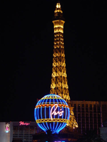
Site name: Paris Las Vegas Hotel & Casino
Site address: 3655 S Las Vegas Blvd
Sign owner: Park Place Entertainment
Sign details: The Paris property lies on the east side of Las Vegas Blvd, between the Aladdin and Bally's. The three properties stretch from Harmon Avenue, all the way to Flamingo Rd. The only real neon signage includes the text seen on top of the replica of the Eiffel Tower, and a three-dimensional balloon shaped pylon sign located at the south end of the property.
Sign condition: Structure 5 Surface 5 Lighting 5
Sign form: Pylon; Fascia; Porte-cochère
Sign-specific description: Leaving the Aladdin property, headed north you are immediately confronted with the giant hot-air balloon, which acts as the main marquis sign for the Paris Hotel and Casino. The three-dimensional balloon shape sits among trimmed shrubbery and foliage, representational of a classic French garden. The sign is located on an island with a long driveway on its north side running east into the property. It towers high above the viewer, almost appearing as if it is floating. In the spirit of properties like the Aladdin and the Excalibur, the facade of the resort is modeled after a theme, which is the French City of Paris. Complete with fountains, replica street fronts and markets, the main focal point is a life size replica of the Eiffel Tower. Some signage is located high up on the tower, in yellow channel letters. The sign reads "Eiffel Tower Restaurant." The three-dimensional sculpted pylon sign is composed of basically three pieces. At the very bottom, a large post holds up the second section of a large cube. All four sides of the cube are occupied by square, advertising screens. The two facing east/west are back lit color plastic, while the ones facing north/south are LCD screens. The cube is finished in stucco, with sculptural treatments along all of the edges of the cubes. The edges are made to look like giant ropes with knots on all eight corners. The sign is located on the East Side of the strip, yet the only directional orientations are on the cube that the balloon sits on. The spherical structure is an exterior frame with blue vinyl material stretched to form the balloon shape. Steel framework also runs around the circumference in six different places along the structure. On the north and south sides Paris is spelled in red channel letters, filled with incandescent bulbs and bordered in neon. The blue vinyl material is treated with graphic painted images, which are repeated around the circumference of the balloon. The images are of lion heads holding red sashes, above golden eagles. On the middle section an image of a woman's face is surrounded by a golden halo. The yellow structural supports, which are visible on the exterior, also house tubes of neon. The resulting effect is a repeating pattern of neon running up the length of the structure, with horizontal bands around the bottom of the structure, below the channel letters and above them also. A criss-cross pattern adorns the two bands below the text, as well as a scalloped pattern above the text also. The porte cochere is a circular drive with the only lighting being incandescent bulbs running along the raceways, which create the structure of the interior. The structure is finished in a patina bronze, made to look oxidized.
Sign - type of display: Neon; Incandescent
Sign - media: Steel; Plastic
Sign - non-neon treatments: Graphics; Paint
Sign animation: Chasing, flashing, oscillating
Notes: The incandescent bulbs inside the text reading "Paris" on the balloon oscillate rapidly.
Sign environment: Located between Bally's and the Aladdin, two heavily frequented and boisterous properties themselves, the Paris fits nicely creating it's own environment that stands alone when entered. If a pedestrian is present among the stunning architecture, it is easy to be pulled into the theme. Even though the Bellagio is west across the street, the expanse of the street keep the Paris far enough away to be mostly independent, that is of course if the Bellagio's water show is not being displayed. The surrounding properties of Bally's, the Aladdin, and The Bellagio make the area of Las Vegas Blvd between Harmon Ave. and Flamingo rd. a fantastic world stylized cities and dazzling imagery, yet an interesting mix of architecture and signage.
Sign designer: Architect/consultant: Bergman, Walls & Youngblood Ltd. Contractor: Perini Building
Sign - date of installation: 1997
Sign - thematic influences: The Paris Hotel Casino is obviously themed after the actual French city of Paris. The entire facade represents the Parisian atmosphere containing the most famous of Parisian attractions including the Eiffel Tower, the Arch de Triumph, open air cafes, plazas utilizing fountains, and the ornate architecture that spans from gothic to neo classical. The Paris fits into the themed hotel casino industry seamlessly, actually boasting one of the more ornate and unique facades. Other properties that parallel the Paris in style and genre include the Aladdin, the Venetian, and the New York New York. In fact it fits into the category of Hotel/Casino whose theme is what dominates the aesthetic surroundings as well as operation inside and out. Other facilities contain elements of a theme, such as the Stardust, but the interior and exterior are no longer the dominant aspect of the aesthetics. It also fits into the category of resorts themed after actual cities.
Surveyor: Joshua Cannaday
Survey - date completed: 2002
Sign keywords: Chasing; Flashing; Oscillating; Pylon; Fascia; Porte-cochère; Neon; Incandescent; Steel; Plastic; Paint; Graphics
Mixed Content
Photographs of Laughing Jackalope signs, Las Vegas (Nev.), 2002
Date
Archival Collection
Description
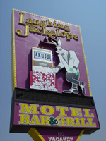
Site address: 3969 S Las Vegas Blvd
Sign owner: Dan, Ron and Randy Horowitz
Sign details: The motel resides on the east side of the strip, and is one of the larger properties on the southern tip of Las Vegas Blvd The facility fits into the typical model of the roadside motel on this portion of the strip. An official building sits on the north side of the property and precedes a span of pavement centered with a pool, and backed by the flanking wings of rooms. A pylon side is on the north end of the property, across a span of pavement from a grass island with a rather large statue of an elephant made of fiberglass. In the near distance behind the island, the pool house for the said pool, is adorned with distinct neon as well.
Sign condition: Structure 3 Surface 2 Lighting 4 Notes: Certain neon tubes around the top of the building are falling and in disarray. Besides that, the signage seems to be in good repair.
Sign form: Pylon; Fascia
Sign-specific description: On the north face of the building, two internally lit, horizontal, rectangular cabinets. Located on the right hand side of the plane of the wall, the yellow steel cabinets hang in close proximity to each other. One in the top right-hand corner, and one sitting right below the former. Both signs are identical in size and a yellow raceways which are lined with incandescent bulbs. The face of the top cabinet reads "Laughing Jackalope", in smaller text on the left hand side, while the rest of the sign is occupied by all capital, yellow, text reading "Bar & Grill." The bottom sign reads "Progressive Video Poker," and "24 HR." Moving around to the west face of the building, another internally lit cabinet rests on the wall above the main entrance. This cabinet has rounded ends, but is the same as the previous two in color and design. This surface reads "Bar & Grill" in yellow text, flanked on either side by the angled logo text, which reads "Laughing Jackalope," also in yellow text. Further south, down the face of the building, above the driveway to the covered valet, a cabinet hangs, which is identical to the one above the main entrance. The only difference is the text. The text reads "Video Poker" in large, all capital, yellow letters. The same two signs seen on the west face are represented on the south as well. The one that reads, "Video Poker," hangs on the left near the "Bar & Grill" cabinet. The pylon sign resides further south in the parking lot. A two sided rectangular pylon rests atop a square post which transforms into a "V" shape. The inverted triangular section supports, an internally lit, black, double-backed cabinet. The face of the cabinet is designed with two sections. The top third of the face is an LED message center, while the remaining two-thirds is purple backlit plastic with Yellow text. The text reads in two lines, "Motel, Bar, & Grill." The rectangular cabinet rises out of the top of the previous cabinet, with the vertical edges angling slightly outward. At the top of the sign, upon the purple steel surface, the "Laughing Jackalope" logo text is spelled in yellow channel letters, and outlined with neon. The interiors are lined with yellow neon on the interior, and on the outside is lined with red. The remainder of the face of the cabinet is occupied by a two-dimensional cabinet. It is crafted into the shape of jackalope/ man figure, playing a slot machine. The surface of the cabinet is graphically treated with the details of the figure and apparatus. Silver coins adorn a pink face, complete with the proper details of a slot machine. The figure is treated appropriately as well, with brown antlers, and white tuxedo. The exterior of the cabinet is painted yellow with a yellow raceway border, lined with incandescent bulbs.
Sign - type of display: Neon; Incandescent; Backlit
Sign - media: Steel; Plastic
Sign - non-neon treatments: Graphics; Paint
Sign animation: Chasing, flashing
Notes: Each one of the letters on the laughing jackalope pylon illuminate one at a time, starting from left to right. They all simultaneously flash off then on then off before restarting the sequence
Sign environment: The environment for the Laughing Jackalope is interesting. Not only is it present on the declining, and simultaneously growing southern end of the strip. It stands out in the dusty remains of the south standing in purple and yellow, screaming at who ever walks by, with an atmosphere that is reminiscent of the garish imagery portrayed by authors such as Hunter S. Thompson. It almost seems surreal, yet fits right in with the surroundings as well. The motel portion fits into the typical design of the roadside motel. Across the street, the Mandalay Bay and the Luxor remind the laughing Jackalope of its place, and maybe imminent fate. The signs are very pedestrian friendly, providing access right up close.
Sign manufacturer: Diamond Head Sign Co.
Sign - date of installation: 1997
Sign - date of redesign/move: Before the Laughing Jackalope was opened it was a property called the Sunbird Inn.
Sign - thematic influences: An interesting theme presented in this southern Las Vegas Blvd Property is centered around the fictitious animal called named the Jackalope, presumably a presentation of the marriage of an antelope and rabbit bodies. Other than the presence of him as a mascot, the theme presented is none other than the aesthetics of hue and nature of the establishment. The hanging wall cabinets are adorned on the edges with raceways lined with incandescent bulbs that chase each other in a rapid fashion, along with a uniform design of font in a combatant duel of the complimentary colors of purple and yellow. It definitely fits into the common design rubric of animation and placement as well as that of the roadside motel. The low level bank of rooms further east on the lot from Las Vegas Blvd is accompanied by a bar and grill. The Laughing Jackalope
Surveyor: Joshua Cannaday
Survey - date completed: 2002
Sign keywords: Chasing; Flashing; Pylon; Fascia; Neon; Incandescent; Backlit; Steel; Plastic; Graphics; Paint
Mixed Content
Transcript of interview with Doug Unger by Barbara Tabach, August 26, 2014
Date
Archival Collection
Description
Interview with Doug Unger by Barbara Tabach on August 26, 2014. In the interview, Unger discusses his schooling, his family's mattress business, and his endeavors in the company and the mattress industry in Las Vegas. Unger becomes involved in Holocaust education and the Sperling Kronberg Mack Holocaust Resource Center.
Doug Unger was born in Cleveland, Ohio, and grew up working summers in a mattress factory, a family business started by his maternal grandfather. After graduating from high school in Cleveland, Doug attended the University of Cincinnati until moving to Steamboat Springs, and enrolled in Denver University, though ended his college career one class away from graduation. Eventually, Unger moved back to Cleveland, then to Las Vegas. In 1976, Dough bought Supreme Mattress and moved to Las Vegas to build his new business. Outside his successful career, Doug was always an active member in the city's Jewish community. He joined Congregation Ner Tamid, where he was a trustee. He became involved with the Jewish Federation, serving as treasurer and later as president. When he moved to Reno, Doug joined Temples Sinai and Emanu-el, and also became heavily involved with Guide Dogs for the Blind Friends Committee, serving as its director for a period of time. He was also the co-chair of the Governor's Advisory Council on Education Related to the Holocaust (GAC). Doug was instrumental in establishing the Library for Holocaust Studies as a successful organization, independent of the Jewish Federation. The Library is now located in its own, donated space, run by trained staff, and receives $200,000 from the state biennially.
Text

Transcript of interview with Anthony A. Marnell II by Stefani Evans and Claytee White, September 29, 2016
Date
Archival Collection
Description
Twentieth-century visitors to the Las Vegas Sands Hotel experienced the masonry work of Anthony A. Marnell, who removed his family from Riverside, California, to North Las Vegas in 1952 in order to build that structure. When he formed his own masonry company in 1958, he taught his namesake nine-year-old son the skills of a mason and the value of honest work. The younger Marnell learned all he could about construction from his father and completed his education by graduating USC School of Architecture in 1972, serving his apprenticeship, and becoming licensed in 1973. After designing McCarran Airport's A and B Gates, he teamed up with Lud Corrao in 1974 to form Marnell Corrao Associates, the first design-build firm in Southern Nevada. Marnell Corrao built many of Southern Nevada's most iconic hotel-casinos including the California Hotel, Maxim Hotel, and Sam's Town and Steve Wynn and Treasure Island, The Mirage, Bellagio, and New York New York as well as the Rio All-Suite Hotel and Casino and the M Resort Spa Casino. In this interview, the Riverside native speaks to the importance of teaching future generations about the value of work, of earning the sense of accomplishment, and of fueling one's inner spirit. His philosophy built a work environment that encouraged employee longevity from the beginning in 1974 (he is employee number one, and his assistant is employee number two). He talks of the American Institute of Architects (AIA), of entrepreneurial gamesmanship, and of casino greats Bill Boyd, Jay Sarno, Cliff Perlman, Kirk Kerkorian, and Steve Wynn. He describes the evolution of Las Vegas resorts from prioritizing casino games to fine dining to night clubs and entertainment. He credits his own Rio staff tradition of serving Chef's Table to the employees and the Rio's award-winning chef, Jean-Louis Palladin, for beginning the Las Vegas food renaissance in the late 1990s that rebranded Las Vegas as a Mecca for celebrity chefs. The nine-year-old who worked part time in his father's masonry business learned his lessons well, much to the benefit of Southern Nevada's growing skyline, its residents' growing waistlines, and its businesses' growing bottom lines.
Text
Charles Lanman Papers
Identifier
Abstract
Charles Lanman Papers (1864-1868) contain the title page of the Dictionary of the United States Congress and the General Government, written by Lanman, solicitation requests for biographical information from notable government figures, and written replies. Of interest with regard to Nevada are the original handwritten letters from James W. Nye and William M. Stewart.
Archival Collection
Photographs of O'Shea's signs, Las Vegas (Nev.), 2002
Date
Archival Collection
Description
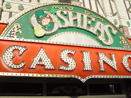
Site address: 3555 S Las Vegas Blvd
Sign owner: Park Place Entertainment
Sign details: O'Shea's Casino is located just north across a small driveway from the Flamingo. The small but busy facade is a small, yet busy stop along the Las Vegas Strip. The exterior signage consists of two corner signs, a blade sign, hanging off of the west face of the building, a main entrance sign, backlit screens as well as various images laden with neon. All of these create a flashing display of luminescence all just above the pedestrian's head.
Sign condition: Structure 5 Surface 5 Lighting 5
Sign form: Fascia
Sign-specific description: O'Shea's Casino is located just north across a small driveway from the Flamingo. O'Shea's theme and signage is influenced by Irish culture and imagery, integrated into the forms of signage along the Las Vegas Strip. The building design itself is influenced by traditional European housing imagery, generalized with other elements of architecture also. One example of this is the coloring, exposed wooden beams and narrow rooflines over treated windows, which suggest styles seen in classic European architectural imagery. Examples of other elements such as sculpted windowsills and exterior molding are more akin to neoclassical than the Irish pub or cottage. A small blade sign hangs in the center of the structure facing north /south. Attached off of the building by two poles, the double sided cabinet is designed with a circular portion at the top that transforms along it's bottom edge into length portion of the "blade" that continues down to a rounded bottom. The Circular portion serves as the "O" in O'Shea's. The exterior of the signs width is finished in a polished gold aluminum surface. The top portion continues into a full circular space in the front where the backlit image of the O'Shea's leprechaun mascot resides in it's center. The image has a circular green neon border at the edge of the cabinet and is set into a field of incandescent bulbs, which occupy the remaining space in the face of the "O". Incandescent bulbs also run around the edge of a face on a gold raceway. Channel letters run vertically down the face of the blade spelling the remaining "Sea's" of the title. Each letter is filled with incandescent bulbs, and bordered on it's exterior in green neon. The remainder of the space, which comprises the surface of the sign, is a green material. The entire edge of the rest of the sign is also bordered with incandescent bulbs. Below the blade sign, the main entrance for the establishment is denoted by the large, arched, marquee logo, and wall sign for the casino. The arch shape is bordered by gold polished raceways, with the interior space where the O'Shea's logo is written in a bowed, horizontal arrangement with the "O" and "S" being the biggest letters in this group. The same back-lit leprechaun figure which is present in the blade sign, in seen in the "O" of the logo. The letters are of channel design and filled with incandescent bulbs. Gold scrollwork adorns the green background above and on the sides of the logo. An entablature, running the length below the arch, reads "casino" in channel letters filled with incandescent bulbs and bordered with green neon. The orange background in contained on the bottom edge with a gold polished raceway, which sharply curves into a downward point at the very center. All the raceway edges of the sign are lined with incandescent bulbs. Flanking the wall on either side of the main entrance are two backlit message centers with vinyl lettering. They also are bordered with incandescent bulbs, strewn upon polished raceways. To the south toward the Flamingo Casino, a corner marquee sign faces toward the southwest. The message center on the right of the main entrance essentially continues its shape wrapping in radius fashion all the way around the corner. As the entablature wraps the corner, the color changes to a section of black, containing the channel letters hung at a slight angle, spelling the words " Hall of Fame," in cursive text. Small stars in channel design adorn the black background. On the left of the text, O'Shea's is painted in red paint, in a cursive script at a similar angle as the premier text. Neon is shaped over the surface of the letters to allow it to be spelled in light. The word "Casino" is spelled on the right hand side, and treated in the same fashion. A top the black portion of pediment, the sign continues with it's corner finishing, rounded marquee, containing the text, "Magic & Movie," in a three lined arrangement. Putting the two signs together the appropriate title for the advertisement of the attraction is read "Magic and Movie Hall of Fame." The channel letters on the top portion are filled with neon and treated white on the interiors. The edge of the cabinet is treated with white bull nose borders, sandwiching a field of pink holding two tubes of contoured neon. At the peak of the sign a small element reminiscent of a fan, created using a multi layered box, uses different levels receding into space, with the center blade at the front of the sign. The sections are lined with gold raceways and incandescent bulbs, with the center blade being horizontally striped with tubes of neon. Two small gold finished gargoyle statues flank either side of the theatre-esque entrance. Underneath the overhang created by the corner sign, polished aluminum element creates a sloping drum shape above the door. This drum is divided into sections by gold polished raceways. The flat portion, which returns to the ceiling of the overhang is adorned with painted images of clovers, encircled in rings of green neon. This section is reminiscent of the top section of the corner drum of the Barbary Coast. The black pediment along the south portion of the building., abruptly changes to the orange color seen on the main entrance. Along the south wall section of the pediment green pan channels in the shape of clovers hang, lined on the interior with neon. A small sign denoting parking is also present. Another corner entrance is located on the north end of the property, facing northwest. It too has the rounded corner entrance and logo sign. Slightly different than the main entrance, the same "Casino text and structure is seen on the orange pediment above the door, as well as the channel logo with the mascot located in the letter "O." A three-sectioned panel with swooping wings and an arched center creates the field for the main logo. A more busy section of two dimensional scrollwork sits below the neon filled text. The wings of the top section a recessed panels with checkerboard design behind that. Each side of the entire top section is book ended with two small square posts. Three small miniature spires line the very top, and the same inverted drum shape sits underneath the door. Street posts reside on the sidewalk outside.
Sign - type of display: Neon; Incandescent; Backlit
Sign - media: Steel; Plastic
Sign animation: Chasing, flashing, oscillating
Notes: All of the bulbs, which reside in the fascia signs which designate entrances, oscillate rapidly. The entrance sign a bit closer to the north end of the property also contain the pan channel star shapes, with incandescent bulbs in the center. The bulbs which, reside on the widths edge of the small pole sign at the south end of the property, oscillate giving a twinkling effect. The main pylon's animation is rather simple considering the amount of lighting. Bulbs which create the dazzling background chase each other upward to the very point, then once they reach the top, each letter light up from left to right, one at a time, then off one letter at a time. The letters all turn on simultaneously while, while the background chases up, leaving the lights off in its trail. The text then shuts off as well. The small incandescent bulbs lacing the background of the main body of the sign oscillate subtly, twinkling themselves. Each letter of the text contains a single row of incandescent bulbs, just inside the border of the red neon. This row is always on in a chasing animation from left to right even when the letters are dark. The animation for the three sided, pole sign, at the north end of the property is adorned with sparkling animation as well. The purple bulbs, which create the border of the main base, chase each other from bottom to top, and the star shape in the center is filled with oscillating incandescent bulbs. The bulbs, which also encrust the bottom surface of the cabinet, oscillate as well. The incandescent bulbs, which adorn the background of the text portion of the sign, also sparkle with a soft random oscillating pattern. The stars which sit on top of the cabinet, animate in a random, non descriptive fashion. The inner star shaped pans oscillate with incandescent bulbs, and the neon borders flash on then off, in a clumsy random order. The three-sided sign also rotates, one of the few animatronic signs on the Strip.
Sign environment: Being essentially part of the Flamingo, O'Shea's is only separated by a small drive, producing the easy traffic flow from the north entrance of the former. The north of O'Shea's on the immediate vertical explosion of the front tower/porte cochere of the Imperial Palace. It is easy to say that O'Shea's is sandwiched in between two giants, assuming its place as the charming gap between the Flamingo and the Imperial Palace which is quite a bit more pedestrian friendly. Traveling north on the east side of the strip, O'Shea's is not hard to miss at all
Sign - date of installation: Original date of installation 1989. The southwest, and northwest corner signage were added at a later date
Sign - thematic influences: O'Shea's centers around the theme of the Irish pub, utilizing various imagery to get support the design. The color green is used extensively in the main signs color scheme while the ever-popular image of the folkloric leprechaun illuminated it a cartoon form upon the pylon. The green pan channels, which are shaped like shamrocks, are place along the exterior wall, an obvious reference to the St. Patrick's Day Holiday as well a reference to good luck. ( example: the four-leaf clover, luck of the Irish.) Luck is something synonymously associated with an industry such as gaming. Gold is also used extensively with the exterior referencing the infamous pot of gold associated with the lore of leprechauns. The actual structure itself is constructed with elements which suggest a European rustic cottage.
Surveyor: Joshua Cannaday
Survey - date completed: 2002
Sign keywords: Chasing; Oscillating; Fascia; Neon; Incandescent; Backlit; Steel; Plastic
Mixed Content