Search the Special Collections and Archives Portal
Search Results
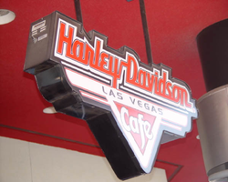
Photographs of Harley Davidson Cafe signs, Las Vegas (Nev.), 2002
Date
Archival Collection
Description
Site address: 3725 S Las Vegas Blvd
Sign owner: Marc Packer
Sign details: Just north of the Tourist center the Harley Davidson cafe sits on the corner of Harmon and Las Vegas Blvd, facing west, with the corner pointing to the northwest. This properties exterior signage consists of two wall marquee wall signs on the west and north faces of the building, a small hanging sign above the entrance, a tall north/south facing pylon sign on the south end of the concrete courtyard that comprises the front of the property. A giant three-dimensional sculpture of a Harley Davidson motorcycle is integrated into the structure of the building to appear as if it is bursting out of the northwest corner of the building. Above the motorcycle is a marquee cabinet advertising for the cafe.
Sign condition: Structure 5 Surface 5 Lighting 5 Notes: See description
Sign form: Pylon; Fascia
Sign-specific description: On the west and north faces of the building, "Harley Davidson Cafe" is spelled in a continuous channel design, only being interrupted by the break between the rest of the text and the word "Cafe." This text is supported by a sleek, black, steel cabinet, that mimics the style of font used for the logo. The letters are crafted of red, shallow, steel channel letters, with white neon around the border as well as red neon on the interior. Standing on the South end of the property the pylon sign is reminiscent of old roadside pole signs, for it is mostly pole. The faceted pole is finished in polished stainless steel giving it highly metallic finish. At the top of the sign a sculpted marquee cabinet holds the advertisement for the cafe. The top portion of the cabinet is the Harley Davidson text logo, supported by an inverted triangle shape, with two lengths running along the underside of the text. The design for the letters is the same as that found on the buildings wall signs with white neon outlining the text, with red neon on the interior. The cabinet itself, without the text, is bordered with red neon, illuminating the highly polished surface of the cabinet. Underneath the Harley Davidson text on the outstretched arms the text "Las Vegas" is spelled in small, black, channel letters with white neon on the interior. Inside the inverted triangle shape created by the cabinet, is another inverted red triangle created by an open channel pan. Cutting across the triangle is channel letters, which spell the word "cafe" painted white on the interior. This text is filled with white neon. The pole continues above the cabinet a short distance. Along the length of the pole, "V" shaped channels repeat, forming a sort of directional sign pointing toward the ground. The channels are filled with tubes of red neon. These chase each other downward pointing toward the plaza and a small blurb of text painted at eye level in red paint. The phrase reads "The best BBQ in Las Vegas," in all caps. The text is then overlaid with red neon. The cabinet on the top of the pylon is repeated over the giant replica motorcycle, facing northwest, upon the northwest face of the wall. The neon scheme is the same as the pylon sign but the "cafe text" is filled with incandescent bulbs. Beneath the motorcycle, and directly over the door, a small back-lit version of the northwest wall above head height.
Sign - type of display: Neon; Incandescent; Backlit
Sign - media: Steel
Sign - non-neon treatments: Graphics
Sign animation: Chasing, flashing, oscillating
Notes: The incandescent bulbs inside the text reading "Paris" on the balloon oscillate rapidly.
Sign environment: Harmon and Las Vegas Boulevard plays host to the Aladdin, which includes the Blue Note jazz and blues club. The Harley Davidson Cafe's sun drenched patio creates the west facade while it stretches east down Harmon to face the Blue Note. This orientation actually creates an intimate feel to the street, seemingly separated from the strip.
Sign manufacturer: Mikhon Lighting and Sign
Sign designer: Roger Pratt
Sign - date of installation: 1999
Sign - thematic influences: The theme of the exterior revolves around the design of the Harley Davidson motorcycle. The slightly italicized Impact text is reminiscent of the text seen on the motorcycles' fuselages. The vertical pylon sign is clearly influenced by roadside, marquee pylon signs, treated in a material also reminiscent of the steel beasts. The exposed metal exterior of the poles can only be associated with the aesthetic so commonly associated with the vehicles.
Sign - artistic significance: Similar to properties that are representative of everyday establishments such as McDonald's and Walgreen's, the Harley Davidson is representative of the themed restaurant, catered to a family environment. It too is an everyday occurrence, of a cafe, dressed with a theme to attract patrons, as well as survive and fit it in the context Las Vegas Blvd Even though the themed restaurant is a popular idea abroad, The Harley Davidson fits in with its partners in the themed cafe industry such as the NASCAR Cafe and Planet Hollywood. Many restaurants among the casinos are themed but, there are only a few that are independently represented with their own signage. The giant replica of the Harley Davidson is also in the tradition of other giant Casino mascots throughout local history. Such mascots could include The Coin King, Mr. O' Lucky, and the original Aladdin sculpture.
Surveyor: Joshua Cannaday
Survey - date completed: 2002
Sign keywords: Chasing; Flashing; Oscillating; Pylon; Fascia; Neon; Incandescent; Backlit; Steel; Graphics
Mixed Content
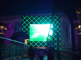
Photographs of MGM Grand signs, Las Vegas (Nev.), 2002
Date
Archival Collection
Description
Site name: MGM Grand Hotel and Casino
Site address: 3799 S Las Vegas Blvd
Sign owner: MGM Mirage
Sign details: The MGM Grand is host to several types and numbers of signs around the exterior of the property. These types include the MGM lion logo and text which adorn the tops of the towers, a multimedia pylon sign, a golden monument sculpture of a lion which serves as the main entrance, and several smaller textual signs that denote parking and entrances.
Sign condition: Structure 5 Surface 5 Lighting 5 Notes: The MGM's signage is excellent repair, being a less than a decade old. The structure is intact, as well as all the lighting, and surface.
Sign form: Pylon; Fascia; Porte-cochère
Sign-specific description: The property contains different types signs including Pylon, sculpted three-dimensional signs as well as building front logos. The pylon sits along the East side of Las Vegas Blvd, just north of Tropicana Blvd, and faces north /south. Constructed as if to appear as different sized towers from the emerald city, the double backed pylon contains the MGM Lion Logo in a backlit steel cabinet and the Letters "MGM" at the top in gold polished channel letters with horizontal bars of Neon. Directly beneath that sit two message centers one being an animated color LED screen on the left, and the one on the right being a backlit plastic advertisement screen. Located beneath the two screens the phrase The City of Entertainment in all capital polished gold aluminum channel letters with neon running horizontally across the diameter of the letters. The sculpted three dimensional lion structure sits on the North East corner of Las Vegas Blvd and Tropicana and faces to the Southwest. The statue appears to be made of polished gold and is surrounded by an impressive array of fountains, which are illuminated themselves. The statue is ambiently lit from underneath with spot lighting and the glow of the fountains. Serving as a backdrop for the structure, an impressive wall of multicolored incandescent bulbs form a concave geometric canvass that wraps the corner of the building. This wall is separated into different sized fields by square columns of similar height. Sitting atop each of the columns is a statue of a man holding a giant urn upon his back. The statuary is lit from underneath with ambient lighting similar to that of the lion sculpture. The bulbs animate in a subtle waving pattern that gently creates the illusion of a rippling of the surface.
Sign - type of display: Neon; Incandescent; Matrix; Backlit
Sign - media: Steel; Plastic; Fiberglass; Masonry; Glass
Sign animation: Chasing, flashing, oscillating
Notes: The V-shaped red channels on the silver main pylon chase each other downward toward the ground. The main text on the pylon animates as well. The letters light up one at a time with red neon from left to right as the arrows continue to chase downward. The logo/text sign located above the giant replica of the Harley Davidson, animate as well. The incandescent bulbs which fill the text, spelling the name of the establishment, oscillate, steady burn, then shut off, and then restarting the sequence. The letters that spell cafe on the lower portion of the sign animate in concert and with the same sequence as the main text.
Sign environment: The MGM Grand dominates the corner on which it sits. Headed west on Tropicana toward the Strip the property casts a green glow but not too electrifying. Once you reach the corner you can't help but be overwhelmed by standing underneath the looming golden lion and the bustling fountains. Facing the structure from the corner, the facade becomes a canvass of dancing light and water. Look up toward the strip the giant pylon booms the golden letters "MGM" and busy LED screens.
Sign - date of installation: Property was opened in 1993 but signage was changed in 1998
Sign - date of redesign/move: The original sculpted lion entrance was replaced in 1998 with a new trophy style sculpture. With the original sphinx structure, patrons passed trough the mouth of the lion into the main lobby of the hotel. Guests and visitors now pass around the pedestal on which the lion sits upon.
Sign - thematic influences: The exterior of the MGM Grand Hotel incorporates the themes of the movie industry for which the name is so prominent. Most specifically the Wizard of Oz's Emerald city theme. The structure is designed to look as such with the base color of the building being emerald green as well as the pylon structures and attached buildings such as the parking garage. The font and MGM lion logo are represented with gold coloring referencing Oz's yellow brick road. The statue is reminiscent of an Academy award also referencing the industry which the name is so familiar with.
Sign - artistic significance: The establishment joins the era of themed modern Vegas resorts with its front spectacle, super pylon and aesthetic which is entirely encompassed by its theme.
Surveyor: Joshua Cannaday
Survey - date completed: 2002
Sign keywords: Oscillating; Pylon; Fascia; Porte-cochère; Neon; Incandescent; Matrix; Backlit; Steel; Plastic; Fiberglass; Masonry; Glass
Mixed Content
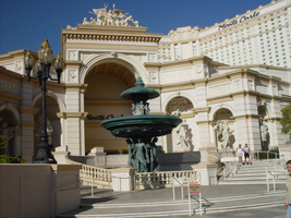
Photographs of Monte Carlo signs, Las Vegas (Nev.), 2002
Date
Archival Collection
Description
Site name: Monte Carlo Resort and Casino (Las Vegas, Nev.)
Site address: 3770 S Las Vegas Blvd
Sign owner: Mandalay Resort Group (50%), MGM Mirage (50%)-Mandalay manages the property
Sign details: The Monte Carlo is located on the west side of the strip just past the New York New York. The signage on the front of the Monte Carlo is limited, with the dominant honors going to the architectural aspects instead. The front facade is made to represent the classical architecture actually found in Monte Carlo. Giant patina fountains are flanked by sweeping staircases, where giant recessed arches and niches hold an abundant array of diversely positioned statuary.
Sign condition: Structure 5 Surface 5 Lighting 5
Sign form: Pylon; Fascia
Sign-specific description: Through the main arch behind the fountain, located on the south east corner, an entrance is guarded from above by black channel letters spelling "Monte Carlo" and filled with incandescent bulbs. This entrance faces southeast. The architecture continues with relief entablature upon fluted columns supporting Corinthian caps, and more statuary. Light posts adorn the sweeping walk in front of the property. Throughout the architecture you can see pools and fountains contained between arches and recessed into other area. Another entrance in the same fashion as the southeast entrance sits facing northeast. Another set of channel letters is set above these doors as well. Just north of the last entrance is the pylon for the Monte Carlo. The pylon fits into the category commonly seen at resorts such as The Mirage, or Luxor. Essentially a giant rectangle in its general silhouette, a multi leveled collection of signs are designated into geometrical planes by the use of classical architectural elements. The sign is at the north end of the Monte Carlo property and faces north/south, and is double sided. The bottom half of the structure is occupied by a tall arch, creating a pedestrian element, allowing passage through the sign. The two legs that flank the arch are created utilizing a pair of double columns supporting a series of crowned ledges supporting yet another architectural element of a pilaster. The resultant effect is two rather massive collections of elements creating the outer legs of columns, combined with pilasters, for the recessed borders of the impressive arch. Above the arch the cabinet rises up divided into two planes, one on top of the other, each holding a message cabinet with a pair of the square post as seen on the structure just below. It creates another pilaster from the front with rows of stacked columns on the structures width. The two arrangements are identical in structure and facade. The difference lies in the different types of display each on holds. The top is a back lit color advertisement currently for magician Lance Burton, while the bottom is an LED matrix screen . The top is an entablature crowned with sweeping overhangs, and containing the text Monte Carlo in black channel letters and filled with incandescent bulbs. The signage on the towers of the hotel are the repeated Monte Carlo logos in giant black channel letters, and filled with incandescent bulbs. On each face of each one of the wings Monte Carlo is spelled in it's trademark text, in black channel letters and filled with incandescent bulbs.
Sign - type of display: Incandescent; Backlit
Sign - media: Steel; Plastic
Sign animation: Oscilllating
Notes: The incandescent bulbs inside the channel letters oscillate, at the entrances on the building as well.
Sign environment: The environment the Monte Carlo creates with its various forms of advertisement abruptly changes in aesthetic contrast to its southern companion and precursor to the northbound traveler. One minute the pedestrian is listening to the nasal audio streaming from the ESPN Zone loudspeakers, to the delicately ornate facade of the Monte Carlo's fountains and highly detailed statuary. Once you cross the drive it is not hard to be attracted the by classical architecture which serves its purpose of bringing in the patron with the limited space utilized for pedestrian passage across the front. I say limited, even though it is one of the more ornate and expansive ones, that is in comparison to its related properties of the Mirage and the Bellagio. The use of architecture makes the utmost use of this great strength of aesthetic by making it interactive for the pedestrian by allowing them to pass up close to the elements while entering the building or traversing the facade. The two giant wings on either end of the property act as arms to pull in people using swooping steps and large fountains. The signage is integrated into this environment, blending in nicely, in similar fashion as the previously mentioned examples. The oscillating incandescent bulbs can be found inside the channel letters, which is the most common animation seen in this type of signage in the other properties as well.
Sign - date of installation: 1995
Sign - thematic influences: The Monte Carlo theme is that of an understated European elegance.
Surveyor: Joshua Cannaday
Survey - date completed: 2002
Sign keywords: Oscillating; Pylon; Fascia; Incandescent; Backlit; Steel; Plastic
Mixed Content
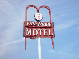
Photographs of Villa Roma Motel sign, Las Vegas (Nev.), 2002
Date
Archival Collection
Description
Site address: 220 Convention Center Dr
Sign details: Just west of the Somerset is the Villa Roma Motel. The only significant signage is located in the pylon side on the edge of the street. The pylon resides on the north side of Convention Center drive with the property facing east/west.
Sign condition: Structure 4 Surface 4 Lighting 4
Sign form: Pylon
Sign-specific description: Just west of the Somerset is the Villa Roma Motel. The pylon resides on the north side of the street with the property facing east/west. The sign consists of a tall white steel pole supporting two double backed cabinets, along with decorative raceways, as well as a logo cabinet. About halfway up the pole, an internally lit, double backed, cabinet cantilevers off of the south side of the pole, facing east/west also. The top of the sign is two horizontal rectangular cabinets, sitting one on top of the other, in close proximity to each other. The cabinets possess aspects of design which add a bit of flavor to plain geometric shape. The faces of the cabinet themselves are concave, bowing in along the length. The maroon surface is also fluted vertically, dividing the surface up into a pattern of vertical rectangles. Along the width of each one of the cabinets, smaller black cabinets run vertically along the edge. These cabinets are adorned with maroon graphically painted scroll work. Channel letters spell the name of the establishment on the two cabinets. The thinner, top cabinet possesses the channel letter text spelling, "Villa Roma," painted white on the interiors. The bottom cabinet's surface contains the text "Motel" in larger all capital channel letter. The interiors of both of both sets of letters are filled with neon. Attached to the bottom of the cabinet, an oval shaped cabinet resides on the north side of the cabinet. It is treated with same maroon color paint ,but the face is adorned with "vacancy" painted on the surface. "No" is spelled in neon as well as being vacancy being overlayed with neon as well. Two pairs of maroon raceways shoot out of the top of either side of the cabinet into the air, then arch inward, meeting at a common point in the center. The spot where each one of the raceway meets, a pseudo oval shaped, internally lit, double backed cabinet professes the logo for the Villa Roma Motel. The logo consists of A capital letter "V" sitting over a Letter "R" in red paint. The raceways also protrudes through the bottom of the cabinet on either side, for a short distance. The edges of the raceways are lined with incandescent bulbs.
Sign - type of display: Neon; Incandescent
Sign - media: Steel; Plastic
Sign animation: Chasing, flashing, oscillating
Notes: The text letters on the porte-cochere and entrances hold a three step animation: The incandescent bulbs all oscillate rapidly inside the letters, then steady burn on, and finally come to rest in the off position. The sequence then repeats. The main pylon sign carries several different sections which all hold different animation patterns. Inside the middle sculptural piece, the incandescent bulbs, which encrust the star shapes, oscillate in a twinkling fashion. The bulbs which border the outlying portion of the middle section chase each other, with the inner row running downward, and the outer row chasing upward. The double rows of incandescent bulbs that create the outer border, also chase each other in a similar fashion. The outer-most lane, of the double rowed bulbs, animate chasing downward, while the inner is treated with chasing animation, which chases upward. The bulbs, which encrust the bottom of the main marquee oscillate, as well as the bulbs on the widths edge of the main message center. The incandescent bulbs, which fill the text in the main marquee of the pylon, oscillate rapidly while the vertical red bars of neon, animate behind them. They star in the middle and chase out to either side illuminating all of the bars, then chase back to the center leaving them dark. They then start all illuminated, and curtain open to either side, then animates, chasing each other from either side back to the middle again. Once all illuminated, they flash off, on, off, on, then off. The marquee seems to be the one with a set sequence. On the main message board, the golden image of the cowboy animates in three stages, rocking back and forth, as if riding the bull. The letters, which adorn the tower of the building, animate in sequence. The incandescent bulbs in each letter light up individually one at a time from left to right, then once all are illuminated, they each oscillate one at a time, from left to right. They then light up continuously from left to right again one at a time, and then turn off. The letters, which run vertically on the northwest side of the tower, also have the same sequence.
Sign environment: The Villa Roma's area is interesting in itself. Convention Center Drive runs east west between the Strip and paradise road, and is home to a unique mix of signage and structures of close but not identical functions. It plays home to the Greek Isles, a bank building, dry cleaners, the Royal Casino, a giant parking lot for the Las Vegas Hilton, as well as the dying Silver Saddle. It stands as a reminder of a roadside motel that is still present, within the heart of an evolving Strip.
Surveyor: Joshua Cannaday
Survey - date completed: 2002
Sign keywords: Chasing; Pylon; Neon; Incandescent; Steel; Plastic
Mixed Content
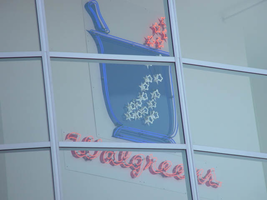
Photographs of Walgreens signs, Las Vegas (Nev.), 2002
Date
Archival Collection
Description
Site address: 3765 S Las Vegas Blvd
Sign condition: Structure 5 Surface 3 Lighting 5
Sign form: Fascia
Sign-specific description: The Walgreens lot is shared with the Fat Burger establishment, and a strip mall of assorted shops. The lot is located on the east side of the strip, just north of the Showcase Mall. On the west elevation of the building the Walgreen's cursive, logo script spells out the word "Walgreen's". The same sign design is repeated on the north face of the building also. The two signs are crafted out of channel letter, with blue and red neon in the interior of the channel. In small black channel letters, a bit further below the logos, there are three separate sets of much smaller channel letters. These spell the phrases "Pharmacy," "24HRS," and "1 Hour Photo." These are also lined on the interior with red and blue neon. Above the entrance to the building, a wall sign crafted of neon in the shape of the "mortar and pestle" is perched above the customers head as they enter the building from the NW. The entire structure of the image of the Walgreen's mortar and pestle, as well as the outline of the exterior stars, is constructed of one giant pan channel. The body of the pestle is made of a series of blue neon tubing which starts in the center of the pan in a square shape and creates a concentric pattern, filling the pan. Small white neon stars float to the top of the sign and into the body of the sign. Below that image, on the same elevated plane, the Walgreen's script logo is written in channel letters with white neon. Below that script is written independently in neon reading "The Pharmacy that America Trusts." Facing north /south, the street-side, pylon sign for the Walgreen's establishment is a multi-use pylon. The sign boasts advertisements for several other businesses, however the Walgreen's advertisement is the most visible and dominant on the face. The architecture of the sign is mostly a giant, stucco covered vertical rectangle with a simple crown cornice molding on the top edge of the structure. The other establishments mentioned on the sign are as read from the top of the sign to the bottom: Alan Albert's Lobster House, Club Utopia, Fatburger, and a small back-lit plastic sign for ice cream and t-shirts. At the bottom of the sign, channel letters spell the phrase parking in rear, with an arrow of the same concept pointing east toward the rear of the property. The pylon is two sided, with almost the entire top of the sign belonging to Walgreen's, and sculpted almost completely out of neon. Red, horizontal neon tubes form a field of light for the neon mortar and pestle, as seen above the entrance. The red field is also home to the cursive, Walgreen's logo script, and the phrase "Open 24 hours." The mortar and pestle are a pan channel including the stars floating out of the top incorporated into its design. Crafted in blue, with white neon for the stars, the mortar handle portion sticking out of the top of the pestle animates to appear as if it is stirring, while the stars turn on and off, representing the concoction being stirred in the body of the image. The Walgreen's script is made of channel letters filled with white neon. The bottom line of the sign that reads "Open 24 Hours," is in all caps, and channel letters with white neon on the interior. They animate in sequence one word at a time from left to right. Along the vertical edge width of the sign, the words "The Plaza" are spelled in red neon.
Sign - type of display: Neon
Sign - media: Steel
Sign - non-neon treatments: Paint
Sign animation: Chasing, flashing, oscillating
Notes: The text, which resides on the southern wall and reads "Casino," is filled with incandescent bulbs that all illuminate at the same time, and oscillate. They then shut off at the same time, and then repeat. The raceways of incandescent bulbs chase each other while the neon, which surrounds the back lit, plastic, screens on this wall flash on then off. The bottom two raceways sandwiching the reflective panel chase from left to right, while the remainder of the raceways surrounding the signs, run right to left. The incandescent bulbs on the pylon chase each other gracefully up the length of the pylon. The animation is patterned so as to appear as if a section of several bulbs are pulsing its way up the towers, hugging the edge of the bulbous tops. The raceways continue around the east face of the building. The umbrellas in the plaza behind the pylon, also are animated with incandescent bulbs chasing each other downward along the raceways.
Sign manufacturer: Mikhon lighting and sign
Sign - date of installation: 1997
Sign - thematic influences: The thematic influence of the Walgreens pylon is based on the logo for the establishment, incorporated into the architectural design of a modern commercial signage. The objects represented in the logo's are based on historical peripheral tools used in the pharmaceutical trade. The mortar and pestle were instruments used by chemists and doctors to grind and pulverize chemical to me mixed together. Since Walgreen's is a pharmacy and purveyor of commonly used goods, the mortar and pestle are appropriate symbols of the property's function.
Sign - artistic significance: Walgreen's fits into a niche of locations on the Las Vegas Strip that are establishments that can be found anywhere in the United States.
Surveyor: Joshua Cannaday
Survey - date completed: 2002
Sign keywords: Flashing; Fascia; Neon; Steel; Paint
Mixed Content
Aruba Hotel (Thunderbird) Neon Survey document, August 30, 2017
Date
Archival Collection
Description
Site name: Thunderbird Hotel and Casino (Las Vegas, Nev.)
Site address: 1215 S Las Vegas Blvd
Sign owner: 1215 Las Vegas Blvd LLC; C.F. Saticoy, LP
Sign details: The building was constructed in 1964 (Assessor). A vintage postcard from 1967 shows the Lotus Inn Motel and a Sambo's restaurant (VintageVegas.com, 2017). The hotel was renamed the Monte Carlo Inn in 1979, but reverted in the 1980's to the Lotus Inn (VintageVegas, 2017). In 1985, it became the Tally Ho (VintageVegas). Casino owner Bob Stupak renamed it the Thunderbird in 1986 or 1987 (VintageVegas). Stupak proposed building 15-story, $400 million resort hotel called the Titanic on the site, but vocal opposition from residents of the nearby John S. Park neighborhood and a trademark controversy derailed the project (Knightly, 2014). The property was renamed the Aruba Hotel in the early 2000's and became the Thunderbird in 2016 (O'Brien, 2016; VintageVegas). As of April 2017, a 15-story residential building was planned for the site (Carter, 2017).
Sign condition: Condition is 5, excellent. The lower portion of the sign is wrapped in plastic. The exposed upper portion of the sign shows the cabinet, paint and neon all in new condition. All of the neon tubes are intact and functioning.
Sign form: Blade
Sign-specific description: The lower portion of the rectangular metal cabinet is wrapped in black plastic. "THUNDERBIRD" is spelled out in white blocks and red serif letters which run vertically down both sides of the plastic wrap. The upper portion of the cabinet is exposed. The cabinet is topped by a bird shape facing the street. The bird and visible part of the rectangular cabinet are painted forest green. Both sides of the bird are covered in white, blue, pink, yellow and green skeleton neon. Underneath the bird , a horizontal yellow skeleton neon tube is visible.
Sign - type of display: Neon
Sign - media: Steel
Sign environment: Las Vegas Blvd north of the Strip. Property is surrounded by other motels and wedding chapels.
Sign - date of installation: c. 2007
Sign - thematic influences: Tropical, Caribbean and Old Vegas. The parrot on top of the sign closely resembles the symbol of the former Thunderbird hotel on the Las Vegas Strip. The property has used the Thunderbird name intermittently since the 1980's, even when it was the Aruba hotel and the word "THUNDERBIRD" appeared over an "Aruba" sign. (Vegas24Seven, 2012)
Survey - research locations: Assessor's website
Survey - research notes: Carter, J. (2017 April 27). Fights are brewing over a proposed 15-story building downtown. Las Vegas Weekly. Retrieved from https://lasvegasweekly.com/intersection/2017/apr/27/fights-are- brewing-over- proposed-building- downtown/ Knightly, A. M. (2014 August 31). A history of landmarks never built. Las Vegas Review Journal. Retrieved from https://www.reviewjournal.com/news/a-history- of-landmarks- never-built/ O'Brien, J. (2016 January 21). Thunderbird Hotel reopening with former Arts Factory owner at helm. Retrieved from http://vegasseven.com/2016/01/21/thunderbird-hotel- reopens/ http://www.vegas24seven.com/substance-cd- release-sinicle- the-great- circuiting-mechanical- death-a- sinners-confession- at-the- aruba-hotel- saturday-june- 30th/ Vegas24Seven.com. (2012). Substance CD Release, Sinicle, The Great Circuiting, Mechanical Death, A Sinners Confession at The Aruba Hotel Saturday June 30th . Retrieved from Vintage Vegas. (2017 February 16). Archive: Lotus Inn Motel, c. 1967. Retrieved from http://vintagelasvegas.com/post/157345077754/lotus-inn- las-vegas Zeitzer, I. (2007 June 29). On The One, The Aruba Hotel " Las Vegas, NV- 6/22. Retrieved from http://www.jambands.com/reviews/shows/2007/06/29/on-the- one-the- aruba-hotel- las-vegas- nv-6-22#ixzz4rBUwxlkh
Surveyor: Mitchell Cohen
Survey - date completed: 2017-08-30
Sign keywords: Blade; Neon; Steel
Text
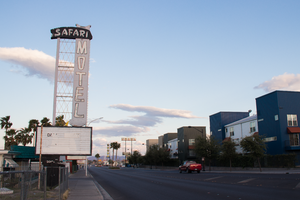
Photographs of Safari Motel sign, Las Vegas (Nev.), April 18, 2017
Date
Archival Collection
Description
Site address: 2001 Fremont St
Sign owner: Harold and Wendy Property Trust, Yeh Wendy Linh, Trs.
Sign details: The current building was constructed in 1956 (Assessor; RoadsideArch, n.d.), although several commentators state that the motel opened in 1954 (Glionna, 2017; VintageVegas, 2017). In its early years the motel was registered with the Automobile Club of America, which vouched for its quality (Glionna).
Sign condition: The condition is 3, fair. The reader board and cabinets are intact. The plastic panels on the east side of the reader board are buckling. The paint on the reader board is fading. The paint on the "MOTEL" letters is peeling slightly. The paint on the "SAFARI" letters and background is peeling moderately. Ten to fifteen percent of the light bulbs on the "MOTEL" cabinet are missing. Almost all of the light bulbs on the reader board cabinet are gone. The neon tubes on the lower third of the sign have shifted position. The neon tubes on the upper two thirds of the sign appear to be in good condition. The neon which spells out "MOTEL" appears to be intact, except for the broken letter "L" on the east side of the sign. Between the reader board and the letter" L" of "MOTEL" is an oblong metal cabinet which is missing all of its former neon.
Sign form: Pylon sign
Sign-specific description: The lower metal pylon is painted black. It supports a black metal framed reader board which is cantilevered toward the street. A rectangular blue metal pole aligned with the center of the pylon rises out of the reader board. To the street side of the pole is a vertical arrangement of three open panels of yellow skeleton neon, the tubes set in a diamond pattern. On the street side of the neon panels is a blue metal cabinet. "MOTEL" runs vertically down the cabinet in white cartoon style sans serif letters which are outlined in white skeleton neon. A row of yellow incandescent light bulbs runs down the street side of the cabinet. Between the reader board and the letter "L" of "MOTEL" is an oblong blue metal cabinet. The top of the blue metal cabinet intersects an irregular oblong shaped black metal cabinet. The black cabinet tops the neon panels and the rectangular pole. Rustic African safari style letters spell out "SAFARI" horizontally across the black cabinet in blue paint and white skeleton neon
Sign - type of display: Neon, LED and Incandescent
Sign - media: Steel and Plastic
Sign - non-neon treatments: LED screen
Sign environment: This location is on East Fremont neighboring many other motels though many of them are currently closed.
Sign - date of installation: Possibly 1960's (Garofalo, 2011; VintageVegas, 2017)
Sign - date of redesign/move: The current sign shows only minor variations from the version displayed on a 1969 postcard (Garofalo, 2011). The pylon previously featured "VACANCY" spelled out in red or pink skeleton neon. AAA and what appears to be another automobile club badge are painted below "VACANCY". The pole and "MOTEL" cabinet were painted red. The oblong cabinet between the reader board and the "MOTEL" cabinet was painted navy blue with "AAA" letters painted in white. A postcard which might come from a slightly later date (the auto club badges on the pylon have been replaced with a sign that states, "AMERICAN EXPRESS CREDIT CARDS ACCEPTED HERE" shows the full neon and incandescent display at night (David, 2010). A photograph from 2011 shows the sign looking almost exactly as it is today (Garofalo, 2011).
Sign - thematic influences: The sign conveys African Safari adventure themes. Also the older advertisements on the sign are remnant of the motor courts and automobile clubs.
Survey - research locations: Clark County Assessor, Parcel No. 139-35-802-002. Retrieved from http://www.clarkcountynv.gov/assessor/Pages/PropertyRecords.aspx?H=redrock&P=assrrealprop/pcl.aspx David, Heather. (2010 September 5). Safari Motel Las Vegas. Retrieved from https://www.flickr.com/photos/14696209@N02/4962785104/ Garofalo, M. (2011 November 1). Still standing-Safari Motel. Retrieved from https://www.flickr.com/photos/vintageroadtrip/6305057788/in/photostream/ Glionna, J. M. (2017 April 23). Motel, once a haven, now a crime-ridden jungle in downtown Las Vegas. Las Vegas Review Journal. Retrieved from https://www.reviewjournal.com/local/local-las-vegas/downtown/motel-once-a-haven-now-a-crime-ridden-jungle-in-downtown-las-vegas/ RoadsideArchitecture. (n.d.). Safari Motel. Retrieved from http://www.roadarch.com/sca/extension3.html Rodgers, L. T. (2016 December 14). No vacancy: The last motels on Fremont Street. Retrieved from http://dtlv.com/2016/12/14/no-vacancy-last-motels-fremont-street/ VintageVegas. (2017 April 23). Safari Motel. Retrieved from http://vintagelasvegas.com/post/159911346449/safari-motel-2001-fremont-st-opened-1954
Surveyor: Mitchell Cohen
Survey - date completed: 2017-09-01
Sign keywords: Neon; Incandescent; Steel; Plastic; Pole sign; Reader board
Mixed Content
Johnny LaVoie Papers on the Culinary Workers Union Local 226
Identifier
Abstract
The Johnny LaVoie Papers on the Culinary Workers Union 226 (1958-1993) contain photographs of Culinary Union meetings; Culinary Union strikes at the MGM Hotel, Frontier Hotel, and other Las Vegas, Nevada hotels; agreements; by-laws; and Culinary Union collective bargaining booklets. Also included are negatives that correspond to the photographs, audiovisual material, newsletters from the Culinary Union and Catering Industry Employees, pins, buttons, and postcards.
Archival Collection
Levy Family Papers
Identifier
Abstract
Collection is comprised of scrapbooks, photographs, awards and certificates, and ephemera mainly dating from approximately the 1950s to 1970s gathered by the Levy family of Las Vegas, Nevada. This collection documents the personal and professional lives of three generations in the Levy family: Harry C. Levy, Al Levy, and Andrew “Drew” Levy. Materials in this collection also include photographs and clippings about the Levy Realty Company and about the various public positions held by Harry C. Levy, such as Las Vegas city commissioner.
Archival Collection

