Search the Special Collections and Archives Portal
Search Results
Howard Hughes Public Relations Reference Files
Identifier
Abstract
The Howard Hughes Public Relations Reference Files (1931-1997) were compiled by Richard "Dick" Hannah, vice-president of the Los Angeles public relations firm Carl Byoir & Associates, which was hired to direct public relations for Hughes’ companies. The collection is primarily composed of newspaper clippings organized into reference files. A significant number of the files contain articles about Howard Hughes’ personal life, the operations of his companies, and legal and political disputes involving Hughes and his companies. The files also document a range of other subjects related to his business ventures, including aviation, aerospace, defense industries, motion picture studios, film stars, communism in Hollywood, and the House on Un-American Activities Committee (HUAC). Later in life Hughes became obsessed with how he was being portrayed in the media. In addition to collecting magazine articles, newspaper clippings, transcripts, screenplays, and books that referenced him. He also collected newspaper clippings about the activities of print media outlets, columnists, radio-television stations, current and former employees, and competitors. The collection also contains newspaper clippings about Watergate, organized crime, gambling, and Las Vegas and contains press releases, correspondence and records generated by Carl Byoir & Associates as well as Rosemont Enterprise, Inc.
Archival Collection
"Stereotypes of Mexicans Projected in Selected Film": manuscript draft by Roosevelt Fitzgerald
Date
Archival Collection
Description
From the Roosevelt Fitzgerald Professional Papers (MS-01082) -- Unpublished manuscripts file.
Text

Chris Lee oral history interview: transcript
Date
Archival Collection
Description
Oral history interview with Chris Lee conducted by Cecelia Winchell and Stefani Evans on December 14, 2021 for Reflections: The Las Vegas Asian American and Pacific Islander Oral History Project. Judge Chris Lee reflects on the lives of his parents, their occupations and experiences during the Korean War, and his family's decision to immigrate from Incheon, South Korea to Las Vegas. He recalls memories from his childhood visiting family in Korea, Korean traditions and food, his educational pursuits, and the livelihood of his parents after immigrating. Chris also shares details of his employment history as Deputy District Attorney for the Clark County District Attorney's Office, as Deputy Secretary of State for Southern Nevada, as the first Asian American elected to the Clark County Justice Court bench, and presently as Judge in Department 1 of the North Las Vegas Municipal Court.
Text
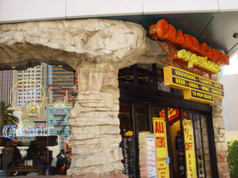
Photographs of Grand Canyon Experience signs, Las Vegas (Nev.), 2002
Date
Archival Collection
Description
Site address: 3791 S Las Vegas Blvd
Sign owner: M H & K Enterprises
Sign details: The Grand Canyon Experience is directly North of the MGM next to the GameWorks complex. Above the clear glass entrances to the outdoor scenic tour's facility is a large building front designed marquee design, as well as a smaller version over the entrance facing northwest.
Sign condition: Structure 5 Surface 3 Lighting 5
Sign form: Fascia
Sign-specific description: The marquee reads Grand Canyon in yellow channel letters outlined in yellow neon, the insides are orange with orange neon in the middle. Experience is spelled in a cursive style orange channel letters with orange neon and incandescent bulbs on the interior. The two texts are supported on a steel framework of interconnecting steel pipes. The shape looks as if it is a bow pointed toward the ground. Two steel poles run vertically approximately 16 feet from the edge of the support system. They run toward the ground against the wall and stop to square i18" tall 10 inch deep, yellow, message box with a black surface. The neon whit von inside of the red channel letters reads "Shop Grand Avenue" in an all caps Arial style text. Two halogen lamps project off of the top of the sign and illuminate a three-dimensional sculpted caricature of a hiker. The entire structure is supported on the West wall of the building. The logo itself spans seventy-eight and a half feet at it's widest and is approximately twenty-three feet tall. Below the NW entrance to the establishment, a smaller version of the giant marquee sign sits above the door. Aluminum channel letters spell " Grand Canyon," with orange argon on the interiors. Below that sits a three-tiered back lit message panel. It forms a shape reminiscent of an upside down step pyramid. The top section actually contains yellow argon in nine-inch cursive text spelling experience. The three stepped cabinet is of a polished aluminum. The text sits on sheet metal raceways.
Sign - type of display: Neon; Incandescent; Backlit
Sign - media: Steel; Fiberglass; Plastic
Sign - non-neon treatments: Paint
Sign animation: Chasing, flashing, oscillating
Notes: The text, which resides on the southern wall and reads "Casino," is filled with incandescent bulbs that all illuminate at the same time, and oscillate. They then shut off at the same time, and then repeat. The raceways of incandescent bulbs chase each other while the neon, which surrounds the back lit, plastic, screens on this wall flash on then off. The bottom two raceways sandwiching the reflective panel chase from left to right, while the remainder of the raceways surrounding the signs, run right to left. The incandescent bulbs on the pylon chase each other gracefully up the length of the pylon. The animation is patterned so as to appear as if a section of several bulbs are pulsing its way up the towers, hugging the edge of the bulbous tops. The raceways continue around the east face of the building. The umbrellas in the plaza behind the pylon, also are animated with incandescent bulbs chasing each other downward along the raceways.
Sign environment: The Grand Canyon Experience is a rather large sign but is dwarfed by the immense MGM pylon just to the south of it. It is accented by faux rock serving as door jambs for the actual entrances.
Sign manufacturer: Mikohn Lighting and Sign
Sign - date of installation: 2000- 08
Sign - thematic influences: The actual theme of the sign is correspondent to that of the business, which the sign advertises. The text does not appear to be associated with any particular theme, but hold a style complimentary to each other. An element of theming is still evident with the faux rock facade, and the sculpted figure on top of the sign.
Sign - artistic significance: If not significant for simply combining different elements to create a completely self-contained sign, it fits into the movement in Las Vegas's history, which is geared more toward the family. The cartoon-like representation of a hiker, the fake rocks, the bright colors, and location in a strip mall, which centered on such establishments as Gameworks and M&M World, all point to the conclusion that families are welcome.
Surveyor: Joshua Cannaday
Survey - date completed: 2002
Sign keywords: Fascia; Neon; Incandescent; Backlit; Steel; Fiberglass; Plastic; Paint
Mixed Content
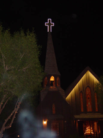
Photographs of Little Church of the West signs, Las Vegas (Nev.), 2002
Date
Archival Collection
Description
Site name: Little Church of the West
Site address: 4617 S Las Vegas Blvd
Sign owner: Greg Smith
Sign details: The Little Church of the West now resides on the south end of the Strip, along the east side among the smaller roadside hotels. Surrounded with pleasant landscaping the property is a charming and welcome sight among the more barren area of the strip.
Sign condition: Structure 4 Surface 4 Lighting 5
Sign form: Pylon; Fascia
Sign-specific description: There are two specific signs which are significant to the property. The first being the double backed internally lit pylon roadside sign which sits on the east side of Las Vegas Blvd and faces east/west. The 10 feet at its widest, and thirty seven feet tall. The structure consists of a center pole upon which an internally lit plastic sculpted message board sits. Painted in an old west script upon the plastic are the words "Little Church Of The West Wedding Chapel," with painted scrollwork on the top and the bottom of the plane. The entire message board is bordered in neon. Sitting on top of the message cabinet is a small, sculpted apse and bell. The original sign from its original construction still exists atop the actual structure of the Little Church of the West. It is an image of a cross outlined in white neon.
Sign - type of display: Neon; Backlit
Sign - media: Steel; Plastic
Sign - non-neon treatments: Graphics; Paint
Sign animation: none
Sign environment: The property sits among the dying roadside motel environment of the South end of Las Vegas Blvd It stands as on of the properties that is still in good repair. The pleasant landscaping and grass provide a pleasant establishment among the southern strip. It seems to capture the environment it has always tried to attain, of the picturesque country church.
Sign manufacturer: Larsen Sign
Sign - date of installation: It was originally part of William J. Moore's Last Frontier Village, which was assembled in the late 1950's. The current pylon sign was manufactured in 1996.
Sign - date of redesign/move: Originally, it resided in the Las Frontier until it was demolished in 1954. The Little Church of the West stood approximately in the spot where Sax Fifth Avenue is located. When the New Frontier was constructed, it was moved to the east side of the Strip approximately where the Silver Slipper was located. It stood in this location until 1978 when it was moved to the south edge of the Hacienda's property. The property was moved to its current location in 1996.
Sign - thematic influences: The thematic influence of the Little Church of the West draws from its original property which was the Old Western theme of the Frontier Hotel Casino. The Last Frontier Village was assembled from actual Western towns and reassembled on the Last Frontier's Property. With its wooden facade, brown color tones, script and pylon structure, the Little Church of the West rings true with its origins, while still incorporating the subtle elements of Las Vegas such as neon.
Sign - artistic significance: The Little Church of the West is reminiscent of old west theme which extends back to the very beginnings of Las Vegas and which dominated the themes for a period of time. " Before it became filled with themed western architecture, Las Vegas was an actual western town with a Spanish Style train station and false front facades fronting plank sidewalks"-Alan Hess, After Hours Architecture. Such properties, which dominated the early years of Las Vegas, were the Pioneer Club, the El Rancho Vegas, the El Cortez, the Last Frontier, Binion's Horseshoe, and the Silver Slipper.
Surveyor: Joshua Cannaday
Survey - date completed: 2002
Sign keywords: Pylon; Fascia; Neon; Backlit; Steel; Plastic; Graphics; Paint
Mixed Content
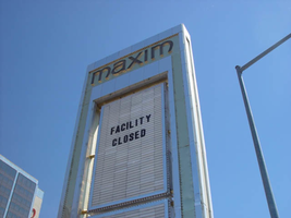
Photographs of Maxim signs, Las Vegas (Nev.), 2002
Date
Archival Collection
Description
Site address: 160 E Flamingo Rd
Sign owner: Premier Interval Resorts
Sign details: The Maxim is located just east of the Bourbon Street, in close proximity to Bally's Hotel Casino. The Maxim is no longer operating, and is fenced off from further inspection. The signage that is seen entails building signs, the original pylon, and the porte cochere
Sign condition: Structure 2 Surface 2
Sign form: Pylon; Fascia; Porte-cochère
Sign-specific description: Building: The tower itself contains the logo and giant text spelling the name of the establishment, on one side of the building. The tower is mirrored and reflective, thus matching the porte cochere and pylon, and reserves to collect its building signage to one end of the tower. The tower, which runs east/west, and faces north/south contains the signs on the east end structure. On the north and south faces of the building, giant red channel letters run vertically along the block surface. The letters look to be lined on the interior of the letters with neon. The logo can be seen on the east face. Pylon: The pylon sign is essentially a giant vertical monolith of a rectangle, divided into several different sub-shapes. The center of the monolith is occupied by cabinets which fill in most of the shape, with a small gap bordering the cabinet. The cabinets are treated the same as the square arch, and flush with the surface. The cabinets are very subtle and create an illusion of one solid object. The entire outer arch shape and interior cabinets are bordered with polished aluminum. The interiors surface of the arch are covered in polished gold aluminum panels. The lining of the incandescent bulbs on the sign is interesting. On the arch the incandescent bulbs are on the interior return width of the aluminum borders. With this configuration, the bulbs sit parallel to the surface instead of perpendicular. The main marquee text is aligned horizontally across the top in gold channel letters with red plastic faces. The letters blend with the gold surface nicely. The interior cabinets are internally lit with plastic faces. There are two cabinets, the larger of the two, occupying the upper part the interior space of the monolith. Incandescent bulbs line the exteriors of the cabinets, sitting back on a recessed edge. Porte Cochere: The porte cochere is unique, opting to rise high above the surface of the pavement. The prismatic design crafted in polished aluminum, interlocks into a pattern suitable to the space which it resides. The recesses in which the decoration resides are separated by a small width of structure. This pattern of giant recesses, matched with the prismatic design in each negative space create a hulking environment high above the head in proud stature. Along the peak edge of the pieces of the prism, rods protrude every foot or so, creating a row of arms holding incandescent spheres.
Sign - type of display: Neon; Incandescent
Sign - media: Steel; Plastic
Sign - non-neon treatments: Graphics; Paint
Sign animation: chasing, flashing
Sign environment: The Maxim is now closed, and stands in marked contrast to its neighbors a bit to the east--the famous "Four Corners" of Flamingo and the Strip, and next to the trendy Meridian at Hughes Center apartment complex.
Sign designer: Maxim letter design: Kenneth Young, Porte Cochere; Lighting: Jack Dubois Pylon sign: Marnell Corrao
Sign - date of installation: 1977
Sign - thematic influences: The influence of the Maxim hotel was 70's Vegas design refined to simple geometric forms and curved linear logo's. The pylon was completely sheathed in polished aluminum, as well as the underside of the porte cochere being polished gold aluminum. The use of the popular 70's material is used extensively throughout the design. Letters hung over the main entrance, as well as signage on three sides of the building. Other examples of the material can be seen elsewhere but not as extensively. The only property that comes close is the pylon for usage of the material is the Westward Ho.
Surveyor: Joshua Cannaday
Survey - date completed: 2002
Sign keywords: Chasing; Flashing; Pylon; Fascia; Porte-cochère; Neon; Incandescent; Steel; Plastic; Graphics; Paint
Mixed Content
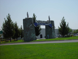
Photographs of McCarran Field signs, Las Vegas (Nev.), 2002
Date
Archival Collection
Description
Site address: 6005 S Las Vegas Blvd
Sign owner: McCarran International Airport
Sign details: On the south end of the Strip, the very last sign on the east side before you arrive at Sunset Blvd Facing West the two stone pylons are set approximately fifty feet off of the street at the end of a dual-lane stretch of pavement separated by an island of grass. The banner marquis between the two pylons stretches over this area of grass.
Sign condition: Structure 3 Surface 3 Lighting 4 Notes: The surface of the pylon is in good shape considering its age and its environmental condition. It is essentially left to fend for itself against the elements, being in the flat expanse of an airfield. The stone, plaques, and paint treatment are all badly worn, with the stone pylons, appearing the least worn.
Sign form: Pylon
Sign-specific description: The original McCarran Air Field entrance is constructed of two masonry pylons sit on an island of grass, and serve as an entrance to the private Hughes executive airport terminal. Each individual tower is adorned with a propeller attached to the front and the representation of a bird's wing crowning the tops Both facets are constructed of steel. When facing the structures the left has a plaque on the bottom section with the inscription "1948" while the one on the right reads "Las Vegas". Between the two pylons a stretch of text in white channel letters and white neon, large text in the old "Frontier style text reads McCarran Airport. The signage sits independently on top of a sturdy connecting steel cabinet, which supports the words "executive terminal" in smaller channel letters, with white neon. The cabinet is a painted blue horizontal plane tapering wider on either end in rounded profile patterns. The wings are outlined in pink neon, while the propellers are outlined in rose neon with a circle of white in the middle.
Sign - type of display: Neon
Sign - media: Masonry
Sign - non-neon treatments: Paint
Sign animation: none
Sign environment: The surrounding area is rather dark due to the wide expanse of the airfield which stretches out behind the sign. It truly is a last marker for the end of the Strip, and stands alone. Even though it is in close proximity to the major strip resorts of the Four Seasons as well as the Mandalay Bay and various small roadside hotels, it seems to stand in solitude.
Sign - date of installation: 1948
Sign - date of redesign/move: The blue banner of steel and white letters was added after its initial construction.
Sign - thematic influences: The masonry pylons are constructed in an adobe style masonry reminiscent of the desert landscape surroundings. Designed for the airport, the appendages stem obviously around the theme of flight. This may be denoted from the propeller and the wing. The juxtaposition of the two elements, one being the method of flight in nature and the other man made, serves as a reminder of mans fascination with flight. The added banner's text is in the pioneer fashion of the original Last Frontier.
Sign - artistic significance: Opened in 1948, the sign was intended for use as a marker for the endpoint of the Strip. " It was part of the city's expanding policy creating a jet-scale entrance for the city," Jorg Rudemer from Lost Las Vegas. Artistic significance also lies in the combination of materials using masonry, steel and, neon. The piece successfully combined these elements to provide an architecturally solid design by day, which was cohesive with its surrounding landscape. A metamorphosis takes place at night as the sign is transformed into a glowing specter of its daytime counterpart. The surrounding area is rather dark as the pylon rises up out of the darkness as a neon marker for the property. The illuminated wing and propeller stand out as the significant and successful partners in the world of flight.
Surveyor: Joshua Cannaday
Survey - date completed: 2002
Sign keywords: Pylon; Neon; Masonry; Paint
Mixed Content
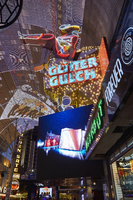
Photographs of Girls of Glitter Gulch signs, Las Vegas (Nev.), June 24, 2016
Date
Archival Collection
Description
Site address: 20 Fremont St
Sign owner: Derek and Greg Stevens
Sign details: Glitter Gulch is next to the Golden Goose. This now closed property has a long history in Las Vegas. In 1959, the Fortune Club was where the Glitter Gulch would soon replace it. For the history of the Golden Goose: Herb Pastor bought the Mecca Club from Sylvia Sioratta in 1974 then opened up the Golden Goose soon after. Mr. Reed's was the property that sat next to the Golden Goose at this time; however, that then became Bob Stupak's Glitter in 1980. In 1981, Pastor ended up buying the Glitter Gulch. In 1991, Pastor merged both of these properties into a strip club. Both of these properties ultimate closed in the summer of 2016. The signage was taken down in 2017.
Sign condition: Vegas Vickie has been taken down and half the Glitter Gulch sign was also taken down.
Sign form: Blade and sculptural sign
Sign-specific description: Perched atop the signage for the Glitter Gulch is Las Vegas favorite girl, Vegas Vickie. She is dressed up in cowgirl attire and kicking her leg out onto Fremont Street. She is painted so you can see all her details in the day and she is a channeled sign lined with neon tubes that matches her paint so you can see her at night as well. She sits on top of a very geometric piece of gold (like a golden nugget) that shines brightly and dotted with incandescent light bulbs. The "Glitter Gulch" letters are open channeled, lined with neon tubes that glow red at night, and filled with neon tubes that glow blue at night and oscillate as well. During the day these letters are a bold white font and instead of a dot for the "I" it is a four point star. Underneath the golden nugget like structure of the sign is a bunch of silver coins lined with neon tubes.
Sign - type of display: Neon, incandescent, back lit
Sign - media: Steel, plastic, fiberglass
Sign - non-neon treatments: Fiberglass and back lit plastic
Sign animation: Neon in Glitter Gulch text oscillates
Sign environment: These signs sit in the midst of the excitement on Fremont Street Experience. Some of the other properties that sit near them are Binion's, Golden Gate Hotel & Casino, and the Plaza Hotel & Casino.
Sign manufacturer: Ad Art
Sign designer: Jack Dubois and Charles Barnard of Ad Art
Sign - date of installation: 1980
Sign - date of redesign/move: Vegas Vickie was taken down in 2017 for restoration and may return back to Fremont after.
Sign - thematic influences: Both of the Glitter Gulch and Golden Goose signs are extremely iconic signs in Las Vegas history and combine elements that are typically used in signage throughout the city, such as: sculptural signage and signs that have a dominant theme for the property. Vegas Vickie being a part of the signage for the Glitter Gulch also gives some indication that this property is a gentleman's club. They are elaborately designed to draw people's attention to these businesses, which many other signs throughout the city aim to do as well.
Sign - artistic significance: These signs are significant because the design of them is elaborate and they are excellent examples of signs that use sculpture/image to help convey the theme of the property. They are also crafted in such an excellent manner and filled with numerous details.
Survey - research locations: Fox news website http://www.fox5vegas.com/story/31783315/d-las-vegas-owner-buys-3-more-fremont-properties , Vintage Las Vegas website http://vintagelasvegas.com/search/glitter+gulch, Review Journal Article https://www.reviewjournal.com/business/casinos-gaming/mermaids-la-bayou-and-glitter-gulch-come-to-a-close-on-fremont-photos/
Surveyor: Lauren Vaccaro
Survey - date completed: 2017-09-17
Sign keywords: Blade; Sculptural; Neon; Incandescent; Backlit; Plastic; Oscillating; Steel
Mixed Content
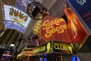
Photographs of Golden Goose sign, Las Vegas (Nev.), June 24, 2016
Date
Archival Collection
Description
Sign owner: Derek and Greg Stevens
Sign details: The Golden Goose is next to Glitter Gulch. This now closed property has a long history in Las Vegas. In 1959, the Fortune Club was where the Glitter Gulch would soon replace it. For the history of the Golden Goose: Herb Pastor bought the Mecca Club from Sylvia Sioratta in 1974 then opened up the Golden Goose soon after. Mr. Reed's was the property that sat next to the Golden Goose at this time; however, that then became Bob Stupak's Glitter in 1980. In 1981, Pastor ended up buying the Glitter Gulch. In 1991, Pastor merged both of these properties into a strip club. Both of these properties ultimate closed in the summer of 2016. The signage was taken down in 2017.
Sign condition: 3, the Golden Goose signage is still on Fremont Street and in good condition.
Sign form: Blade and sculptural sign
Sign-specific description: Perched atop the signage for the Golden Goose is a sculptural goose made out of fiberglass wearing a brown cowboy hat and red scarf around its neck with white polka dots all over it. In its right hand it hold a golden egg covered in incandescent light bulbs, which looks just like the eggs surrounding the bottom of the goose. Under the goose and the eggs surrounding it is a base that has a yellow border on the top and bottom of it and yellow incandescent light bulbs lining these lines. In the center is an orange band. The main portion of the signage for the Golden Goose is an interesting organic shape in a red/brown color that curves inward at in the middle top of the sign and in the middle side of the sign that faces Fremont. The edge of the sign that faces Fremont Street is lined with ten golden eggs that look just like the ones surrounding the goose; however, these vary in size and do not line all the way down the entire sign. This edge of the sign also has red incandescent light bulbs covering it. Each side of the sign is lined with a yellow line that outlines the sign and incandescent light bulbs are part of that line as well. "Golden Goose" is in a stylish mustard yellow font with made up of open channel letters filled with incandescent light bulbs. This sign is also lined with neon tubes that run up and down the sign and oscillate at night.
Sign - type of display: Neon, incandescent, back lit
Sign - media: Steel, plastic, fiberglass
Sign - non-neon treatments: Fiberglass and back lit plastic
Sign animation: Neon tubes lining the Golden Goose sign oscillate.
Sign environment: These signs sit in the midst of the excitement on Fremont Street Experience. Some of the other properties that sit near them are Binion's, Golden Gate Hotel & Casino, and the Plaza Hotel & Casino.
Sign - date of installation: About 1974
Sign - date of redesign/move: The Golden Goose sign was removed from Fremont in 2017.
Sign - thematic influences: Both of the Golden Goose and Glitter Gulch signs are extremely iconic signs in Las Vegas history and combine elements that are typically used in signage throughout the city, such as: sculptural signage and signs that have a dominant theme for the property. The signage for the Golden Goose features a sculpture of a goose to drive the theme of the property to motorists and pedestrians. They are elaborately designed to draw people's attention to these businesses, which many other signs throughout the city aim to do as well.
Sign - artistic significance: These sign are significant because the design of them is elaborate and they are excellent examples of signs that use sculpture/image to help convey the theme of the property. They are also crafted in such an excellent manner and filled with numerous details.
Survey - research locations: Fox news website http://www.fox5vegas.com/story/31783315/d-las-vegas-owner-buys-3-more-fremont-properties , Vintage Las Vegas website http://vintagelasvegas.com/search/glitter+gulch, Review Journal Article https://www.reviewjournal.com/business/casinos-gaming/mermaids-la-bayou-and-glitter-gulch-come-to-a-close-on-fremont-photos/
Surveyor: Lauren Vaccaro
Survey - date completed: 2017-09-17
Sign keywords: Blade; Sculptural; Neon; Incandescent; Backlit; Plastic; Oscillating; Steel; Fiberglass
Mixed Content
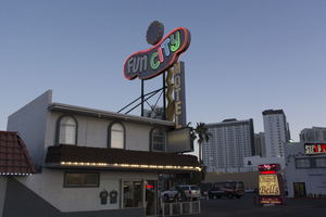
Photographs of Fun City Motel, Las Vegas (Nev.), March 1, 2017
Date
Archival Collection
Description
Site address: 2233 S Las Vegas Blvd
Sign owner: Rick Trusdell and Chetak Development Corporation
Sign details: Originally the Glenn Vegas Motel in early 50's then the sign was reused for Holiday Motel in 1960's and later to the Fun City Motel circa 1970's to current.
Sign condition: This is rated a 2 since the structure is in semi-salvage condition. No treatment seems to have been done. The damage from the sun has left the bright red hue into a grayish purple color. Part of the neon lettering from Fun City is not in working condition.
Sign form: Pole
Sign-specific description: The Fun City Motel sign was installed in 1952. However, the sign has been used in other properties before it became the Fun City Motel. The Sign was first used for the Glenn Motel circa 1950's with a western theme. The reason why the Fun City Motel doesn't resemble Googie influence is because the original funky curvilinear shape was designed to be a peanut. The Glenn Vegas Motel sign included an illustrated rodeo cowgirl holding a looped rope towards the left end of the sign. In the middle top of the sign is a woman diver; towards the bottom of the sign is an outline of a pool with the word swimming pool in the middle. The peanut shape is painted black. In-between all the designs; in large letters Glenn Vegas Motel is written in white with the female diver drawing separating the two words. Underneath the peanut shaped structure is a rectangular sign held by two hooks on each sign with the word motel. The entire structure itself is held by two steel poles with a blue incandescent directional squiggly arrow facing downwards. The Holiday Motel version changed from the black background to a brilliant red with white large neon letters reading Holiday. The sign removed all implication of the western theme and changed the squiggly directional arrow from light blue to a silver hue. There were two additions to the sign; the first is the word motel vertically connected to the side of the directional arrow and second is a circular structure in white and yellow. Later with the Fun City Motel sign there wasn't much change from Holiday Motel. The only significant change was the name of the establishment. The fun city lettering lights up in multiple colors like the rainbow at night. And the two poles that hold up the structure were painted to black. Today the sign itself has lost all its brilliant red hue and is now a gray color from over sun exposure and no maintenance done to the sign. The directional incandescent arrow is still bright yellow.
Sign - type of display: Neon and incandescent
Sign - media: Steel and fiber glass
Sign animation: Chasers for the incandescent directional arrow. The circular structure on the tops of the curvilinear shape have incandescent lights following a circular motion.
Sign environment: This location is on the North end of the strip near the Holiday House, Holiday Motel, and Kaei Thai restaurant.
Sign manufacturer: YESCO
Sign - date of installation: Circa 1970's
Sign - date of redesign/move: 1950's the sign was used for Glenn Vegas Motel, and in 1960's into the Holiday Motel.
Sign - thematic influences: The fun city sign is funky with an odd curvilinear shape that was originally used for a western theme motel as a peanut. Today the theme seems to be clownish with its colorful palette and rainbow neon.
Sign - artistic significance: The fun city sign is funky with an odd curvilinear shape that was originally used for a western theme motel as a peanut. Today the theme seems to be clownish with its colorful palette and rainbow neon.
Survey - research locations: Assessor's page, Photographs on the internet from Vintage Vegas website http://vintagelasvegas.com/search/Fun+City+Motel
Surveyor: Gisselle Tipp
Survey - date completed: 2017-08-30
Sign keywords: Neon; Incandescent; Steel; Chasing; Pole sign; Roof Sign; Back to back; Backlit
Mixed Content
