Search Results
Photographs of Luxor signs, Las Vegas (Nev.), 2002
Date
2002
2017-08-15
Archival Collection
Description
Photos show Luxor signs during the day. Two surveys were conducted to gather information about this sign. One was conducted in 2002 and one was conducted in 2017. PDFs are available for both surveys. See the 2017 survey PDF for additional information that is not included in the object description.
Site name: Luxor (Las Vegas, Nev.)
Site address: 3900 S Las Vegas Blvd
Sign owner: Mandalay Resort Group
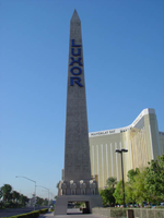
Sign details: The giant black, glass, pyramid rises out of the desert as certainly one of the most unique structures. The pyramid is also accompanied by a monolithic, heavily geometric structure, finished in the same black, panels of windows. Just to the north. The front of the property is dominated by an array or Egyptian architectural landmarks such as an giant obelisk, the Sphinx, various statues of Egyptian gods and pharaohs line the multi tiered expanse of concrete and stucco. The property is pedestrian interactive, being able to pass underneath the giant obelisk, and through and beneath the giant Sphinx. The feel produced by area is appropriate for the desert environment.
Sign condition: Structure 5 Surface 5 Lighting 5
Sign form: Pylon; Fascia; Porte-cochère
Sign-specific description: On the expanse of concrete in front of Las Vegas Blvd, just north of the obelisk, a double-sided pylon sign joins the ancient composition. The pylon actually is more akin to the pylons seen at properties such as the Monte Carlo or the Mirage. It is located in the northern portion of the property on the west side of the strip-facing northwest along Las Vegas Blvd Two square posts support a two-sided square cabinet which houses a back lit advertisement and a set of crafted letters spelling the name of the establishment. Occupying the upper portion of the space between the legs another internally lit, two sided, cabinet, atop a small pair of internally lit sculpted cabinets. From a distance the cabinets look like thumbs holding up the cabinet. The shapes are graphically treated on the surfaces to look like colorful recreations of a hieroglyphic bird, the wings being the elongated portion of the cabinet. The only art attached to the cabinet is the portion designated for the head of the creature. Three sets of sculpted cornices, create borders for the different planes. The bases of the legs are treated with the ledging, the section separating the top cabinet, from the rest of the sign, and finally another set around the top crowning edge of the sign. Both sides of the top edge have a sculpted element in the very center. A flat circle, presumably a representation of the sun, flanked by two snakes are set on a pair of large wings spreading to either side. This element is ambiently lit from underneath. The text, which spells "Luxor," is composed of polished gold channel letters, with closed faces with graphic treatments in blue upon the faces. The faces are painted to appear if the letters are faceted into three dimensions. They are lit from behind with whit neon creating a halo effect around the letters. The surface of the actual structure is finished to appear as if it is constructed of limestone, utilizing false joints and seams. The south end of the property close to the street is the four-sided obelisk. The text on the obelisk is the same word treated in the same fashion, structurally and aesthetically, as the pylon sign. The only difference is that it reads vertically from top to bottom. Statuary adorn the base of the obelisk in a repeating pattern as well as it being covered in hieroglyphic patterns. A tunnel allows for the pedestrian to pass underneath the obelisk. The porte cochere is located underneath the body of the Sphinx, another use of the architecture to incorporate the pedestrian element. If you head east through the sphinx, a tunnel opens up into a small courtyard where a shuttle bus may be caught. The ceiling of the porte cochere is adorned with a circular chandelier, composed of metal representations of leafy branches radiating around a rounded center. The ends of the arms hold length-wise half cylinder lamps. The ceiling above is painted blue. The most spectacular element of the Luxor is its super powerful light in the place of the capstone at the very peak. The beam is one of the most powerful lights in the world, and can be seen from high above into the earth's atmosphere as well. The edges of the pyramid are also raceways, which can be seen in action in the dark. An animation of bulbs makes it appear as if a single bulb of light streams up the base to the very peak. The animation runs at an interval of every couple of seconds. On the very south edge of the property, actually on the southeast corner, is a sculpted, small pylon which houses a color led screen.
Sign - type of display: Neon
Sign - media: Steel; Masonry
Sign - non-neon treatments: Plaster
Sign animation: Chasing
Sign environment: Standing next to the Mandalay Bay on the west side of the southern end of Las Vegas Blvd, the Luxor's front exterior is a sprawling mass of smooth vertical planes turning into eloquent statue and stucco walls. They are interlaced with drives and signage complete with a platform at the base of the Sphinx, which is just east of where the valet and porte cochere are grounded in the base of the beasts belly. From the edge of a Platform a tram station is located and also a view of the signage can be seen as well. The Luxor's environment is a very pedestrian one as well. Being in an isolated part of the strip, the noise clutter brought about by the surging traffic is considerably better than the heart of the strip.
Sign designer: Veldon Simpson
Sign - thematic influences: The theme of the Luxor is obviously that of ancient Egypt. The Ancient Egyptian imagery is placed among the same images but represented in the shiny black glass, giving a touch of future meets the past. The image seen are some of the most commonly seen images when talking about the Ancient Egyptian culture. The Sphinx stands guard at the base of the giant black pyramid, one sign is attached to an obelisk. Various statuary adorn the entire plaza. The environment created with the motif obviously fits into the desert like dust, but still retains the surreal nature associated with the themed hotel. The aesthetics appear to be fantastic, but are a bit odd due to the arrangements and limitations on space. It does however fir into an interesting sub category of resort that is themed around a culture. Yes it is themed around a city, but the culture shines through with more dominance. Another example of this is the Imperial Palace. It is not necessarily themed after a particular city, but the architecture and imagery suggests the Asian culture.
Surveyor: Joshua Cannaday
Survey - date completed: 2002
Sign keywords: Chasing; Pylon; Fascia; Porte-cochère; Neon; Steel; Masonry; Plaster
Site name: Luxor (Las Vegas, Nev.)
Site address: 3900 S Las Vegas Blvd
Sign owner: Mandalay Resort Group
Sign details: The giant black, glass, pyramid rises out of the desert as certainly one of the most unique structures. The pyramid is also accompanied by a monolithic, heavily geometric structure, finished in the same black, panels of windows. Just to the north. The front of the property is dominated by an array or Egyptian architectural landmarks such as an giant obelisk, the Sphinx, various statues of Egyptian gods and pharaohs line the multi tiered expanse of concrete and stucco. The property is pedestrian interactive, being able to pass underneath the giant obelisk, and through and beneath the giant Sphinx. The feel produced by area is appropriate for the desert environment.
Sign condition: Structure 5 Surface 5 Lighting 5
Sign form: Pylon; Fascia; Porte-cochère
Sign-specific description: On the expanse of concrete in front of Las Vegas Blvd, just north of the obelisk, a double-sided pylon sign joins the ancient composition. The pylon actually is more akin to the pylons seen at properties such as the Monte Carlo or the Mirage. It is located in the northern portion of the property on the west side of the strip-facing northwest along Las Vegas Blvd Two square posts support a two-sided square cabinet which houses a back lit advertisement and a set of crafted letters spelling the name of the establishment. Occupying the upper portion of the space between the legs another internally lit, two sided, cabinet, atop a small pair of internally lit sculpted cabinets. From a distance the cabinets look like thumbs holding up the cabinet. The shapes are graphically treated on the surfaces to look like colorful recreations of a hieroglyphic bird, the wings being the elongated portion of the cabinet. The only art attached to the cabinet is the portion designated for the head of the creature. Three sets of sculpted cornices, create borders for the different planes. The bases of the legs are treated with the ledging, the section separating the top cabinet, from the rest of the sign, and finally another set around the top crowning edge of the sign. Both sides of the top edge have a sculpted element in the very center. A flat circle, presumably a representation of the sun, flanked by two snakes are set on a pair of large wings spreading to either side. This element is ambiently lit from underneath. The text, which spells "Luxor," is composed of polished gold channel letters, with closed faces with graphic treatments in blue upon the faces. The faces are painted to appear if the letters are faceted into three dimensions. They are lit from behind with whit neon creating a halo effect around the letters. The surface of the actual structure is finished to appear as if it is constructed of limestone, utilizing false joints and seams. The south end of the property close to the street is the four-sided obelisk. The text on the obelisk is the same word treated in the same fashion, structurally and aesthetically, as the pylon sign. The only difference is that it reads vertically from top to bottom. Statuary adorn the base of the obelisk in a repeating pattern as well as it being covered in hieroglyphic patterns. A tunnel allows for the pedestrian to pass underneath the obelisk. The porte cochere is located underneath the body of the Sphinx, another use of the architecture to incorporate the pedestrian element. If you head east through the sphinx, a tunnel opens up into a small courtyard where a shuttle bus may be caught. The ceiling of the porte cochere is adorned with a circular chandelier, composed of metal representations of leafy branches radiating around a rounded center. The ends of the arms hold length-wise half cylinder lamps. The ceiling above is painted blue. The most spectacular element of the Luxor is its super powerful light in the place of the capstone at the very peak. The beam is one of the most powerful lights in the world, and can be seen from high above into the earth's atmosphere as well. The edges of the pyramid are also raceways, which can be seen in action in the dark. An animation of bulbs makes it appear as if a single bulb of light streams up the base to the very peak. The animation runs at an interval of every couple of seconds. On the very south edge of the property, actually on the southeast corner, is a sculpted, small pylon which houses a color led screen.
Sign - type of display: Neon
Sign - media: Steel; Masonry
Sign - non-neon treatments: Plaster
Sign animation: Chasing
Sign environment: Standing next to the Mandalay Bay on the west side of the southern end of Las Vegas Blvd, the Luxor's front exterior is a sprawling mass of smooth vertical planes turning into eloquent statue and stucco walls. They are interlaced with drives and signage complete with a platform at the base of the Sphinx, which is just east of where the valet and porte cochere are grounded in the base of the beasts belly. From the edge of a Platform a tram station is located and also a view of the signage can be seen as well. The Luxor's environment is a very pedestrian one as well. Being in an isolated part of the strip, the noise clutter brought about by the surging traffic is considerably better than the heart of the strip.
Sign designer: Veldon Simpson
Sign - thematic influences: The theme of the Luxor is obviously that of ancient Egypt. The Ancient Egyptian imagery is placed among the same images but represented in the shiny black glass, giving a touch of future meets the past. The image seen are some of the most commonly seen images when talking about the Ancient Egyptian culture. The Sphinx stands guard at the base of the giant black pyramid, one sign is attached to an obelisk. Various statuary adorn the entire plaza. The environment created with the motif obviously fits into the desert like dust, but still retains the surreal nature associated with the themed hotel. The aesthetics appear to be fantastic, but are a bit odd due to the arrangements and limitations on space. It does however fir into an interesting sub category of resort that is themed around a culture. Yes it is themed around a city, but the culture shines through with more dominance. Another example of this is the Imperial Palace. It is not necessarily themed after a particular city, but the architecture and imagery suggests the Asian culture.
Surveyor: Joshua Cannaday
Survey - date completed: 2002
Sign keywords: Chasing; Pylon; Fascia; Porte-cochère; Neon; Steel; Masonry; Plaster
Mixed Content
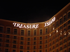
Photographs of Treasure Island signs, Las Vegas (Nev.), 2002
Date
2002
2017-08-30
Archival Collection
Description
Photos show Treasure Island signs during the day and at night. Two surveys were conducted to gather information about this sign. One was conducted in 2002 and one was conducted in 2017. PDFs are available for both surveys. See the 2017 survey PDF for additional information that is not included in the object description.
Site name: Treasure Island Hotel and Casino (Las Vegas, Nev.)
Site address: 3300 S Las Vegas Blvd
Sign owner: MGM Mirage
Sign details: Next to the Mirage, this property complements its sister property
Sign condition: Structure 5 Surface 5 Lighting 5 Signage is in good condition
Sign form: Pylon; Fascia; Porte-cochère
Sign-specific description: The Treasure Island Hotel and Casino sits between the Mirage and Spring Mountain road. Fitting right into the themed hotel resort genre that dominates this side of the strip, the Treasure Island provides one of the more unique facades. Just past the bust of Siegfried and Roy, the dense foliage and trees continue on almost fluently between properties. The first elements you see headed north is the giant sculpted pylon for the resort, set beside a sweeping incline drive, leading to the porte-cohere. The pylon is a collection a heavily crafted and sculpted elements, creating a framework for two message cabinets and a marquee banner on either side. At the base, steel poles exit the ground in a "V" shape, into the interior of the area designated for the LCD and backlit cabinets. Steel poles forma grid work between the "V" shape. The message boards are bordered by steel piles made to appear as if they are pieces of bamboo lashed together at the corners, extending past the joints in an irregular fashion. Two base poles and inner grid are finished in the same fashion. Above the message cabinet a three-dimensional sculpted crows nest sits just below a giant skull adorned with a scarf. The tip of the bottom of green finished crows nest just reaches the top of the two cabinets. The fully three dimensional skull is finished in a realistic fashion. Two giant swords cross each other in an X pattern behind the crow's nest and underneath the skull. The resultant effect is the pirate emblem of the "skull and cross bones" or "jolly roger." The hilts of the two swords come to rest on top of the message centers also. A grid work of false bamboo poles can be seen , providing a buffer between the two halves of the sign. Above the head of the pirate an arched steel cabinet ,creates a banner, which reads "Treasure Island" in white channel letters and filled with incandescent bulbs. Decorative scrollwork adorns the top of the banner as well as the two sides of the skull. The Treasure Island tower is also in the popular Y shaped configuration. The 38 story building stands 456 feet tall, with the text hung on the top of the tower in a couple of different fashions. On the face created by the north and southeast wings of the tower, Treasure Island is spelled in giant channel letters, but the two words are in close proximity to each other, resting in the angle created by the joining of the two wings into the center structure. The southwest face created by the west and southeast wings have the text separated. Treasure on the west towers and island on the southeast tower. The northwest side is appropriately displayed only on the north face of the wing, so the southbound traffic on I-15 can read the letters clearly. The Treasure Island also has two additional signs located toward the back of the property. Those would include a small pylon facing east west actually situated in the rear of the property. The pylon is a simple square supported with two square posts. The other resides on Spring Mtn Rd. headed east on the south side of the street. It resides on the corner of the main traffic flow from the parking garage and inner sanctum of roads leading to the porte- cochere.
Sign - type of display: Neon; Incandescent; Backlit
Sign - media: Steel; Plastic
Sign - non-neon treatments: Graphics; Paint
Sign animation: Oscillating
Notes: The only animation present is in the channel letters themselves. The incandescent bulbs on the interiors oscillate wildly
Sign environment: The front spectacular of the pirate show truly creates the theme of the pirate island, and is where most of the pedestrian traffic for the hotel is present. The pylon is just south of the spectacular, towering high overhead. The Treasure Island's environment is abruptly halted by Spring Mtn road but at the same time, it also wraps the corner of the hotel, and continues west. It is the bookend piece to the other major MGM resorts, which reside south of the Treasure Island. Even though it is a smaller child of the bigger properties, it still looms as a giant to its neighbors the Vagabond and Tam O'Shanter
Sign manufacturer: Atlandia Design
Sign - date of installation: 1993
Sign - thematic influences: The theme of the Treasure Island is painfully apparent, from its name to its live pirate show. The signage truly reflects it as well. Treasure Island is definitely in the class of properties, which can be called a themed resort. The main pylon looks to be constructed out pieces of a wrecked ship, with the most commonly seen symbol for a pirate, in the Jolly Roger skull, being the most impactful piece up there. Steel beams are finished to look like wooden masts, and giant ropes, slinging the entire sign together. It utilizes the three dimensional aspects, yet retains the design of a pylon. Unlike its neighbor to the south the mirage, the Treasure islands theme encompasses the main pylon, with the exception of the pylon in the rear of the property. The surroundings, which provide the background for the pylon, as well as the environment for the property, reflect them as well. The landscaping boasts tropical plants emitting false bird noises, which stretch around to the face of the property, where the pirate village and ships reside in cold waters, and faux cliffs. The wooden planks resembling pier docks, provide a tidy border for the arena and spectators. The theme has been seen before in one sense or related from a slight distance. None has actually utilized the name of the novel, and been so garish with the pirate theme, but it can be tied to propertied that are more island, and paradise themed. Such properties include the Mirage, the Tropicana, and the Castaways.
Surveyor: Joshua Cannaday
Survey - date completed: 2002
Sign keywords: Oscillating; Pylon; Fascia; Porte-cochère; Neon; Incandescent; Backlit; Steel; Plastic; Paint; Graphics
Mixed Content
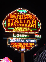
Photographs of Battista's signs, Las Vegas (Nev.), 2002
Date
2002
Archival Collection
Description
Photos show Battista's signs at night. Two surveys were conducted to gather information about this sign. One was conducted in 2002 and one was conducted in 2017. PDFs are available for both surveys. See the 2017 survey PDF for additional information that is not included in the object description.
Site address: 4041 Audrie St
Sign details: Battista's "hole in the wall" Italian restaurant is located in a small shopping mall on the corner of Audrie and Flamingo, just east of the strip. The actual establishment of Battista's faces east in the northwest corner of the shopping center. The pylon sign sits on the northwest corner of FlamingoRd and Audrie st., the entrance to the building is also adorned with neon signs as well. On the extreme north end of the property a pole sign for a general store also shares signage with Battista's.
Sign condition: Structure 5 Surface 5 Lighting 5
Sign form: Pylon; Fascia
Sign-specific description: The pylon sign for Battista's is on the corner of Flamingo and Audrie, on the wet side of Audrie. It is a double- backed roadside pole sign with two cabinets, and an LED message center. The sign is a host of visual candy, laden with neon and incandescent bulbs. The upper portion of the sign is comprised of the larger cabinet, below that the LED message-center, then below that the smaller cabinet makes up the bottom of the sign. The top cabinet has sculpted edges created bulging edges as well as a round top. The two corners are stepped. The bottom of the sign is a flat horizontal edge. The surface of the sign is painted red. The majority of the sign's face is occupied by channel letters spelling "Battista's Italian Restaurant," in channel letters with red neon borders. Below that "Lounge," and then "Banquets" is spelled one on top of each other in yellow channel letters. Yellow neon in on the interior of the channels. Two tubes of green neon extend horizontally from each side of this text. On the far left and right-hand sides of the cabinet, green neon scrollwork adorn the space between the main text and the edge of the cabinet. Spelled in small painted letters above the main text, resides the phrase "hole in the wall. Yellow neon tubes spell the same text, hovering over the graphics. In the remaining space above this text and the top edge, purple and green neon are sculpted to appear as a bunch of grapes and their vines. The entire sign is bordered in gold polished raceways with incandescent bulbs. Below the main section of the cabinet is a tri-colored LED message center, running scrolling messages about the restaurant in red, white, and green, which are the colors of the Italian flag. The smaller cabinet below the message center has sculpted edges also, with the top edge being straight along the length of the message center. It is painted green. General store is spelled across the top of the sign in white channel letters with white neon on the interior. Graphically painted in red, below the white text, the words "groceries, beer wine, souvenirs, and slots" are overlayed with red neon. In the remaining space on the bottom of the cabinet a small logo for "Coors Light," is graphically painted and overlayed with corresponding neon. To the left and right of that two arrows point toward the property, painted in red then overlayed with red neon. Over the entrance to the building, a wooden A-frame shaped structure forms a cover over the main entrance to the restaurant. In an arched pattern on the wooden face of this awning, "Battista's" is spelled it it's specific text in channel lettering, filled with neon. Below that in green channel letters, in the same arched pattern, spell hole in the wall, and has green neon in the interior. On other side of the dual arched text two, channel designed scrollwork pieces are illuminated with yellow neon. On the far north end of the lot a pole sign is designated next to the general store that the main pylon advertises. The top of the sign is an internally lit cabinet with graphic treatments for the general store. Incandescent bulbs line the edge of the cabinet. Further down the pole a small back-lit, horizontal, rectangular cabinet advertises for the Battista's establishment. Below that a square, internally lit cabinet, has red and green graphical treatments reading "Fine Italian Cuisine." The last bit of signage on the pole is a small, internally lit cabinet, flag poled off of the east end of the pole with red neon spelling, "groceries 24 hrs." On the North side of the building another sign for Battista's is present.
Sign - type of display: Neon; Matrix; Backlit; LED
Sign - media: Steel
Sign - non-neon treatments: Graphics; Paint
Sign animation: Chasing
Notes: The raceways which run around the border of the surface of the sign, chase each other from right to left. The incandescent bulbs which surround the internally lit cabinet on the pole sign designated for the convenience store also chase each other.
Sign environment: The Battista's pylon share unique company when it comes to it's environment. East across Audrie, is the Bourbon Street Hotel Casino, while the extensive Bally's property resides south across Flamingo Dr. The small shopping center proves a break in the action of casino hotels. The pylon stands as a prominent figure on the corner of the lot. Just to the west of the pylon, on the same side of the street, is the original Flamingo pylon, preceding the Barbary Coast. If you continue north on Audrie, the Flamingo Hilton may be assessed through a drive to the west.
Sign manufacturer: YESCO
Sign - thematic influences: The theme of the facility centers around the theme of an Italian restaurant. The pylon's colors, and matrix message center are all in accordance with colors of the Italian flag, as well as the signage above the door. The graphics, and neon representations of grapes on the pylon reference the afore mentioned theme. The entrance to the facility is the A-framed roof-like structure wood structure, referencing a rustic cottage or facility. This is significant in the name "Hole in the wall," which the facility boasts.
Sign - artistic significance: The significance of the Battista's establishment fits in with other facilities on the Strip such as The Rosewood Grill, Alan Albert's, and the Peppermill. Considering that most dining establishments are located on the interior of the properties, these stand as excellent quality, intimate restaurants seen by and available to the pedestrian public. Like the everyday establishments dressed to fit in the Las Vegas Strip such as the neighboring Walgreens, Alan Albert's is a non-casino dressed up to fit in with the local surroundings. It is also unique in the fact that the establishment which dominates the space which it resides. Unlike Alan Albert's which is tucked down a narrow alley, it is spoken out loudly with a pylon sign, another pole sign and a wall sign as well. Both pole signs are reminiscent of old roadside motel signs.
Surveyor: Joshua Cannaday
Survey - date completed: 2002
Sign keywords: Chasing; Fascia; Pylon; Neon; Matrix; Backlit; LED; Steel; Paint; Graphics
Mixed Content
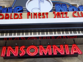
Photographs of Blue Note signs, Las Vegas (Nev.), 2002
Date
2002
Archival Collection
Description
Views of the Blue Note club signs on the Las Vegas Strip. Information about the sign is available in the Southern Nevada Neon Survey Data Sheet.
Site address: 3663 S Las Vegas Blvd
Sign owner: Blue Note International: Father & Son team of Danny and Steven Bensusan
Sign details: The Blue Note is located a short distance east, down Harmon Ave., on the north side of the street, facing south. It is part of the Aladdin Hotel Casino. A vacant lot resides on the corner, and is the only thing that separates the Blue Note from the Strip. Signage for the property includes two logo wall signs on the west wall of the building, a vertical blade sign and an entrance sign over the main port to the establishment.
Sign condition: Structure 5 Surface 5 Lighting 5
Sign form: Fascia
Sign-specific description: Just east off of Las Vegas Blvd, down Harmon Ave, lies the entrance to the "Blue Note: Jazz Capital of the World." The Blue Note is actually part of the Aladdin property, residing in the eastern most wing of the building, on the south side of Harmon. The majority of the signage hangs on the front of the building, which faces south toward Harmon Ave., with additional signage on the west face of the structure that extends from the Aladdin property. A vacant lot on the north east corner separates the Blue Note from the rest of the strip. The structure of the building and the design of the signage are juxtaposed with the building still being finished in a Persian Palace theme. While the signs are reminiscent of roaring twenties style font and theatre front design. Several different types of signs adorn the Blue Note. Two wall /logo signs hang on the west side of the building, while a sculpted entrance marquee, a hanging logo sign, and a vertical blade sign hung on the south side of the building. The west wall logo sign is composed of blue channel letters spelling the text " Blue Note," separated by a circular cabinet with a tube of neon bent to emulate the shape of a musical note placed in the middle. Five steel bars just out from either side of the cabinet. Below the text, a white steel cabinet with rounded ends, support a thin set of blue channel letters reading, "Jazz capital of the world." Further to the right a set of pink channel letters rest upon the upper portion of the corner of the structure. The letters are filled with pink neon. Along the South face of the building the first sign, hung in close proximity to the southwest corner, a vertical blade sign sits on a radius base of shaped molding jutting out of the wall. The actual body of the sign is a double backed cabinet finished in polished aluminum, with blue pin striping along the edges as well as along the rounded edge of the top. Near the top of the sign, the same rounded cabinet seen on the west wall of the structure, is integrated into the blade facing east/west. The cabinet is thicker in width to compensate for the width of the actual sign. The edges of the steel structure are painted in the same blue tone. The afore mentioned blue neon tubing fashioned into the shape of the note resides in this cabinet also. Along the east/west sides of the sign the text "The Blue Note," runs vertically from top to bottom, in blue channel letters only interrupted by the circular cabinet. The panel, which the text resides is painted white. Along the edge of the blade, which faces south, the text "Blue Note" is spelled vertically in blue channel letters. Sitting along the edge of the base, which the sign sits on, thin red channel letters stand almost independently, wrapping around the radius of the base. Starting on the west side of the sign and finishing on the east side, the text reads "Club & Cafe." These letters are filled with tubes of red neon. The letters are attached to a backing radius band of metal appearing to be gold. Further down the face of the building the main entrance to the building plays host to an overhead marquee/logo sign incorporating sculptural elements as well. Directly in the center of the composition, a long horizontal cabinet plays host to the red channel letters filed with red neon, reading, "World's Finest Jazz Club." Sitting on the top edge of the cabinet the same configuration of the Blue Note logo sign along with the circular cabinet, rests in front a sculpted piece of black steel. This piece of black painted steel is cut to appear as if it is the open top to a piano. Along the interior edge of the lid tubes of blue neon form a blue border. Between the piano top and the Blue Note logo, a horizontal steel grate serves as a divider as well as support for the blue channel letters. This entire section sits on a long horizontal ledge composed of a long polished steel section with a long LED message center just below that. Slightly recessed below the message center another width of overhang constructed of steel is painted to appear as if it is made of piano keys. Along the wall, just above the door, the pink channel letters read "Insomnia" with pink neon on the interior.
Sign - type of display: Neon
Sign - media: Steel; Fiberglass
Sign - non-neon treatments: Paint
Sign environment: Situated just east off the strip, down Harmon Avenue, the Blue Note is the only attraction in its immediate area. Even though it is part of the Aladdin complex, the closest property is the Harley Davidson Cafe on the south east corner of Harmon and Las Vegas Blvd At night, the property loses its Arabian Nights architecture emitting a sultry glow of neon. It is hard to miss, if a pedestrian peers down the street while traveling north or south, on the east side of the strip. During the day, the architecture helps to blend in the property to appear as it is, part of the Aladdin.
Sign manufacturer: YESCO
Sign - date of installation: 2000
Sign - thematic influences: The building itself is part of the actual Aladdin property, so the faced of the structure is themed in the manner of an ancient Persian city. It is an interesting juxtaposition for the sleek, modern finish and colors of the signage, with the organic facade of domed towers and stone facade. The Blue note signage is themed around the subject of music, specifically Jazz and Blues music. The blue hue of the neon, and the cabinet containing the crafted musical note are all evidence of this. The blade sign is thematically influenced by marquee building signs for theaters and music clubs from the first part of the century, specifically the forties and fifties. Such examples that utilized a similar designed blade sign were properties from the 1930's 40's and 50's such as The Boulder Club, The Pioneer Club, and the Las Vegas Club.
Surveyor: Joshua Cannaday
Survey - date completed: 2002
Sign keywords: Fascia; Neon; Steel; Fiberglass; Paint
Mixed Content
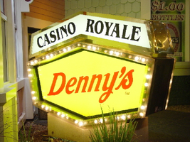
Photographs of Casino Royale and Denny's signs, Las Vegas (Nev.), 2002
Date
2002
Archival Collection
Description
Daytime and nighttime views of the Casino Royale and Denny's signs on the Strip. Information about the sign is available in the Southern Nevada Neon Survey Data Sheet.
Site address: 3419 S Las Vegas Blvd
Sign owner: Tom Elardi
Sign details: The Casino Royale is located on the east side of the strip facing west, just south of the Venetian. The smaller establishment shares its space with a Denny's restaurant, which was present before the Royale was opened. The exterior is adorned with a stylized, European-esque, architecture, including apparent windows, domes, towers, and a cohesive landscape of connected buildings. The exterior of the Royale is a brightly lit facade of white raceways, lined with incandescent bulbs, boxing in vibrantly toned walls, and subdued neon. The colors correspond with those seen in the sign itself, as well the neon placed inside the edges of the windows. One section displays purple, the next a teal color, next a blue, then a red. Total signage of the property includes a two LED screens, one on the west side of the building, and the other housed in the logo cabinet on the south west corner of the property. Two logo cabinets, one in the aforementioned spot, and the second facing west over the main entrance on the west side of the building. Two double-faced cabinets lie on the northern end of the west side of the building, advertising for Denny's restaurant. Two small logos signs are also placed on the west face of the structure, for Caffe Trilussa.
Sign condition: Structure 5 Surface 5 Lighting 5
Sign form: Fascia
Sign-specific description: Upon the southwest corner of the building, a blue cabinet houses an LED screen in the rectangular body of the cabinet. The cabinet continues upward where the blue steel face supports white channel letters bordered in red neon and filled with incandescent bulbs. The text is written in two lines. The cabinet continues upward and is transformed into the sculpted design of a pink, purple, red, and blue crown on channel faced scrolls and sweeping shapes. The interiors of each section are lined with neon of a corresponding color to the paint treatments. Around to the west side of the building, the same style of text and scrolling adornments are used in a different marquee sign denoting the main entrance to the establishment. The same style of text seen on the southwestern sign is present with the same pattern of scroll work, crafted in a cabinet style, with channel faces. The major difference between the two signs is the size. The main entrance sign is much larger than the corner sign, as well as not having a LED screen incorporated below the text. The western sign possesses more scroll work below the text instead. The neon treatments are the same, as well as the incandescent bulbs, inside of the text. The lower roofline of the property plays host to the small but noticeable signage for Caffe Trilussa. Upon a extended surface of the roof line, two separate signs for the establishment are present. The roof shape is three sided with the signage on the northwest and southwest sides of the extension. Inside a section of the entablature created with white raceways, brown channel letters, spell the text "Trilussa," stretching across the length of the surface. The brown letters sit upon a yellow surface and are filled with incandescent bulbs, which are as wide as the channel letters themselves. Spelled in bent neon tubing, the word "Caffe" is spelled in all capital letters, sitting just above the left hand side of the title text. The right of the collection is occupied by a graphically treated, two-dimensional cut-out of a palm tree. The palm tree is treated on the surface with neon tubing as well. The tubing glows green and a gold corresponding to the graphical treatments. At the northern end of the property, two signs sit outside facing north, south. The double backed, internally lit cabinets represent the advertisements for the Denny's restaurant attached to the Royale. The first is at ground level outside the main entrance of the restaurant, the six sided, green cabinet, sports a yellow plastic face with red graphic text, reading "Denny's" in script text. Around the border of the face, incandescent bulbs run in a raceway pattern, and are covered in a plastic sheath. An angular cabinet rests on top of the other cabinet, creating a shallow peak. The internally lit, white face reads "Casino Royale" in black text. The same cabinet can be seen cantilevering off of the west side of the building above its partner sign. The cabinets are of identical design except for there is no plastic sheath covering the raceway of incandescent bulbs, and the plastic face of the main section of the cabinet is treated in different graphics. The script reads "Denny's" similar red script, but with a different background.
Sign - type of display: Neon; Incandescent; Backlit
Sign - media: Steel; Plastic
Sign - non-neon treatments: Graphics; Paint
Sign animation: Chasing, oscillating
Notes: The incandescent bulbs inside the channel letters of the main text oscillate, while all incandescent bulbs on the raceways along the building chase each other also. The incandescent bulbs, which surround the Denny's cabinet, also chase each other.
Sign environment: The Casino Royale stands independently on it's own even though it is surrounded on all sides by casino giants. To the north stands the Venetian, to the South stands Harrah's, and the Mirage lies west across the street. Yes, the property itself seems to be dwarfed by the immense neighbors, but the ultra bright, clear external signage and facade create a charming and bright environment that announces its presence.
Sign manufacturer: YESCO
Sign - date of installation: 1992
Sign - date of redesign/move: The Royale was once the Nob hill, which was closed in 1980. It was reopened in 1992 as the Casino Royale.
Sign - thematic influences: The theme seems to be tied to a European theme with the French term "Royale" in the title. The scrollwork is reminiscent of confetti or Mardi Gras theme. Such a combination of elements to suggest a theme is seen in the Harrah's property also. The party themed reminiscent sculpted cabinets are also reminiscent of the Fleur de Li. Believe it or not, the property is tied to many other larger, corporate, properties in one respect regarding its facades. The facade of a town or city, shrunken down and stylized into the facade of the property is present all over the Strip. Such properties which utilize this technique, to one degree or the next, include: New York New York, Oshea's, Treasure Island, Bellagio, The Venetian, The Luxor, The Tropicana, and the Excalibur.
Surveyor: Joshua Cannaday
Survey - date completed: 2002
Sign keywords: Chasing; Oscillating; Fascia; Neon; Incandescent; Backlit; Steel; Plastic
Mixed Content
Photographs of Arby's and Guinness World of Records Museum signs, Las Vegas (Nev.), 2002
Date
2002
Archival Collection
Description
Daytime and nighttime views of the Arby's and Guinness World of Records Museum signs on the Strip. Information about the sign is available in the Southern Nevada Neon Survey Data Sheet.
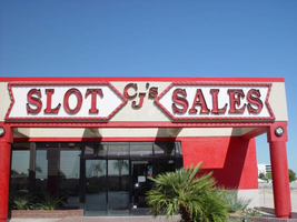
Site address: 2776 Las Vegas Blvd, 2780 Las Vegas Blvd
Sign owner: Arby's: Schultzen and Harry Sax, Guinness: ?, Cj's: PDS Gaming used to be Carl Fredrickson
Sign details: Located in a small lot on the west side of the strip, north of the giant Circus Circus pylon, and just north of the Arco AM/PM, the Arby's fast food establishment shares property and a sign with Guinness World of Records, and CJ's Slot Sales Facility. The Arby's is located in the front of the lot facing the strip, flanked on either side by drives. The "L" shaped structure for the other two establishments lies in the rear, western portion of the lot. To the north of the property, is vacant desert, stretching to Sahara Ave. To the south is Fantasia Gifts. Text signage adorns both structures, as well as a small pylon on the front northeast corner of the property. This sign is located in close proximity to the street.
Sign condition: Structure 4 Surface 3 Lighting 3 The structural integrity of all the signs on the property seem to be stable and in decent repair. The surface of the Guinness channel letters is faded, and showing patches of white. The lighting on the Guinness sign does not work, but the main pylon is functional. Even though CJ's slot sales are not present in this location any more, the text on the pylon for CJ's is functional and animating. The back-lit letters on the Arby's facility are functional, but the red channel letters are not.
Sign form: Pylon; Fascia
Sign-specific description: The north and south sides the Arby's building contain red painted, channel letter text, reading "Museum & Gift Shop," with a lengthy channel arrow underlining the above text and pointing toward the buildings located at the rear of the property. The pylon sign is on the north end of the property, across the drive from the establishment itself. It is basically a two-sided, vertically standing rectangle, divided into two sections by a narrow LED message center. The top half belonging to Arby's and the bottom half designated for the Guinness establishment. Both are placed on a smaller section, which serves as the base. The top half is finished in mirrored panels, providing a reflective surface for the Arby's logo. The insignia for the establishment is the outline of a ten-gallon cowboy hat, with the text spelling "Arby's," displayed cutting through the outline onto either side of the object. The entire logo is constructed of crafted channel raceways. Two separate yellow pieces form the top and bottom portions of the hat, while the text is created in orange. All the channels are filled with incandescent bulbs, and outlined in neon. The bottom portion of the sign is also two sided with, a yellow tinged face providing space for a four lined series of text. The text reads, "Guinness World of Records Museum," in red channel letters, and filled with neon, of the same color. The entire sign itself is bordered in neon. The remaining exposed face of the cabinet is finished with mirrors also. The bottom edge of the cabinet is a sloped mirrored surface which angles down into thinner, but equally wide base that contains signage also. In polished channel letters, internally lit with red plastic faces, the text "Slot Sales," resides and contains a small arrow of the same design on the western edge of the sign. A black internally lit cabinet sits beneath that. The sides of the lower portion are mirrored panels as well. The wall signs of the building at the rear of the property, are similar to those seen on the north and west sides of the Arby's establishment. The signs run parallel to the walls of the face of the building. The building is "L" shaped with the leg of the "L" pointing east, and the longer section running north. Supported on a background held up with a series of cylindrical columns, a facade of gold, raceway bordered message banner, runs along the east face. It then recedes west along the leg of the "L", parallel to the northern face section, and angles back to meet the rest of the building. The text on the sign is spelled in red channel letters, and bordered with yellow neon. Along the shortest section facing east, the word "Guinness" is spelled. The section shooting west, and facing north, possesses the text "World of Records." The texts in both sections are almost as tall as the banner itself and in all capitals. The angled portion has smaller text, reading "Entrance" and two arrows pointed down on either side. The remainder of the eastern face is blank until the northern end of the face. On the wall above the entrance two cabinets flank a set of red channel letters reading "CJ's." The edges of the cabinet on either side of the center initials, is crafted in a triangular peak, making the two signs into arrows pointing toward the center. The outside edges are negative triangular cuts, echoing the other pointed end. The edges of the cabinet are crafted out of red raceways, lined with incandescent bulbs. Red channel letters, filled with neon occupy the white background on both cabinets. The left cabinet reads "Slot" and the right reads "Sales."
Sign - type of display: Neon; Incandescent
Sign - media: Plastic; Glass
Sign - non-neon treatments: Paint
Sign animation: Flashing, oscillating
Sign environment: The environment of the Arby's Guinness complex is one of finality. To the north a vacant lot stretches on, leaving the Arby's dangling in conclusion on the west side of the strip. Even though giants such as the Sahara and the Circus Circus loom nearby, the Arby's complex seems very alone.
Sign - date of redesign/move: In August of 2002, the Signage for CJ's was removed
Sign - thematic influences: The theme is only dealt with within the realm of the businesses that they advertise. The Guinness signage is only text, but retains the raceways that are consistent throughout strip properties. The pylon itself is a multi use structure for all the properties, with a mirrored surface, and the cowboy hat logo for Arby's. So if there is any theme present it could be linked to a somewhat cowboy theme.
Sign - artistic significance: The facade can be linked to a trend that took place in Las Vegas in the 1970's. In an effort to help with energy consumption, the incorporation of mirrored panels was put into effect to help reimburse the present effect of lighting. The pylon has a mirrored surface. A trend popular throughout the 80's as well. In a weird link to a specific casino, the Arby's western hat coupled with the mirrored surface is reminiscent of a site such as the Westward Ho Motel. It too is a mirrored surface, utilizing similar colors, and the inkling of a western theme present in its text. The yellow bulbs animated in the Arby's channel edge are comparative to the pulsating raceways of the Westward Ho.
Surveyor: Joshua Cannaday
Survey - date completed: 2002
Sign keywords: Flashing; Oscillating; Fascia; Pylon; Incandescent; Neon; Plastic; Glass; Paint
Mixed Content
Meeting minutes for Consolidated Student Senate, University of Nevada, Las Vegas, September 26, 1978
Date
1978-09-26
Archival Collection
Description
Agenda and meeting minutes for the University of Nevada, Las Vegas Student Senate. CSUN Session 7 Meeting Minutes and Agendas.
Text