Search the Special Collections and Archives Portal
Search Results
Flora Dungan Papers
Identifier
Abstract
Flora Dungan Papers (1929-1974) contain high school and university records, certificates, newspaper clippings, press releases, notes, correspondence, and booklets about her life and political activism in Nevada. Also included are Legislative materials, an audio cassette tape, a copy of the Nevada Constitution, and an oil painting of Flora Dungan.
Archival Collection

Chris Lee oral history interview: transcript
Date
Archival Collection
Description
Oral history interview with Chris Lee conducted by Cecelia Winchell and Stefani Evans on December 14, 2021 for Reflections: The Las Vegas Asian American and Pacific Islander Oral History Project. Judge Chris Lee reflects on the lives of his parents, their occupations and experiences during the Korean War, and his family's decision to immigrate from Incheon, South Korea to Las Vegas. He recalls memories from his childhood visiting family in Korea, Korean traditions and food, his educational pursuits, and the livelihood of his parents after immigrating. Chris also shares details of his employment history as Deputy District Attorney for the Clark County District Attorney's Office, as Deputy Secretary of State for Southern Nevada, as the first Asian American elected to the Clark County Justice Court bench, and presently as Judge in Department 1 of the North Las Vegas Municipal Court.
Text
Stardust Resort and Casino Records
Identifier
Abstract
The Stardust Resort and Casino Records (1950-2006) contain materials of the Stardust Resort and Casino, which operated in Las Vegas, Nevada from 1958 to 2006. The collection contains materials on events hosted by the Stardust, the resort and casino's corporate history, interior and exterior building design, and performers. The collection also includes photographs, negatives, and slides that document the history of the resort and casino. Newspaper and magazine clippings, advertisement and marketing materials related to the Stardust's venues, shows, entertainers, and events are also present in the collection. The collection also contains a significant amount of audiovisual material, including VHS tapes, audio cassettes, optical discs, film reels, and cassette tapes containing footage and audio recordings of Stardust show promotions, news broadcasting clips, interviews, and commercials featuring the Stardust.
Archival Collection
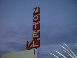
Photographs of Happi Inn signs, Las Vegas (Nev.), 2002
Date
Archival Collection
Description
Site address: 3939 S Las Vegas Blvd
Sign details: The Happi Inn resides on the corner of Mandalay and Las Vegas Blvd, stretching east, ending at Gilles street. The property is the largest of the small roadside sites. The signage, however, is limited. Three pole signs and an internally lit cabinet comprise total signage. The two pole signs, being the tallest, reside on the north end of the property while a small vertical pole sign resides on the top of the building's roofline. The small internally lit cabinet sits over the drive, next to the main office.
Sign condition: Structure 3 Surface 4 Lighting 3 Notes: The structure of all the signs appear to be intact, with no visible, severe damage. Various lighting is out an all the signs, with the small roof line pole sign, no longer being lit. The internally lit cabinets on the sign within the pole sign furthest east, are no longer lit as well. The surfaces of the sign are intact, but are worn.
Sign form: Pylon; Fascia
Sign-specific description: Two pole style pylons, reside on the north end of the property. On the rear of the property on the corner of Mandalay Bay and Gilles Street, is a simple design. A single white, steel pole, supports three, two- sided cabinets stacked on top of each other to create the shape. A small white, horizontal, rectangular, cabinet, has a white face with "Office" painted in red text, and a red arrow pointing to the west. It sits slightly off center the center pole. A tall, thin, vertical, rectangular cabinet, is painted orange, and has the world "Motel," spelled in all capital, white neon letters. Centered on top of this cabinet, another internally lit cabinet, white cabinet, crowns the sign. The cabinet has a green face with white text spelling "Happi Inn" in all capital letters. The main pole sign for the property is similar to the previous piece, but a bit more elaborate. As the white pole rises up from the ground it is met with a pair of black, cabinets, sandwiching the north and south sides of the pole. The sign itself faces north south. The cabinets are white faced with text painted upon the surface. Above the two cabinets, a double-backed cabinet is crafted into an "L" shape, facing north, and facing south it would be a "J" shape. Either way it is a horizontal cabinet, which makes a horizontal turn to the east. The foot of the character curves down to a point, while the vertical section, runs up the west side of the white pole, which continues upward. The vertical surface contains the text "Motel" that is written horizontally downward in all capital, white, painted text. The graphic text is shadowed over with neon tubing. The horizontal section has the words "vacancy" written in white all capital text, with red neon lying over the surface. The top of the sign is crowned with a double backed, six sided, geometric cabinet. The surface is green written in capital, white text, with the word "Happi" written in an arched pattern, with "Inn" written horizontally below that. Over the entrance to the driveway, stretching into the east-end of the lot, is a small, internally lit cabinet, with rounded ends. The face of sign is green plastic with "Happi Inn" written in all capitals, in a two lined text. White, scroll-type designs, flank, both sides of the text. Just past the Psychic Sessions, palmistry establishment, actually standing on the corner of the building, a vertical pole sign, rises in the sky. I single red pole shoots upward a short distance, with five double-backed square cabinets being speared through the center. Each cabinet, also red, contains 1 letter from the word "Motel, in all capitals." The letters are overlaid with neon as well/ Pointing down toward the property, an angled arrow, crafted in the same fashion and material as the cabinet, is positioned just below the east side of the cabinet containing the letter "E."
Sign - type of display: Neon; Incandescent; Backlit
Sign - media: Steel; Plastic
Sign - non-neon treatments: Paint
Sign animation: Chasing, flashing, oscillating
Notes: the letters inside of the letters of the tower actually oscillate.
Sign environment: The Happi Inn is part of the distinctive section of the Strip comprised of older roadside motels, met with a few of the larger resort casinos. Facing west on the corner of Las Vegas Blvd and Mandalay Rd., the property resides in the shadow of Luxor. To the north, vacant land reaches until ended by the Tropicana property.
Sign - thematic influences: There appears to be no apparent theme associated with the Happi Inn other than the fact that it belongs to the style and genre of the roadside motel design seen throughout the southern end of the strip.
Surveyor: Joshua Cannaday
Survey - date completed: 2002
Sign keywords: Chasing; Pylon; Fascia; Neon; Incandescent; Backlit; Steel; Plastic; Paint
Mixed Content
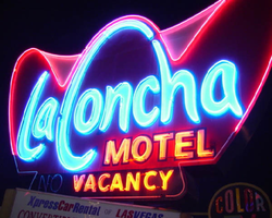
Photographs of La Concha sign, Las Vegas (Nev.), 2002
Date
Archival Collection
Description
Site address: 2955 S Las Vegas Blvd
Sign owner: Edward Doumani
Sign details: The La Concha is located north of the Riviera hotel Casino, just past the giant glass wall advertising for Splash. The La Concha double sided ground sign, sits close to the street on the east side of the strip, facing north /south. Directly to the east the origin of the signs shape resides in the form of the front structure of the La Concha's lobby structure. The sweeping elliptical roofline creates a structure dripping with the flavor of outlandish 50's-60's expressionistic modern design. The roadside ground sign reflects this shape actually mimicking it in a stylized silhouette of itself. The two icons are separated by a small but busy parking lot that expands north of the La Concha to house other similar style structures. The wings of the hotel, which extend out behind the main lobby, are a rather stark and plainly rectangular form, compared to the front portion of the lot.
Sign condition: Structure 4 Surface 4 Lighting 4 Notes: Considering the age of the property and the sign, it is in great condition, everything is intact, but not perfect.
Sign form: Pylon
Sign-specific description: The sign resides in a pleasant spot of green grass, among the concrete and black top surfaces. A rectangular base, painted a light hue of blue and gold, supports a double-sided sculpted cabinet in a three-pointed crown, which is the stylized profile of the building in sits in front of. Below the main cabinet a triangular internally lit message center has been added, as well as two more, flat rectangular cabinets on the north and south sides. The cabinets are adorned with text that advertising for car rentals located in the same neighboring lot. Off of the west side of the cabinet a small circular cabinet is cantilevered off of the edge. It is an internally lit marker, noting that color television is available inside. The surface of the actual cabinet is painted red, and is somewhat faded. The section of the cabinet that would be dedicated to the low-lying portions of the La Concha's roof are addressed in white. The "La Concha" is spelled across the front of the sign in white text outlined in blue. The text is designed specific to the sign, for the capital L and C are shaped to match the contours of the crowns of the sign. The rest of the script also takes on some of the same stroke of the manner. Motel is spelled in the same coloring across the bottom right hand portion of the signs face, in block text. The very bottom portion of the cabinet is a black painted horizontal extension with edges that angle back into the body of the sign. The words "vacancy' are written across the surface of the sign to the right hand side. No is spelled on the left, but only in neon. When illuminated the main text is lined with a light electric blue, while the edges, and the top contours are lined with a pink and fuchsia glowing borders. The words "vacancy" and "motel" are lined in an orange, amber colored, warm tubing.
Sign - type of display: Neon; Incandescent; Backlit
Sign - media: Steel; Plastic
Sign - non-neon treatments: Graphics; Paint
Sign animation: none
Sign environment: The La Concha sits just to the south of the Riviera's giant glass wall. Headed south, the property comes into view, being a quiet transition from the extreme nature of the Riviera. The sign sits in a black top expanse that meanders back into the rest of La Concha's property. The base of the sign is surrounded with plants and curbing, firmly rooted into the urban mainstream of the neighboring street.
Sign manufacturer: YESCO
Sign - thematic influences: The theme of the La Concha can be drawn directly from 1950's and 60's modern design. Such curve can be seen signs of the decade for example the original Dunes pylon displays elements of such curve and swell. In Jorg Rugemer's Lost Las Vegas, there is a picture of a 60's era automobile sitting next to the building. It is used to show the influences of the structures design present in the design of something as common as the automobile. It is reminiscent of the protruding fins and large eye like taillights seen on such autos. The sign itself is an interpretation of the building in a silhouette form, so it's angle draw from the same pool as well. The coloration of the neon is also reminiscent of the era. The turquoise, vermilion and red are reminders of such properties as the original Flamingo, and the Algiers.
Surveyor: Joshua Cannaday
Survey - date completed: 2002
Sign keywords: Pylon; Neon; Incandescent; Backlit; Steel; Plastic; Graphics; Paint
Mixed Content
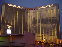
Photographs of Mandalay Bay signs, Las Vegas (Nev.), 2002
Date
Archival Collection
Description
Site name: Mandalay Bay (Las Vegas, Nev.)
Site address: 3950 S Las Vegas Blvd
Sign owner: Mandalay Resort Group
Sign details: Mandalay Bay resides on the west side of the Strip, south of the Luxor. The expanse of property is surrounded with ornate foliage, jutting faux rocks, and assorted statuary accented with the flavor of an ancient island. The three-winged tower looms over the low-rise casino structure. The surface of the tower is covered with an impressive expanse of gold mirrored windows, and vertically striped with gold tubes of neon. The towers also home to the giant channel letters, which serve as the logo building text for the establishment. The ground level the property is home to two giant pylon signs at either end of the property as well. One resides on the east side of the property, while the other on the west.
Sign condition: Structure 5 Surface 5 Lighting 5
Sign form: Pylon; Fascia
Sign-specific description: The Mandalay Bay has little signage, but is cohesively joined together into a simple yet effective use of lighting, which fits in well with it's environment. The building itself is actually the biggest piece of signage, being vertically striped with tubing of gold neon. There is actually over three miles of neon tubing which runs up and down the surface of the tower, reflecting off of the gold, mirrored, surface of the tower. The tower itself during the day is unassuming, for the off white stucco, and mirrored surface, blend to create a harmonious surface. When dark, the building transforms into a mysterious figure clad in golden stripes. On each wing of the Y shaped tower, " Mandalay Bay" is spelled in channel letters across the top edge of the surface. These giant black pans hold incandescent bulbs, which oscillate rapidly. The two pylon signs sit flanking the building on extreme edges of the property. The two pylons are rather plain in design, but are efficient and large. They are highly integrated architecturally, being essentially two giant vertical rectangles. Two massive square legs support an upshot of space defined by two internally it color screens advertising for the "Shark Reef" and for the "House of Blues" These two are squares which sit side by sides, comprising the bottom section of the face. Above that, a large LED screen stretches up to the end of this section. The three signs are closed in on either side by a set square legs capped on the top and bottom with molding. Making up the top section of the pylon another horizontal plane rises up a bit before being topped with a series of crown moldings. Two lines of channel letters spell " Mandalay Bay" and are filled with incandescent bulbs.
Sign - type of display: Neon; Incandescent; Backlit
Sign - media: Steel; Plastic; Masonry
Sign - non-neon treatments: Graphics; Paint
Sign animation: Oscillating
Notes: The incandescent bulbs inside the channel letters which spell the text for the establishment oscillate in a pattern which makes them appear as if shimmering. This style is the most common animation next to the incandescent bulbs on the raceway.
Sign environment: The Mandalay Bay resides in exclusive company on the south end of the Strip. It stands as one of the four major establishments before Tropicana Ave. The other three include the Luxor, the Excalibur, and the Tropicana
Sign manufacturer: LED and plastic sign inside pylon were manufactured by Ad-Art
Sign - date of installation: 1999
Sign - thematic influences: The theme of the Mandalay Bay is one revolving around an island paradise, transformed into a sleek ultra modern super resort, creating a sort of independent city of steel glass, neon, lush foliage, and assorted statuary. It could best be said that it is a combination of the influences of the Tropicana, the Mirage, and Treasure Island, all mixed together as one. The pylons themselves find themselves more a kin to those displayed by the large corporate properties like the Bellagio, and the Mirage. The simple vertically oriented rectangle, plays host to LED screens and backlit color advertisements, and channel letters filled with incandescent bulbs. These elements can be seen in other large properties such as the Mirage.
Surveyor: Joshua Cannaday
Survey - date completed: 2002
Sign keywords: Oscillating; Pylon; Fascia; Neon; Incandescent; Backlit; Steel; Plastic; Masonry; Paint; Graphics
Mixed Content
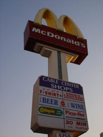
Photographs of McDonald's sign, 3755 S Las Vegas Blvd, Las Vegas (Nev.), 2002
Date
Archival Collection
Description
Site address: 3755 S Las Vegas Blvd
Sign details: The McDonald's pylon sits in the parking lot just to the north of the Fatburger establishment and the Walgreen's structures. It faces north/south in the parking lot of the Cable Center Shops. It sits across a property length parking lot, near Las Vegas Blvd It is also serves as advertising for the rest of the shops in the shopping center, but the main cabinet is dedicated to the McDonald's logo cabinet. The shops behind the sign are covered in the same stucco as seen on the surface of the pylon.
Sign condition: Structure 5 Surface 4.5 Lighting 5 Notes: It is noted that the structural integrity is intact. Certain elements of lighting are out or not working, but present still. The surface appears to be slightly deteriorating at this point.
Sign form: Pylon
Sign-specific description: The pylon sign for the McDonald's and the Cable Center Shops is essentially a double sided pole sign comprised of a two sided main logo cabinet and an internally lit rectangular cabinet. The internally lit cabinet located in the middle of the pole finished it's exterior the same as the rest of the actual pole. The post is covered in an off white stucco finish, with a green channel running up the center of each face. The channel T's off as well following the supporting stretch at the top of the rise, below the main cabinet. Three gold neon bars run up the center of the green channel. The internally lit cabinets face is adorned with graphics advertising for all of the shops located within the strip mall. Its luminescence is strong for an internally lit cabinet. A blue section at the top of the plastic face is designated blue with white script reading "Cable Center" shops. The rest of the text below that reads like two-sided menu. The McDonald's cabinet at the very top of the pole is constructed of red painted steel, as well as yellow painted steel for the golden arch crown designated as the top portion of the cabinet. The face of the cabinet is encrusted with red incandescent bulbs as well as being striped horizontally across its width edge with bars of red neon. The underside of the golden arches is also encrusted with yellow incandescent bulbs, while the faces of each arch is striped horizontally with neon bars as well bordered on the edges of the ace of the arch as well. The text McDonald's is spelled in white channel letters and lined on the interiors with white neon.
Sign - type of display: Neon; Incandescent; Backlit
Sign - media: Steel; Plastic
Sign - non-neon treatments: Paint
Sign animation: Oscillating, flashing
Notes: The incandescent bulbs located on the underside of the arches, as well as on the face of the sign oscillate rapidly, while the neon bars on the width of the sign and underneath chase each other from top to bottom. The neon bars, which comprise the face of the arches, chase each other also. The rest of the arch is dark as they start at the bottom of the middle point of the "M" shape. They chase each other until the surface of the sign is covered, and at this time they all flash off, then on, then off again before the entire sequence starts over.
Sign environment: It is an interesting section of the strip between the Showcase Pylon sign and the edge of the Cable Center shops. First, it is noticeably an interesting cross section of the Strip, because vicinity has three establishments which fit a specific genre of sign. The Fatburger, Walgreen's and McDonalds are properties which function in everyday America, but are suited up to be part of the neon charged appearance of this specific location. Not only are the establishments linked by nature to everyday America, but the face that a strip mall is added to the scenery, just adds to the point. The environment is a heavily pedestrian-accessed area, bombarded by the combination of all of the signage.
Sign manufacturer: YESCO
Sign - thematic influences: The theme of the McDonald's establishment is in the realm of the well-established McDonalds corporation. The golden arches, and solid red hue, have become synonymous with the name " McDonald's," and is an image, which has been communicated to the masses of people for half a century. It is an icon, which is associated with America all over the world. McDonalds has created it's own realm and thematic influence over the years from all of it's extensive advertisements and marketing. Therefore, the theme of the establishment's signs draws from itself and the world that the name has created. Being one of the most commonly seen images in America, this sign is tailored to fit into the illustrious, illuminative properties held on the Las Vegas Strip. It fits into the category of everyday images and businesses dressed up for Las Vegas, which include, Arby's, Arco AM/PM, Walgreen's, and Fatburger.
Surveyor: Joshua Cannaday
Survey - date completed: 2002
Sign keywords: Oscillating; Flashing; Pylon; Neon; Incandescent; Backlit; Steel; Plastic; Paint
Mixed Content
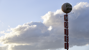
Photographs of Desert Moon Motel sign, Las Vegas (Nev.), April 18, 2017
Date
Archival Collection
Description
Site name: Desert Moon Motel (Las Vegas, Nev.)
Site address: 1701 Fremont St
Sign owner: Jerzy and Celina Kosla
Sign details: The building was constructed in 1942 (Assessor). According to one commentator, the Desert Moon motel opened on the site in 1952 (Roadside Architecture.com). The cars on a vintage postcard of the motel appear to date from the late 1940's or early 1950's (Ebay). The same vintage postcard (Ebay) shows the motel as a member of United Motor Courts, an early motel referral chain founded in 1933 which published a travel guide until the early 1950's (Wikipedia). Based in Santa Barbara, California, United Motor Courts was made up of "a friendly group of independent owners of motor lodges..." (Historic Highways). The Quality Inn motel franchise was a spinoff of United Motor Courts (Wikipedia). The motel has been renovated by its current owner, Polish immigrant George (Jerzy) Kosla (Glionna, 2017).
Sign condition: The sign is Condition 4, good. The paint appears slightly faded but there is no flaking or peeling. The cabinets, reader boards, and fiberglass moon are all in good condition. The neon is intact.
Sign form: Pole sign
Sign-specific description: The sign pole and metal cabinets are painted pink. The design and lettering are the same on both sides of the sign. The trapezoid-shaped lower cabinet extends horizontally toward the street. It contains a rectangular white plastic lightbox which states "FREE ADULT MOVIES" in red sans serif letters and "FLAT SCREEN TV'S in smaller black san serif letters. To the left of the letters is the black silhouette of a female figure. On the metal below the plastic screen are clear sans serif neon letters which spell out, "NO VACANCY" in red when illuminated. The upper metal cabinet hangs from the street side of the pole. White painted san serif letters, covered by clear sans serif neon letters which glow red when illuminated, run vertically down the cabinet to spell out, "XXX MOVIES". Five metal cabinets attached to the street side of the sign run vertically to spell out, "M-O- T-E- L" in white painted sans serif letters covered by yellow sans serif neon letters. On top of the pole is a white p
Sign - type of display: Neon, Lightbox
Sign - media: Steel, Plastic, Fiberglass
Sign - non-neon treatments: Lightbox
Sign environment: East Fremont Street, surrounded by other motels.
Sign - date of installation: c. 1950s
Sign - date of redesign/move: The now pink or faded red sign cabinets were painted blue in a 2003 photograph
Sign - thematic influences: Desert, Space Age, Western
Sign - artistic significance: The current sign appears to have taken the Western/Lunar theme from the previous sign and transformed it into a 1950's/1960's Space Age/Lunar theme
Survey - research locations: Assessor's website
Survey - research notes: Ebay. Las Vegas NV Desert Moon Motel roadside Nevada vintage linen postcard ca 1940s. Retrieved from https://picclick.com/LAS-VEGAS- NV-Desert- Moon-Motel- Roadside-Nevada- 141923576051.html Glionna, J. M. (2017 April 23). Motel, once a haven, now a crime-ridden jungle in downtown Las Vegas. Las Vegas Review Journal. Retrieved https://www.reviewjournal.com/local/local-las- vegas/downtown/motel-once- a-haven- now-a- crime-ridden- jungle-in- downtown-las- vegas/ Historic Highways. (2007 July 14). Archive for the "Motel Associations" category: Looking for a motel in 1933. Retrieved from https://historichighways.wordpress.com/category/motel-associations/ Roadside Architecture. com (n.d.). Las Vegas Signs: Desert Moon Motel. Retrieved from http://www.roadarch.com/signs/nvvegas.html RoadsidPeek.com. (n.d.). Downtown motels Las Vegas: Desert Moon Motel. Retrieved from http://www.roadsidepeek.com/roadusa/southwest/nevada/vegas/lvmotel/lvdownmotel/index5.htm Wikipedia. (n.d.). Motel: 2.6 R
Survey - other remarks: A postcard circa early 1950's features a different sign with a saguaro cactus and quarter moon (Ebay). The current sign appears to have taken the Western/Lunar theme from the previous sign and transformed it into a Space Age/Lunar theme, which may indicate that the sign dates from the date from the late 1950's or 1960's.
Surveyor: Mitchell Cohen
Survey - date completed: 2017-08-22
Sign keywords: Neon; Steel; Plastic; Fiberglass; Pole sign; Light box; Sculptural
Mixed Content
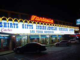
Photographs of Fantasia signs, Las Vegas (Nev.), 2002
Date
Archival Collection
Description
Site address: 2800 S Las Vegas Blvd
Sign details: Fantasia on the Strip is located north of the Circus Circus, among the smaller properties located the northern end of the Strip before Sahara Avenue. The building faces east, only separated from the street by a small parking lot, which runs along the front of the property. The two-story building is adorned with a building length message cabinet, and sculpted, patterned raceways. The sign extends north across a drive designating parking in the rear. A small pole sign also sits on the east edge of the property.
Sign condition: Structure 3 Surface 4 Lighting 4 The Fantasia establishments signage looks decently weathered up close, for the colors and paint treatments are in good condition. The structure of the sign has a couple of anomalies that are apparent. The pole sign on the street side of the property has no face on the triangular portion of the surface. The far right hand side of the building fascia makes an uncomfortable transition into the support structure from the ground.
Sign form: Pylon; Fascia
Sign-specific description: The design is a building front, message cabinet running the length of the facade of the building, facing east. The white, steel, paneled front cabinet contains Blue and red plastic text. The larger fonts run the entire length of the sign and read "Souvenirs, T-shirts, Gifts, Indian Jewelry, Moccasins, Liquor," in an "old west" style text seen on properties such as the Frontier. This arrangement's color is blue. The bottom line of text is smaller and is broken up into three separate phrases and distributed evenly across the surface. The left side reads, " Jewelry, Belts, Hats, Cactus" in red cursive. The center is blue western font, reading "Las Vegas Souvenirs." The right hand side is red cursive again reading "Sundries, Food, Beer Wine, Ice." The bottom and top edges are lined with yellow raceways with incandescent bulbs. The top edge is created by a repeating series of raceway arches, matching the finish of the other edges. The top edge of repeating arches continues north past the edge of the cabinet onto a smaller, much thinner cabinet. The thinner cabinet looks as is if it is a continuation of the main sign with pieces cut out of it. The arches continue to the end of the extension and down connecting to a steel I-beam linked to the ground. The smaller plane reads "park in rear" in red, plastic, all capital, letters. Raceway arrows protrude through the bottom of the sign, pointing through the entrance it creates for traffic. The arrows are arranged on the bottom edge as if they are extensions of the imaginary points created by the meeting of the downward strokes two sides of two arches. Across the very top of the main banner, a narrow, red, steel cabinet reads the word "Fantasia" in white script. The script is surfaced with neon. Near the street, on the northern portion of the property, a pole sign holds an internally lit cabinet. The frame of the cabinet is a blue raceway whose western edge is fashioned into an arrow shape. White plastic comprises the face of the sign, which faces north south, and does not reach into the arrow section. It is a skeleton of a frame, with nothing in the middle. Translucent vinyl lettering is present on the face of the sign and reads "Liquor, Moccasins, Indian Jewelry 1/2 off," in all capital letters.
Sign - type of display: Neon; Incandescent; Backlit
Sign - media: Steel; Plastic
Sign - non-neon treatments: Paint
Sign animation: Chasing
Notes: The only animation present is the animation of the incandescent bulbs on all the raceways surrounding the signs. The bulbs chase each other from left to right.
Sign environment: The fueling station resides on the northern edge of the strip before Sahara Avenue. Directly to the east, across the street is the Sahara Hotel Casino, but is flanked by smaller non-resort related properties. Along with the other two properties to the north and to the south, they seem as functional aspects for tourists and patrons of the larger properties of the Circus Circus and the Sahara. Almost dwarfed by the two nearby giants the properties can easily go unnoticed without the treatment of the illumination.
Sign manufacturer: YESCO
Sign - thematic influences: There is no real theme associated with the property other than being a typical Las Vegas strip shopping establishment. The unique array of raceways and chasing incandescent bulbs are reminiscent of the countless canvass of the same design technique seen all of the strip, yet retain a hint of originality with it's arched pattern. Another widely used element , present in the design, is the internally lit message center. These two simple elements are used in conjunction to create a unique display typical to the Las Vegas Strip. It fits into the context of the Las Vegas strip as one of the many gift shops, but stands out as one of the larger ones, with the most vibrant signage.
Surveyor: Joshua Cannaday
Survey - date completed: 2002
Sign keywords: Chasing; Pylon; Fascia; Neon; Incandescent; Backlit; Steel; Plastic; Paint
Mixed Content

